Most designers confuse “vintage” with “retro” and use them interchangeably. They’re not the same — and the distinction matters more in POD than anywhere else, because buyers searching “vintage shirt design retro” are looking for era-accurate aesthetics, not a general vibe.
Vintage means authentic to a specific past period. Retro means inspired by the past, often exaggerated or reinterpreted. A real 1975 concert tee is vintage. A new shirt designed to look like a 1975 concert tee is retro. Both sell — but they sell to slightly different buyers with different expectations.
Here are 41 vintage shirt design retro styles organised by decade, with what defines each era visually.
What Is the Difference Between Vintage and Retro in T-Shirt Design?
Vintage: the original. A shirt that was actually made in a past era, with the materials, printing methods, and typography of that time.
Retro: a new design that references, interprets, or deliberately evokes the look of a past era. Modern file, vintage feeling.
For POD, everything is technically retro (it’s all made now), but the design language matters. Buyers searching “vintage” want designs that look like they could have been made in 1972. Buyers searching “retro” accept modern interpretation. Designs that nail the era-specific details serve both audiences simultaneously.
70s Groovy Typography — Earthy Retro
Rounded display lettering with botanical border motifs in mustard, rust, and forest green — the specific visual grammar of 1970s American graphic design. Not a generic “retro” look. Era-accurate typography and palette that reads as authentically 70s from ten feet away.
Decade-by-Decade: What Defines Each Retro Era
Each decade has a specific design signature. Knowing the difference lets you build era-accurate designs that appeal to buyers who grew up in (or romanticise) those years.
| Decade | Typography | Colours | Motifs | POD strength |
|---|---|---|---|---|
| 60s | Bold condensed serifs, psychedelic hand-lettering | Bright primary + black, op-art patterns | Peace symbols, op-art, mod shapes | Niche — peace/counterculture buyer |
| 70s | Rounded groovy display, script, Souvenir-style | Mustard, rust, avocado green, cream | Botanical, macramé-inspired, nature, groovy sun | High — broadest retro appeal |
| 80s | Neon gradients, bold italic, chrome effects | Hot pink, electric blue, neon yellow, black | Memphis patterns, cassette tapes, sunglasses | Medium — nostalgia buyer, 35–45 age range |
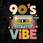
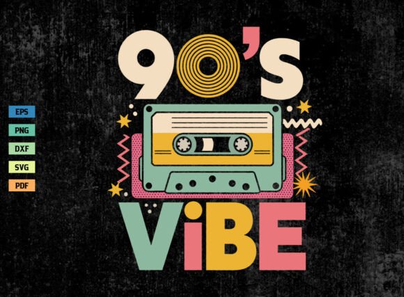
| 90s | Grunge distressed, bootleg-style, boxy bold | Black, white, grey, neon accents | Flames, skulls, skate culture, bootleg pop culture | High — 30–40 age range, strong on Etsy |
90s Grunge / Distressed Style
Heavy distress, rough ink edges, and a boxy bold font — the visual language of 1990s skate and streetwear culture. Black on white with maximum ink break throughout. This design format drives some of the highest save rates in the men’s vintage category on Etsy.
How Era-Specific Elements Translate to Modern Tees
You can’t just take a 1970s colour palette and call it 70s. The details matter:
70s: Use Souvenir-style rounded serifs, not modern sans-serifs. Use botanical illustration that references macramé and folk art, not digital botanical vectors. The earthy palette alone isn’t enough — the typography must match.
80s: The defining element is the gradient — colour transitions from one neon to another were physically possible with then-new printing techniques. The 80s design should have gradients. Flat 80s-palette designs don’t read as 80s; they just read as colourful.
90s: The distress is different from other eras. 90s distress has a specific grunge texture — rougher, more irregular, heavier ink break than the worn-and-washed vintage look of the 70s. The typography is bolder and less refined — it should look like it was made quickly, not carefully designed.
80s Neon Badge Style
A bold badge format in hot pink and electric blue — the neon colourway of 1980s American graphic design. The gradient between the two colours is what makes this era-accurate. Flat pink on blue reads as 80s adjacent; the gradient reads as 80s authentic.
Each design below is a commercial-licence PNG or SVG from Creative Fabrica — ready for immediate upload to Printify or Printful. Era-specific files built by designers who know the visual references.
Classic Retro Badge — Era-Neutral
A circular distressed badge that reads as vintage without being decade-specific — works in the 60s–70s overlap. Earthy brown and cream, serif typography, worn-ink texture throughout. The baseline retro design that sells across all buyer segments.
Era-Accurate Distressed Retro
A distressed badge with non-uniform ink breaks — heavier in the flat fill areas, cleaner on the stroke outlines. This internal texture distribution is what separates properly built retro designs from designs with a surface-applied overlay.
70s Illustrated Retro Logo
A circular illustrated logo with thick-outline botanical border, centered bold serif wordmark, and a warm earthy palette — the 70s design language in its most commercially effective form. Year-round Etsy performer, consistent Merch CTR.
Browse Vintage Retro Shirt Designs →
Retro Colour Palettes by Decade
The colour palette is the fastest visual signal of era. Get it wrong and the design reads as “retro-ish” rather than era-accurate. Get it right and buyers who lived through (or romanticise) that decade respond immediately.
60s: Primary red, yellow, and blue on white — the op-art and pop art palette. Also psychedelic: bright orange, lime, violet. High contrast, bold separations.
70s: Mustard, avocado green, harvest gold, burnt sienna, chocolate brown, cream. Muted and earthy. Never neon. Never primary.
80s: Neon pink, electric blue, purple, yellow-green on black. Gradients between neons. Miami Vice palette. Chrome effects on dark backgrounds.
90s: Black, white, and one saturated accent — often neon green or red. Or all greyscale with heavy distress. The 90s palette is the most restrained of the four decades — it’s less about colour and more about texture and form.
For more on specific retro print techniques, our vintage t-shirt print guide covers halftone, distress, and screen-print effects by era. For 90s-specific designs, our 90s bootleg shirt design article covers that aesthetic in depth.
Key Takeaways
- “Vintage” means authentic to an original era; “retro” means inspired by the past — POD designs are retro, but era-accurate details make them read as vintage to buyers
- The 70s is the strongest retro decade for POD: broadest buyer appeal, year-round relevance, and the most commercially consistent colour palette
- Each decade has a non-negotiable visual signature: gradients for 80s, grunge texture for 90s, botanical+earthy for 70s — getting one element wrong shifts the era-reading
- The 90s grunge/distressed style has the highest Etsy save rates in the men’s vintage category among all four retro decades
Frequently Asked Questions
What is the difference between vintage and retro t-shirt design?
Vintage refers to designs from (or authentically replicating) a specific past era — the original visual language of that time. Retro is a broader term for any design inspired by the past, often with modern interpretation or exaggeration. In POD, the distinction matters because era-accurate vintage designs appeal to buyers who value historical accuracy, not just a nostalgic feeling.
Which retro decade is most popular for t-shirt design?
The 70s is the most consistently popular retro decade for POD t-shirt design. The earthy palette, botanical motifs, and groovy typography have broad cross-demographic appeal and year-round search volume. The 90s grunge aesthetic is the fastest-growing, particularly in the men’s vintage category on Etsy.
What fonts define each retro decade for t-shirt design?
60s: bold condensed serifs and psychedelic hand-lettering. 70s: rounded display faces (Souvenir-style), script, and botanical hand-lettering. 80s: bold italic with gradient fills, chrome effects, and outlined neon type. 90s: distressed grunge faces, boxy bold, rough-edged condensed type. Each decade’s typography is distinct — using a modern sans-serif for any era undermines the vintage effect.
What colours should I use for a 70s retro t-shirt design?
Mustard, avocado green, harvest gold, burnt sienna, chocolate brown, and cream are the core 70s palette. The key is to use muted, earthy tones exclusively — never neon, never primary. Even a single electric blue in a 70s design will shift it out of era.
Can I sell retro t-shirt designs on Merch by Amazon?
Yes — with commercial-licence files that don’t include trademarked imagery or copyrighted cultural references. Generic era-accurate designs (70s typography, 90s grunge badges, 80s neon emblems) are fully eligible for Merch by Amazon upload with a Creative Fabrica commercial plan.