The “shirt up and down” layering trend — an open button-up worn over a graphic tee — is not a new idea. It’s what every teenager figured out at a thrift store in 1994. But the vintage-specific version of this look has a formula, and getting the formula right is the difference between a product photo that saves and one that scrolls past.
For POD sellers, this trend is commercial intelligence: buyers searching “vintage shirt up and down” or “open vintage shirt over tee” are ready to buy a complete outfit concept. Give them both pieces and the styling context, and you’re solving a real search intent.
Here are 32 vintage shirt up and down layering ideas for men, with graphic design pairings for each configuration.
What Does “Shirt Up and Down” Mean in Men’s Vintage Fashion?
It refers to wearing an open button-up or overshirt as a layer over a graphic tee. “Up” = the outer shirt is open, worn like a jacket. “Down” = fully buttoned. The “up” version is what the layering trend is about.
In the vintage context, the outer shirt is typically a vintage-style woven shirt — plaid, solid flannel, camp-collar, or military overshirt. The inner tee carries the graphic. The outer shirt provides the context: heritage, workwear, 90s casualwear.
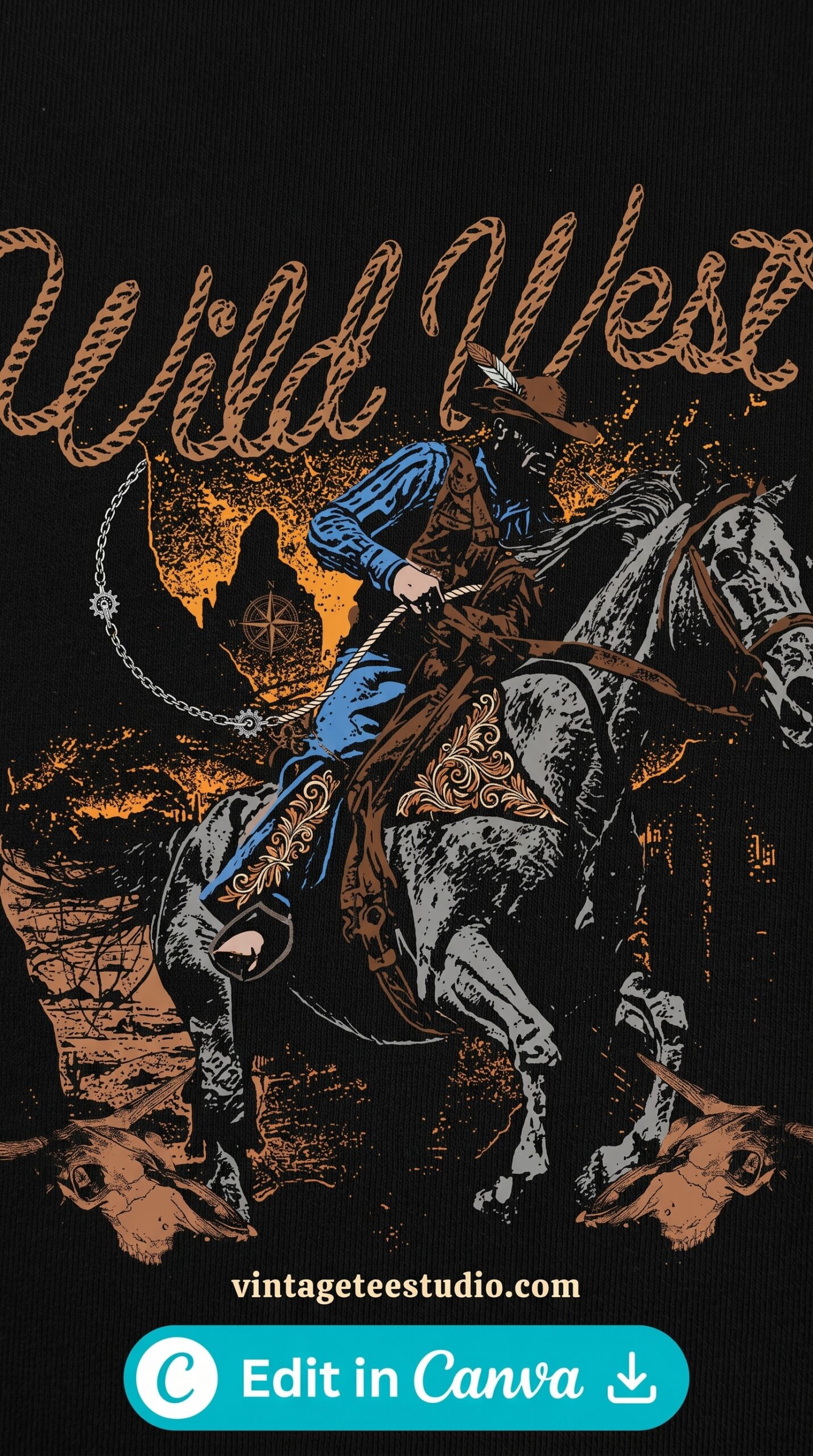
Graphic Tee — Bold Badge for Layering
A high-contrast distressed badge graphic — centered chest, bold enough to read through an open outer layer at Etsy thumbnail scale. The design needs to be simple: one or two colours, no fine detail, readable at 30% of the shirt visible.
Open Button-Up Over Graphic Tee: Design Combinations That Work
The outer shirt and inner tee need to work together visually. Four proven combinations:
Olive flannel over white Americana badge tee: The most classic combination. The neutral olive frames the graphic. Works across age groups and buyer demographics. Photographs well in product listings on any background.
Navy coach jacket over white retro script tee: The 90s streetwear version. The coach jacket’s clean lines contrast with the handmade feel of the script. Dark outer, white inner, bold graphic — clean read in product photos.
Rust overshirt over natural/cream 70s logo tee: The earthy lifestyle version. Both pieces in the same warm palette. The outer shirt and inner tee share colour language. Works for the heritage/outdoor buyer.
Black open flannel over white concert-style tee: The most graphic-forward version. Maximum contrast between outer and inner. The white tee graphic is fully visible against the black flannel frame. Strongest for buyers who want the design to do the work.
Americana Badge — White Tee Under Olive Flannel
A distressed circular Americana badge — navy and rust on white — designed to remain readable when 30–40% of the shirt is covered by an open flannel. The bold outer ring and simple center motif hold up at reduced visibility.
Which Graphic Tee Design Works Under Which Outer Layer?
| Inner tee graphic | Best outer layer | Platform strength |
|---|---|---|
| Bold black-ink badge on white | Any solid flannel — olive, navy, rust, black | Etsy + Merch — maximum versatility |
| 70s earthy logo (rust/mustard) | Olive or tan overshirt — warm palette echo | Etsy outdoor/heritage buyer |
| Retro script (single dark ink on white) | Navy or black coach jacket — dark frame, clean contrast | Etsy streetwear + casual fashion |
| Concert-style tee (stacked text) | Open black flannel — full graphic frame | Etsy vintage/music buyer |
| Distressed western emblem | Brown leather jacket or rust overshirt | Etsy western lifestyle buyer |
Each design below is a commercial-licence PNG from Creative Fabrica — transparent background, 300dpi, sized for chest placement on standard men’s tees. Upload directly to Printify or Printful.
Retro Logo — Bold Enough to Layer
A stacked retro logo in two-colour bold ink — designed with a strong outer border and clear interior typography so it reads at 60% visibility when an open jacket covers part of the shirt. The design functions both as a standalone and as a layer piece.
Concert-Style Tee — Flannel Frame Format
Stacked vertical text with a center graphic — the concert tee visual layout that photographs well when partially framed by an open flannel. The stacked format means the top half of the graphic is always visible, even when the lower chest is covered.
Outdoor Lifestyle Graphic — Layer or Standalone
A centered outdoor badge that works fully exposed and at partial visibility — the design format that photographs well in both a flat lay (tee only) and a styled shot (tee under open overshirt). Dual-use product photo versatility.
Browse Vintage Layering Shirt Designs →
Patterns and Prints That Work Together in the Layered Look
When the outer shirt has a pattern (plaid, check, or subtle texture) and the inner tee has a graphic, the pattern and the graphic are competing for the eye. One needs to be primary.
The rule: if the inner tee has a bold graphic, the outer shirt must be solid or very low-contrast (subtle herringbone, fine check). If the outer shirt has a strong pattern (bold plaid), the inner tee should have a minimal or small-scale graphic — a small left-chest badge, not a full-chest statement piece.
The mistake: loud plaid over loud graphic tee. Neither wins. Both lose. The product photo looks chaotic and saves nothing.
For more design options across men’s vintage categories, our vintage t-shirt outfit for men guide covers full outfit formulas, and our vintage button-up shirt design article has pattern options for the outer layer.
Key Takeaways
- Graphic tees worn under open outer shirts need bold, simple designs that read at 30–60% visibility — fine detail and complex layouts disappear under a flannel frame
- Solid-colour outer shirts (olive flannel, navy coach jacket, black overshirt) are the strongest pairings for vintage graphic tees — they frame the design without competing
- Never layer a bold graphic tee under a bold patterned outer shirt — one must be primary, the other secondary
- Product photos showing the layered look (open shirt over graphic tee) save at 2–3x the rate of single-garment shots on Etsy men’s vintage listings
Frequently Asked Questions
How do you wear a vintage shirt up and down?
Wear the button-up open (unbuttoned) over a graphic tee as an overshirt layer. The inner tee’s graphic should be visible through the open front. Keep the outer shirt untucked. The look works with straight-leg jeans, dark denim, or cargo trousers, with clean sneakers or boots.
What graphic tee designs work best under an open shirt?
Bold, simple designs with strong outer borders — distressed badges, Americana emblems, concert-style stacked text, and retro logos. Fine detail, complex illustrations, and light-coloured graphics don’t hold up when 30–40% of the shirt is covered by the outer layer.
What outer shirt works best over a vintage graphic tee?
Solid-colour flannel, coach jacket, or overshirt in neutral or earthy tones — olive, navy, rust, black, or charcoal. Avoid bold patterns (plaid, check) when the inner tee has a statement graphic — the pattern and the design compete for visual attention.
What patterns work for the outer shirt in the layered vintage look?
Subtle patterns — fine herringbone, micro check, or lightly textured solids — work alongside graphic tees. Bold plaids and large-scale checks only work when the inner tee has a minimal or small-scale design (left-chest badge rather than full-chest graphic).
Does the shirt up and down layering style work for all ages?
Yes — the styling formula adapts by adjusting the fit and the graphic choice. For a younger streetwear buyer: oversized tee + coach jacket, bold contemporary graphic. For a heritage menswear buyer: well-fitted tee + flannel overshirt, Americana or workwear badge.