Most POD sellers treat vintage t-shirt art the same way they treat clipart: find it, resize it, upload it. The sellers generating 50+ sales a month on the same design do something different — they understand what makes vintage graphic art function as wearable art, not just decoration.
The difference is not budget. It’s not even the design tool. It’s understanding the visual grammar of authentic vintage t-shirt illustration — and choosing files that actually have it.
Here are 16 vintage t-shirt art styles that turn ordinary shirts into collectibles, with specific visual criteria for each.
Why Is Vintage T-Shirt Art Different From Regular Vintage Graphic Design?
Regular vintage graphic design was made for paper. T-shirt art was made for fabric — and that changes everything.
Fabric absorbs ink differently than paper. The registration of a screen-printed design is never perfect. The wash cycle distresses edges that paper never sees. Vintage t-shirt artists designed with these constraints in mind. The best vintage tee designs look slightly imperfect on purpose — because they’re compensating for how fabric and printing behave over time.
That’s the detail most digital files miss. They’re too clean. Too symmetrical. Too perfectly registered. They look like they were designed by a computer for a computer.
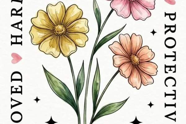
Hand-Drawn Illustration Style
Thick outlines with slight variation in stroke weight — thicker on the downstroke, thinner on the turns. The kind of irregularity that signals hand-illustration rather than digital perfection. The motif is botanical, the feel is 1974.
Concert Tee Art and Why It Became a Collectable Format
Concert tees became collectibles because they were limited. A shirt from a 1979 arena tour in one specific city — that’s a piece of documented history. The art reflected that: it was commissioned, rushed, printed in bulk on whatever blank was cheapest, and worn into the ground.
That aesthetic — slightly chaotic, era-specific, with a clear center graphic and supporting text — is what makes the concert tee format work as a POD category.
The concert tee format sells not because it looks good. It sells because it tells a story in a single glance. Stacked text, year, tour dates (even fake ones), bold center graphic — the reader’s brain fills in the rest.
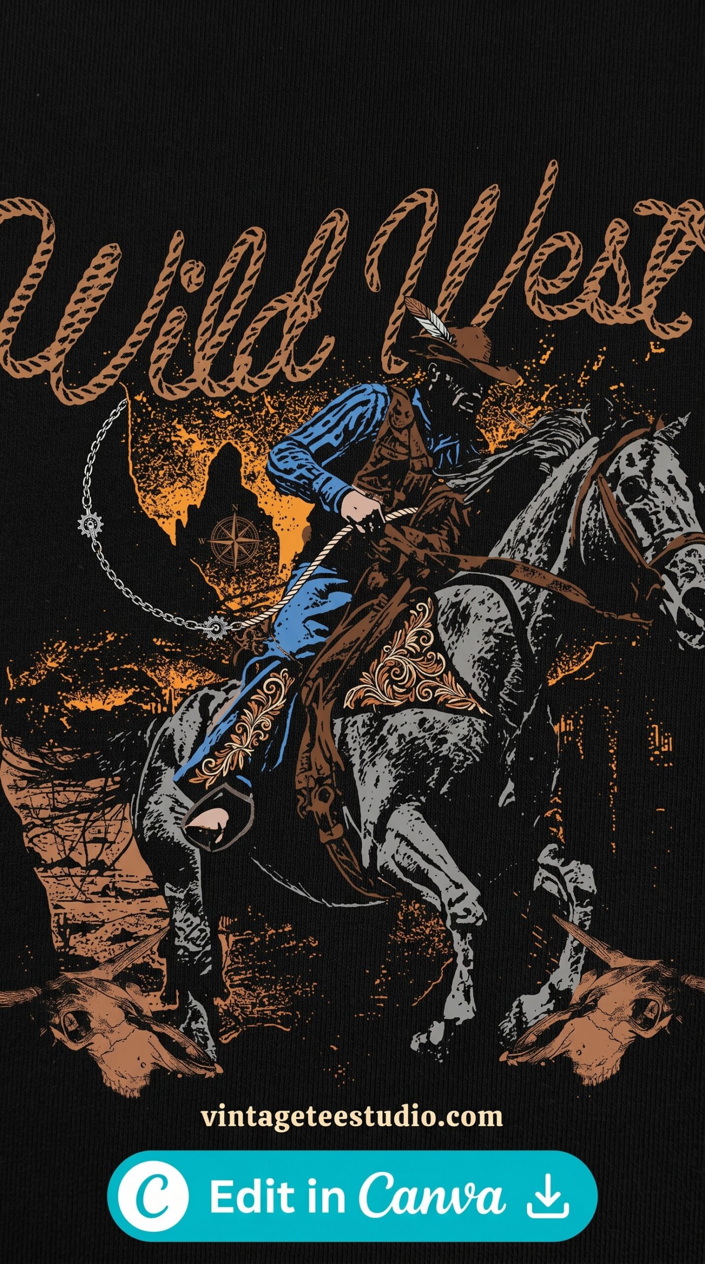
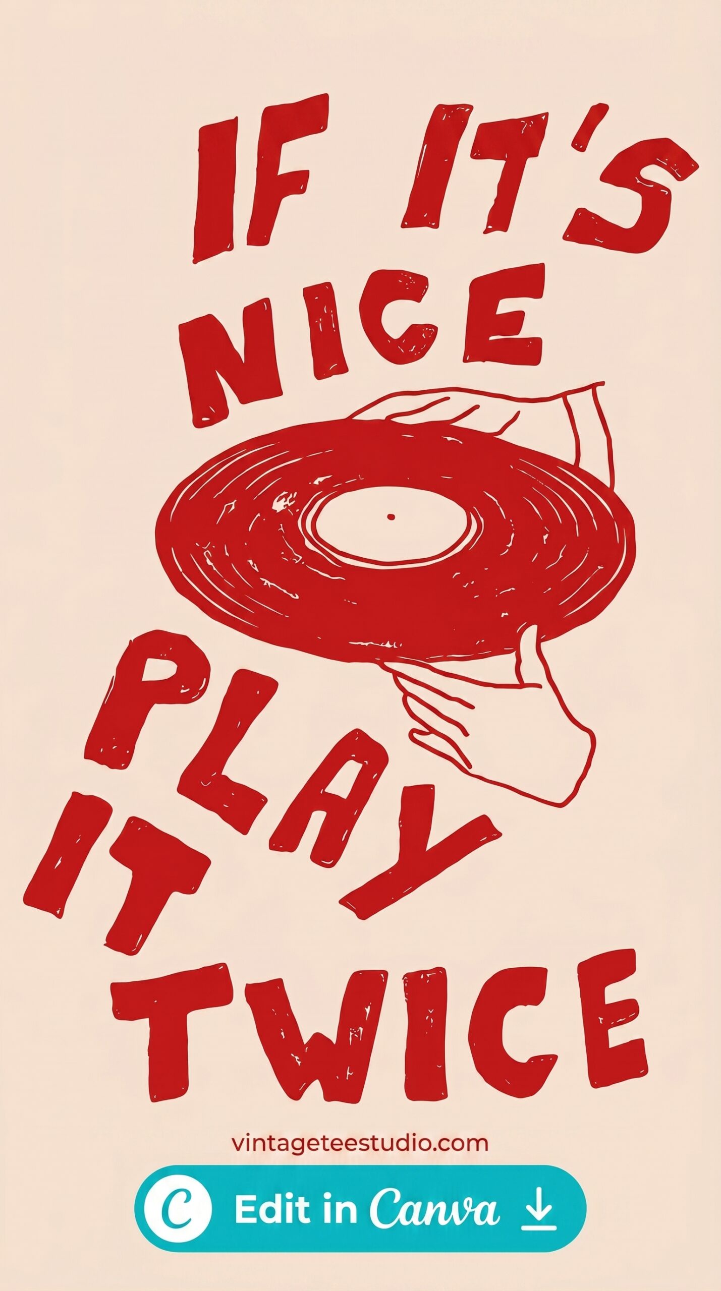
Concert Tour Tee Art Format
Stacked vertical text composition — bold display font at top, supporting text below, center graphic, and year in smaller type at the base. The exact layout grammar of every collectable concert tee from 1975 to 1994.
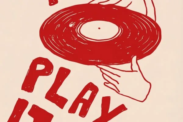
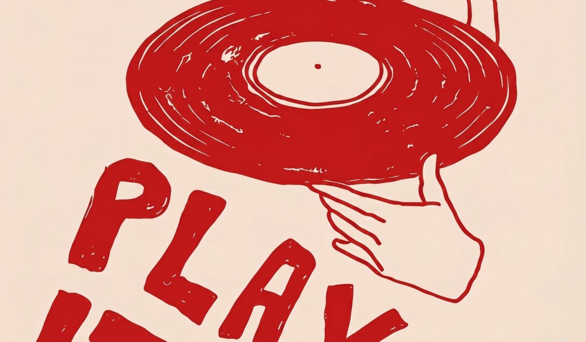
Screen-Print Effect Art — Why It Works Better Than Distress Overlays
A distress overlay is applied over a clean design. A screen-print effect is baked into the design itself.
The difference is visible from 3 metres away. Overlay distress creates a uniform texture across the whole design — the ink breaks pattern is too regular, too even. Real screen printing has ink breaks that correspond to the mesh density, the ink viscosity, the substrate. They cluster differently on flat areas versus stroke outlines. They fade differently from centre to edge.
When a buyer at a thrift store picks up a shirt and says “this feels real” — that’s the screen-print effect doing its job. A distress overlay can’t replicate that. Only a well-built file can.
Authentic Screen-Print Effect Art
Ink breaks are non-uniform — heavier ink drop-out at the flat fill areas, cleaner edges on the strokes. The texture reads as real screen printing because it’s built into the file, not applied as a surface layer.
Each file below is a ready-to-download PNG or SVG with a commercial licence — upload directly to Printify, Printful, or Gooten and the art goes straight to print. No editing required. Creative Fabrica’s commercial plan covers Etsy, Merch, and Redbubble sales.
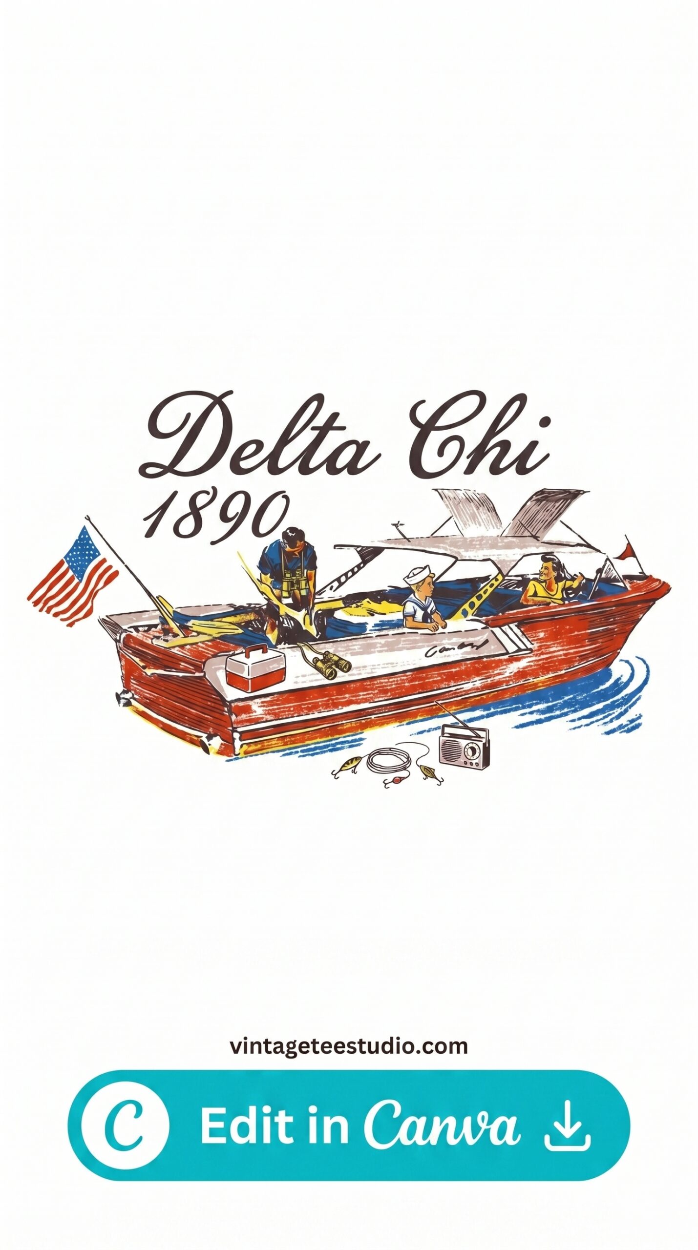
Collectible Badge Art
A circular badge with layered typography, worn ink fill, and a thin outer ring — designed to sit like a patch on the chest. The badge format is the most collectible visual grammar in vintage apparel art history.
Vintage Logo Art — Wearable Brand Style
A rectangular or horizontal wordmark with supporting sub-text and a background texture treatment — designed in the visual language of a 1970s or 80s brand identity applied to apparel rather than a product label.
Retro Script Lettering Art
Connected brush script with variable stroke weight and deliberate inconsistency in the letter spacing — the handmade feeling that makes a shirt look like it came from a small-batch printer in 1968, not a digital marketplace in 2026.
How to Use Vintage T-Shirt Art Commercially Without Licensing Problems
This is the most common question — and the simplest answer: use design files with explicit commercial licences.
Copyright on vintage art is complicated. Original concert tee art from the 1970s can be in private hands, under corporate licence, or technically public domain — and there’s no simple lookup. The safest path for POD sellers is to use files that were created from scratch in vintage styles, not reproductions of actual historical designs.
Creative Fabrica’s commercial licence covers: selling the finished printed product on Etsy, Merch by Amazon, Redbubble, Printify stores, and Printful storefronts. It does not cover: reselling the digital file itself, or using it in templates sold to other designers. That’s the line.
For more on file formats and commercial use, our vintage t-shirt PNG for POD guide covers licence types in detail. For illustration styles across more categories, see our vintage graphic t-shirt design PNG roundup.
Key Takeaways
- Authentic vintage t-shirt art has intentional imperfection — uneven stroke weights, non-uniform ink breaks, slightly asymmetric composition — that distress overlays cannot replicate
- The concert tee format (stacked text + center graphic + year) is the most collectible visual grammar and consistently drives saves on Etsy
- Screen-print effect that’s baked into the file outperforms overlay distress every time — the ink break pattern is what buyers read as authentic
- Use files with explicit commercial licences — never reproduce actual historical design art for POD, only files created in vintage styles from scratch
Frequently Asked Questions
What makes a t-shirt art style look “vintage”?
Three things: ink texture inside the print area (not just on edges), halftone grain in gradient areas, and era-accurate typography. Clean digital designs with only edge distress don’t read as vintage to experienced buyers.
Can I sell vintage t-shirt art designs on Etsy?
Yes — if the design file has a commercial licence and doesn’t reproduce copyrighted art from actual historical sources. Files from Creative Fabrica’s commercial plan are licensed for use in products sold on Etsy, Merch, and other POD platforms.
What is the concert tee art format?
A visual layout with stacked text at the top, a central graphic or illustration, and supporting text (like a year or “tour dates”) at the base. It’s the standard layout of concert merchandise from the 1970s through the 1990s, and it remains one of the most recognisable formats in vintage t-shirt design.
How do I know if a vintage design file is good quality?
Check: does it have texture inside the flat colour areas (not just edge distress)? Is the typography era-specific rather than generic? Are the ink breaks non-uniform? If all three are yes, the file has been built properly. If it’s a clean vector with a texture layer on top, it’s a shortcut that shows in print.
What resolution do vintage t-shirt art files need for POD?
300dpi at 4500×5400px is the standard. Vintage art files often have complex textures that soften below 200dpi — always use the highest resolution version available from the file download.