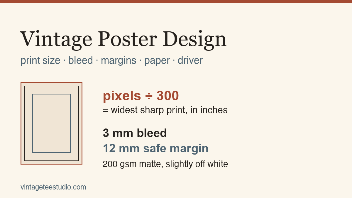
Quick answer: Take the pixel width of your file and divide it by 300. That number, in inches, is the widest you can print the poster without the edges going soft. Add 3 mm of artwork past the trim line so the cut never leaves a white sliver, and keep every word 12 mm inside it. Print on a heavy matte stock, 200 gsm or more, and set the driver to that exact paper type at its highest quality, with colour management left to the printer and scaling switched off.
You found a vintage poster file, you love it, and now it is sitting on your desktop and you have no idea what to do with it. What size will it actually print? What happens at the edges? Which paper out of the six in the shop, and what do you tick in that print dialog so the result looks like a poster instead of an inkjet page? That is what this walks through, with the numbers you can check against your own file before you spend a single sheet.
The one to start with
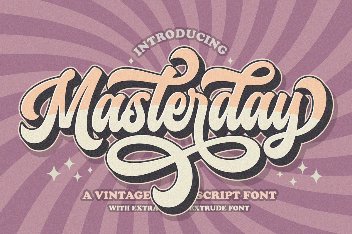
Masterday
A retro handwritten face with swashes, PUA encoded so the alternate glyphs are reachable without hunting through a glyph panel. Use it for the curved subtitle line under a big headline, the line that most often gets set in something modern by accident and quietly ruins the period. Take it if your poster has a headline and one supporting phrase, and you want the two to look like they were lettered by the same hand.
How big can this file actually print?
Open the file and look at its pixel dimensions, not at the words in the listing. A poster at 300 dots per inch is the printing standard because that is roughly where a person holding the sheet stops seeing individual dots. So the arithmetic is one division: pixels divided by 300 gives you inches.
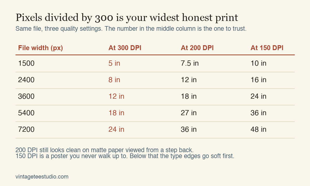
A 3600 pixel wide file prints 12 inches wide at full quality. Push the same file onto an 18 inch poster and you are printing at 200 DPI, which still holds up on matte paper seen from a step back, because matte scatters light and hides the softness that gloss shows off. Push it to 24 inches and you are at 150, which is a poster you hang high and never walk up to. The part that gives way first is not the illustration, it is the type. Thin strokes and tight corners go mushy a good while before a flat block of colour does, which is why a poster built on one big lettered headline needs more pixels than a poster built on a shape.
Find type sized for a 24 inch print
Where does the printer cut, and what does it eat?
Two lines matter on any sheet that gets trimmed. The trim line is the finished edge. The bleed is the strip of artwork you run past it so that a cut landing a hair off centre still lands in ink. Three millimetres is the standard, and it is the difference between a clean edge and a thin white line down one side that you notice every time you walk past the frame.
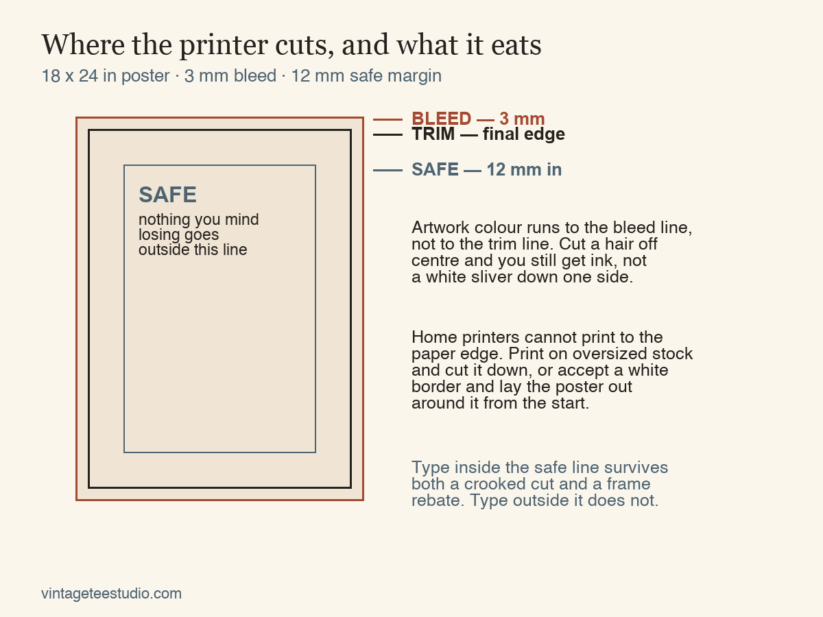
The safe margin is the other half of it. Keep every letter, every date, every small credit line at least 12 mm inside the trim. A frame rebate swallows a couple of millimetres on its own, and a home guillotine is never as straight as it feels. Anything sitting right against the edge is a gamble you will lose eventually.
Printing at home changes this. Almost no desktop printer can lay ink to the paper edge, so a borderless poster has to be printed on oversized stock and cut down afterwards. If you are not going to cut, plan the white border in from the start and make it generous and even, 20 mm or more on all four sides. A deliberate wide border reads as a print. A thin uneven one reads as a mistake.
The one number to check first: pixel width divided by 300. If that comes out smaller than the poster you had in mind, no paper choice and no driver setting will rescue it. Everything else on this page only matters once that division gives you the size you want.
See poster designs built with bleed already in
What paper makes it look printed rather than printed at home?
Weight first. Anything under 160 gsm curls under a heavy ink load and shows the image from the back. Around 200 gsm the sheet holds itself flat in a frame, and at 250 to 300 gsm it feels like something that came out of a press. That heft does more for the vintage impression than any texture overlay in the file.
Then the surface. Matte and uncoated stocks absorb ink slightly and soften the dot, which is exactly how old offset and screen work looked, and they kill the reflections that give a modern print away under a lamp. Gloss and semi gloss photo paper push saturation up and put a sheen on the paper that no poster from the era ever had. If the design leans on flat blocks of colour, uncoated is the right call. If it leans on a photographic image with deep blacks, a matte photo stock keeps the density without the shine.
Off white matters too. A warm or cream sheet does half the ageing work for free, because it shifts every colour in the file a touch toward the yellow end and lifts the deepest blacks slightly. A vintage design printed on bright white paper always looks like a new file pretending to be old.
See what prints well on heavy matte stock
Which type makes a poster read as vintage?
Strip a poster from the period down to its parts and the illustration is often simple, two or three flat colours and one shape. What dates it is the lettering: how wide the strokes run, how the corners round, how tight the words sit together. That is also the part a filter cannot fake, and the part that decides whether the whole sheet reads as vintage or as a modern layout with grain on top.
Everything below is a display face I would set a poster headline in, chosen on one test: does it hold its shape when it is printed large on matte paper, and does it belong to a period rather than to a trend. Each entry says who it is for, because a face that carries a travel poster will fight a concert flyer.
Unlimited creative assets. Access to AI tools.
Commercial licence included.
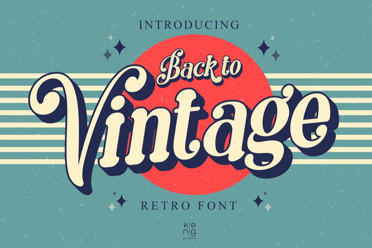
Get downloadsBack to Vintage
Drawn off the display lettering of the 60s and 70s, wide and rounded with heavy joins. It is the face for a poster where one word fills the top third of the sheet, because the counters stay open at size and it does not clog when it prints solid. Best if you are building a travel or event poster and the headline is the whole design.
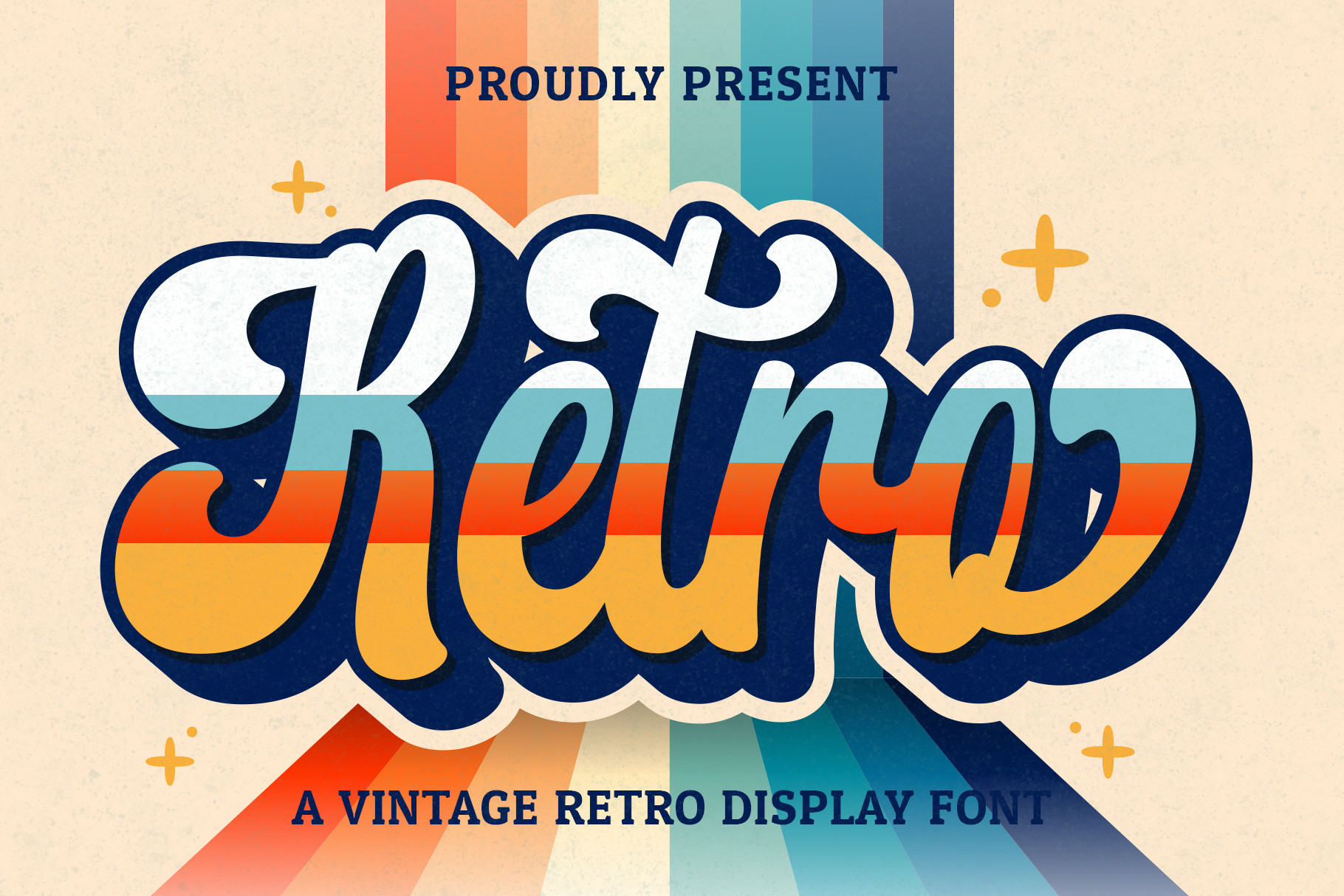
Retro Script
A handwritten script with an even slope and a steady stroke, the kind that ran across advertising art before phototypesetting. Set it as a single line and let it be the only script on the sheet. Pick this one if your poster needs a warm human line to sit against a hard geometric headline.
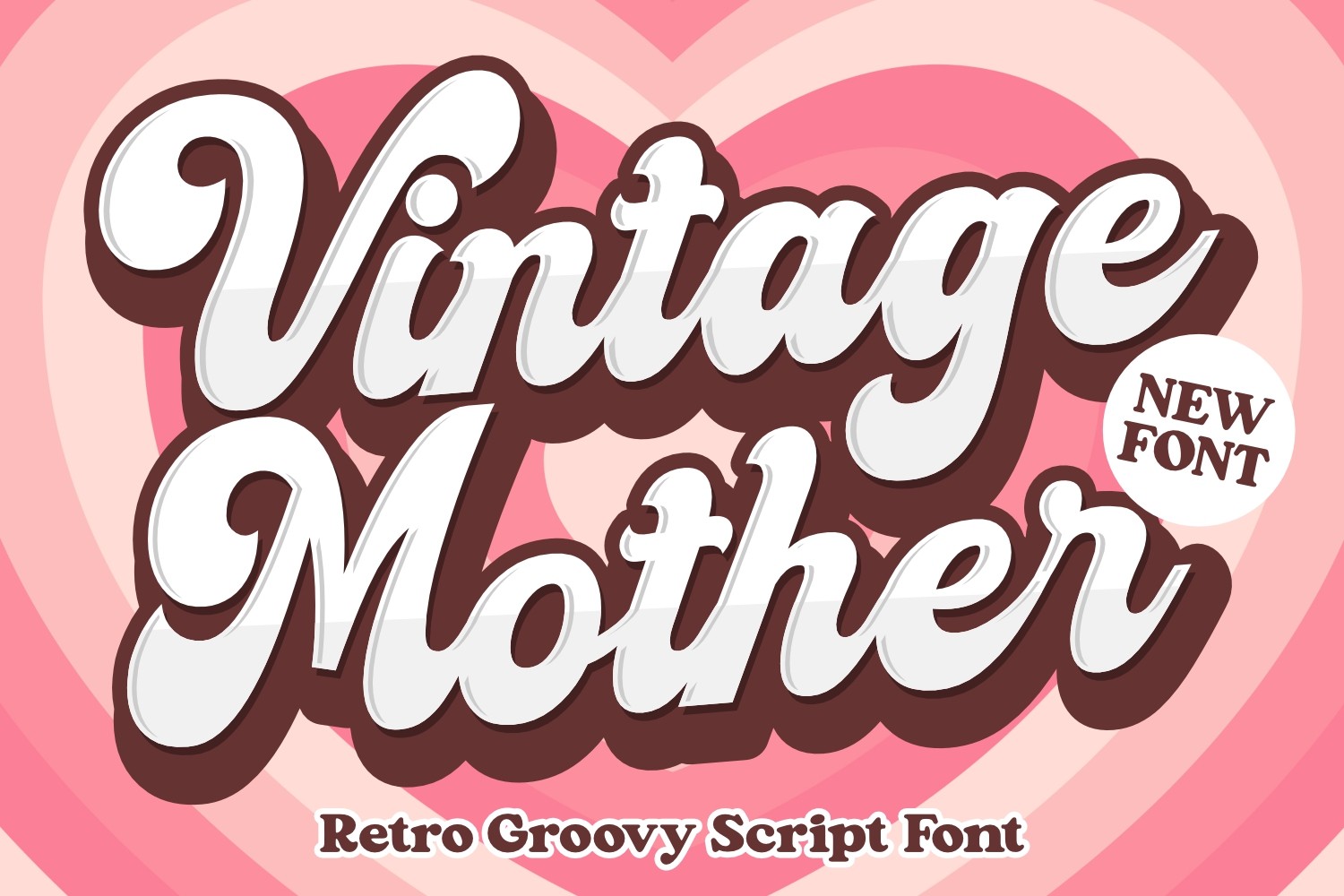
Vintage Mother
A playful display face with a nostalgic bounce in the baseline, closer to a fairground sign than to a press poster. Good for anything domestic or celebratory, a kitchen print, a birthday sheet, a market stall notice. Skip it for anything sombre, the bounce will fight you.
Unlimited creative assets. Access to AI tools.
Commercial licence included.
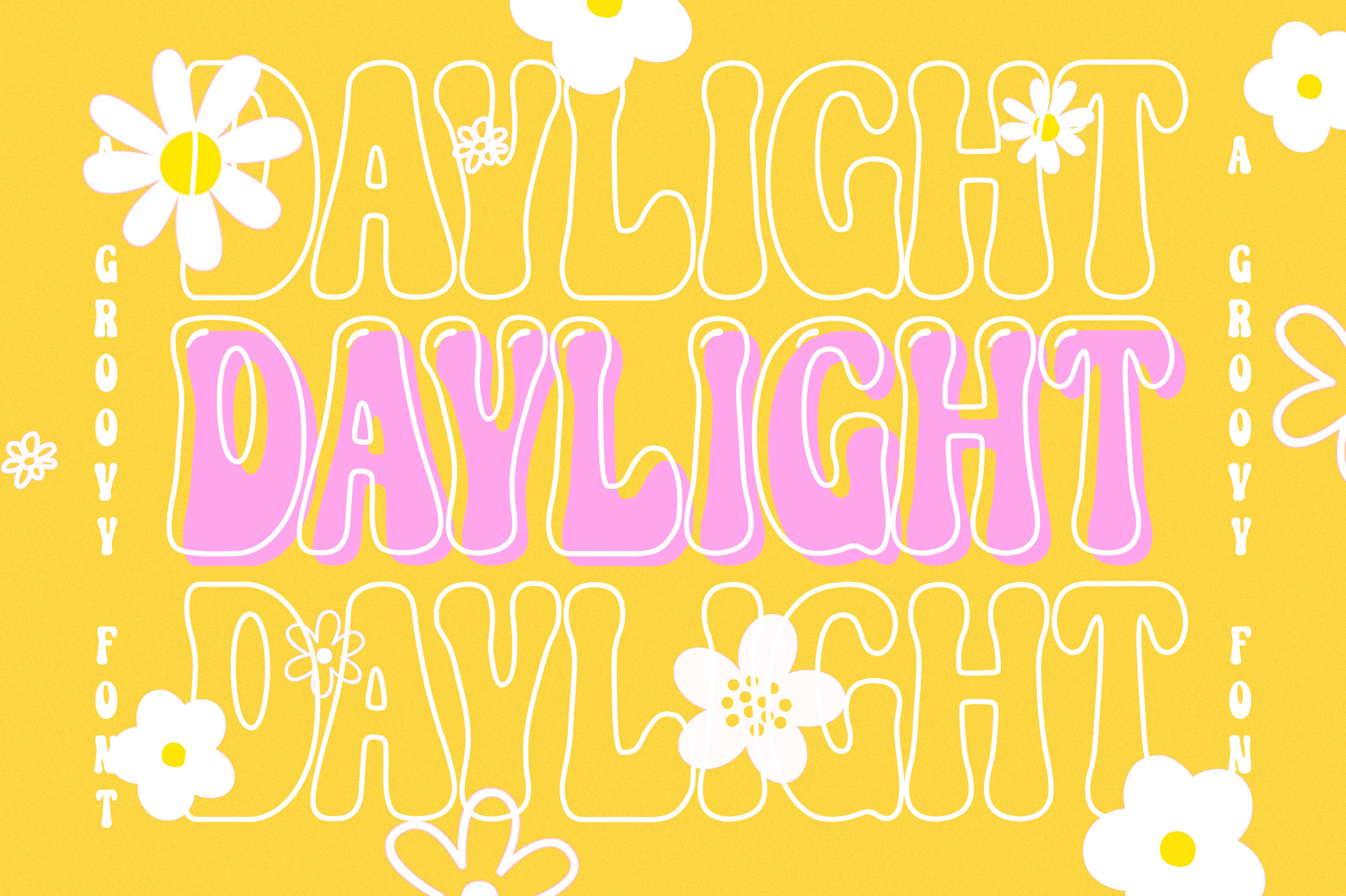
Get downloadsDaylight
Thick lettered and groovy, the fat rounded style that filled record sleeves and poster art in the 70s. It wants a lot of space around it and very few words inside it, three or four at most. Take it if your poster is one loud phrase in a single colour on a warm ground.
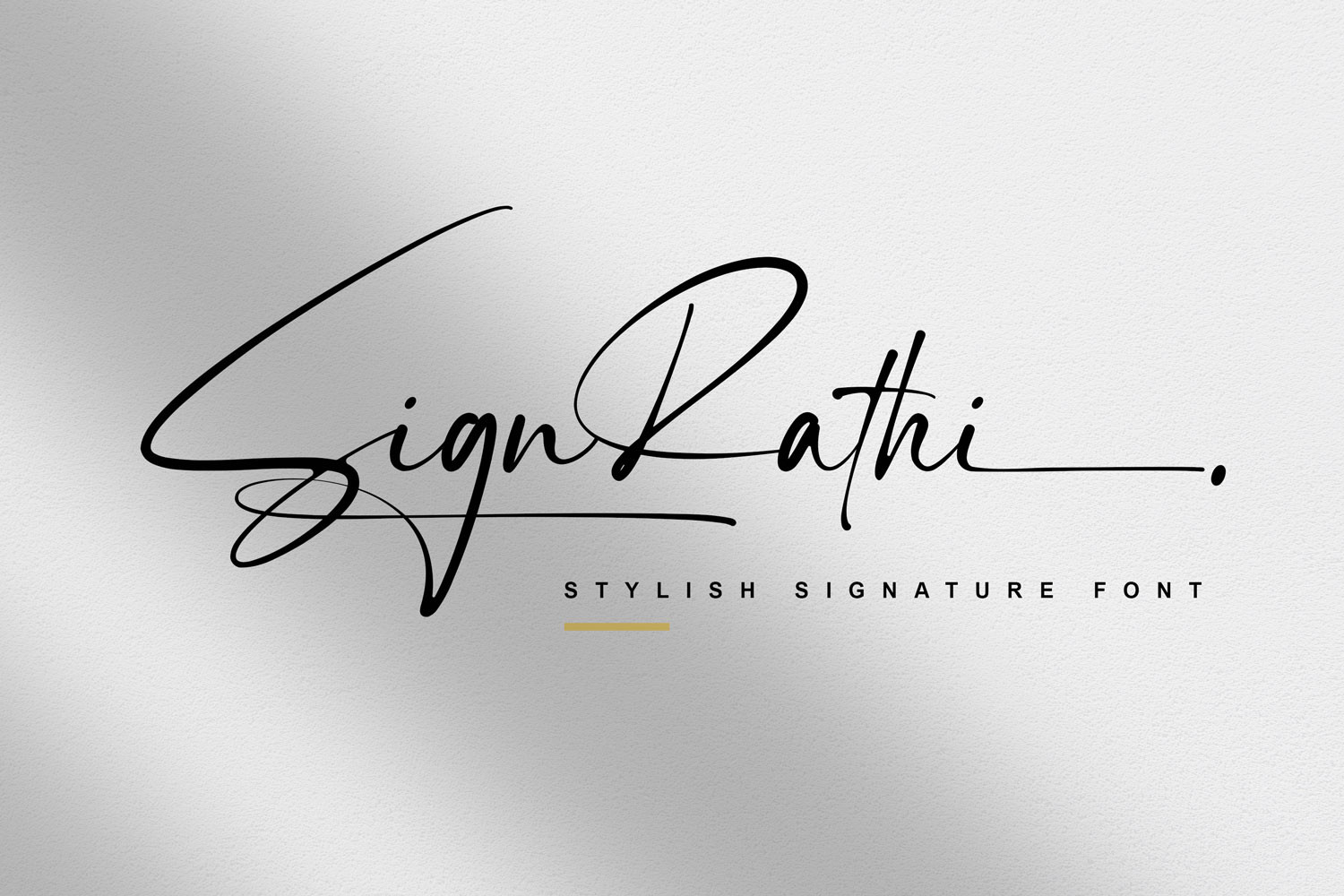
Sign Rathi
A thin cursive script, PUA encoded, closer to a shopfront signwriter’s hand than to a formal invitation. Use it small, for the dateline or the venue, where a heavier script would shout. Right for a poster that already has a strong headline and needs its second voice kept quiet.
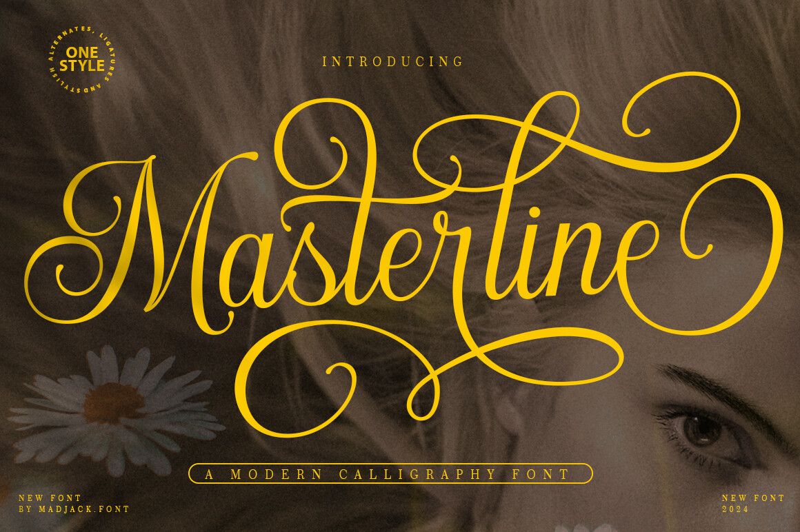
Masterline Calligraphy
A modern calligraphic face with long swashes, the outlier here in that it is not tied to a decade. It earns its place on a vintage sheet when the design is a framed quote or a wedding notice rather than an advertisement. Choose it when the poster should feel handwritten and formal at once, and print it no smaller than 24 pt or the hairlines drop out.
Compare the retro faces side by side
What to set in the print dialog
Five settings do almost all the work, and four of them are wrong by default.
- Paper type. Tell the driver exactly what is loaded, matte, heavyweight matte, photo matte. It uses this to decide how much ink to lay down. Left on plain paper, a heavy stock comes out starved and pale.
- Quality. Highest or best, not normal. On a poster this is the setting people skip and then blame the file for.
- Scaling. Off, or 100 percent. Fit to page is what silently resizes your careful 18 inch layout and shifts every margin you set.
- Colour management. Pick one manager, not two. Either the application handles colour and the driver is set to no colour adjustment, or the driver handles it and the application is set to printer manages colour. Both at once is the usual cause of a print coming out muddy or oddly warm.
- Borderless. Only if the printer supports it and only with the bleed already built into the file. Otherwise leave it off and cut.
Pick the type before you burn a sheet
Why the test print is worth the sheet
Print one test at a small size first, on the same paper. Ink behaves differently on every stock, and the flat colours in a vintage design show a shift far more plainly than a photograph does.
Once the poster is set, the same type and the same print settings carry straight across to screen printing designs, and the paper notes here apply just as well to vintage scrapbook paper design. If you want the sheet finished at the edges rather than trimmed flat, the frames in vintage border design are built to sit inside the safe margin described above.
Key takeaways
- Pixel width divided by 300 is the widest print that stays sharp. Everything else is secondary to that one number.
- Run artwork 3 mm past the trim line and keep all type 12 mm inside it, or a slightly crooked cut will show.
- 200 gsm or heavier, matte or uncoated, slightly off white. Weight and surface sell the vintage impression before the design does.
- In the driver: correct paper type, highest quality, scaling off, and colour managed in one place only.
Line up the type against your paper choice
Frequently asked questions
What paper should I print vintage posters on?
A matte or uncoated sheet at 200 gsm or heavier, in a slightly warm white. Matte absorbs ink the way old press work did and does not reflect a lamp back at you, and the weight keeps the sheet flat in a frame. Save gloss photo paper for images that need deep blacks and high saturation.
Why does my print look faded compared to the file on screen?
Usually one of three things. The paper type in the driver is still set to plain, so the printer is holding ink back. Quality is on normal. Or colour is being managed twice, once by the app and once by the driver, and the two corrections are cancelling each other. Fix them in that order and test at a small size before committing a full sheet.
Can I print a poster bigger than the file allows?
You can, and it stays acceptable down to about 200 DPI on matte paper viewed from a step back. Below roughly 150 DPI the lettering goes soft first and the poster only works at a distance. Enlarging software helps a little with flat colour and almost nothing with fine type.
Do I need bleed if I am printing at home?
Only if you intend to cut the sheet down. If you are printing to the edge of a standard sheet and framing it as is, you have a white border whether you planned it or not, so plan it, keep it even and at least 20 mm, and pull all type inside that.
Can I use these designs on posters I sell?
That depends on the licence attached to each file, and it is the line worth reading before you print a run rather than after. A personal use licence covers the poster on your own wall; selling printed copies or supplying the design to a client needs a commercial or extended licence, and font licences are usually written separately from graphics licences.
Get the type that holds at poster size