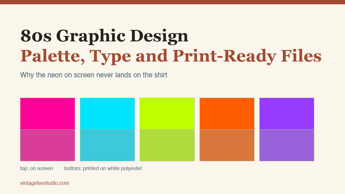
Quick answer: The colours that make a design read as 80s are exactly the ones ink cannot reach on fabric. Hot magenta, cyan and acid lime sit outside the printable range, so they land duller than the screen promised. Pull them back yourself in the file, keep the design to four or five flat colours, print on white or very pale polyester because sublimation ink is transparent and the garment shows through, and set the type in a display face heavy enough to survive that shift.
You bought the file, the preview on screen was electric, and what came off the press looks like someone left it in a sunny window. Nothing is wrong with your printer and nothing is wrong with the file. Screen colour and fabric colour are two different systems, and the 80s palette lives right on the line between them. Here is what shifts, by how much, and what to change in the design so the result is the one you expected.
See type built for a bright 80s palette
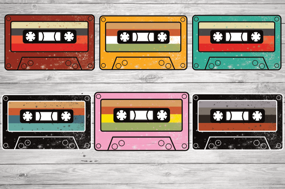
Vintage Retro Cassette Tape
A cassette is the one object that says 1985 without a word of type next to it, which is why this set is the easiest place to start if you have never built an 80s design before. The shapes are drawn flat and separated, so you can recolour them into a palette a press can actually hold instead of fighting whatever gradient came in the file. Take it if you want a subject to build the whole shirt around; skip it if your design is already carrying a big word.
Why 80s colour is the hardest palette to print
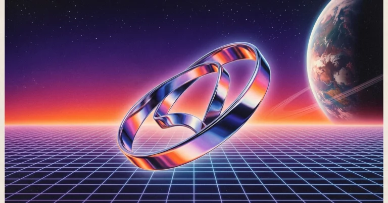
A monitor makes colour by adding light, so it can produce a magenta brighter than anything that exists as a pigment. Ink works the other way round: it removes light from whatever is underneath. The gap between the two is widest exactly where the 80s lived, in the saturated fluorescents. Every other palette era, the muted 70s earths, the 90s pastels, sits comfortably inside what ink can do.
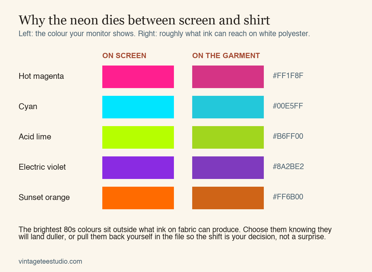
The important part is that the shift is not uniform. Cyan holds up reasonably well. Magenta loses its glow and gains weight. Acid lime is the worst offender, because half its brightness on screen comes from a green channel value that no ink can match, so it drops toward a garden green. If your design puts hot magenta next to acid lime and relies on the vibration between them, that vibration is the first thing you lose.
The practical move is to make the shift your decision. Pull the most extreme colours back yourself, by ten or fifteen percent of saturation, and look at them together. A palette you dulled on purpose stays balanced. A palette the printer dulled for you comes back with the relationships between colours broken, because it pulled each one by a different amount.
Find faces heavy enough for a fabric print
I ran the whole palette through a print conversion and counted
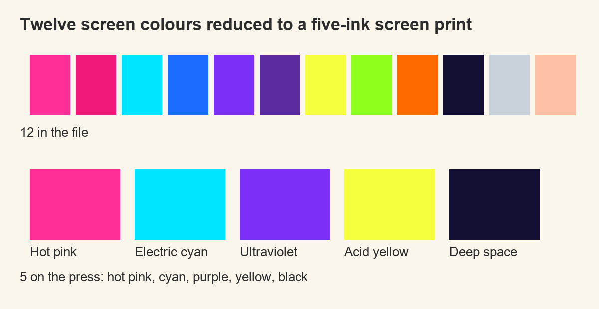
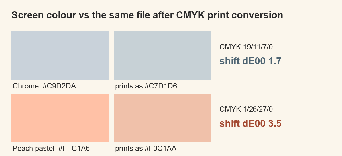
Guessing at this is what wastes shirts, so I stopped guessing. I took twelve colours that carry the decade — hot pink, magenta, electric cyan, electric blue, ultraviolet, grape, acid yellow, lime, sunset orange, deep space, chrome and a peach pastel — and pushed every one of them through the same conversion a printer does: screen colour into printing inks and back again, using the standard colour profiles that sit on any Mac. Then I measured how far each colour had moved, in the unit the industry uses for exactly this. Below two, your eye cannot tell the two swatches apart. Above two, you can.
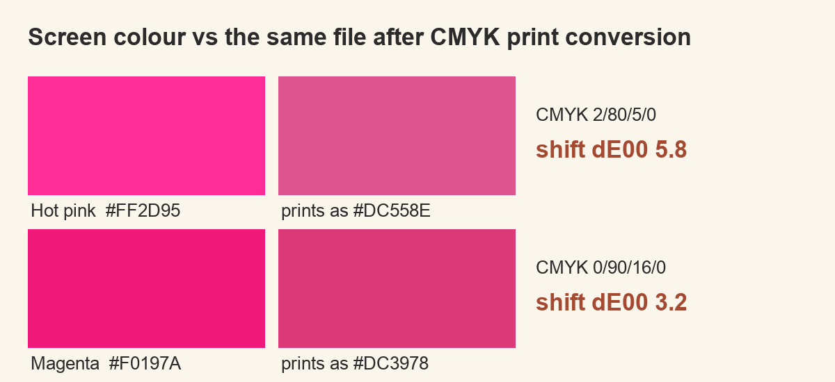
Eleven of the twelve moved past that line. Not drifted — moved somewhere you would notice with the two swatches side by side and no reference. I had run the same test on a 70s palette a few days earlier and got four of twelve, with the worst offender at 3.5. Here the worst is 18.2. That is the whole reason an 80s file behaves differently on a press, and it is a difference in kind rather than degree.
Which colours break, and by how much
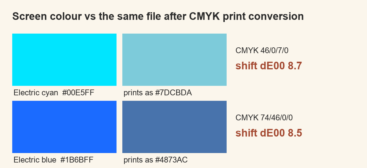
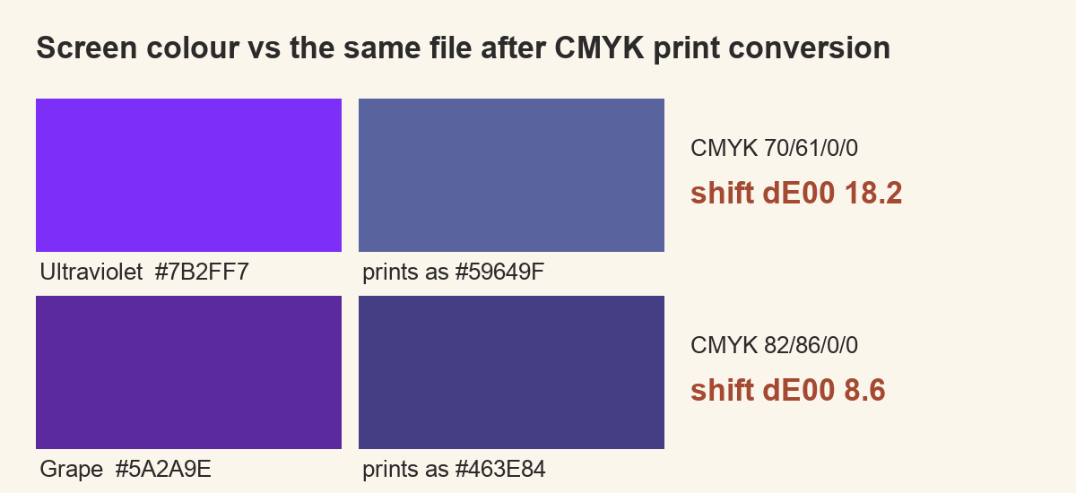
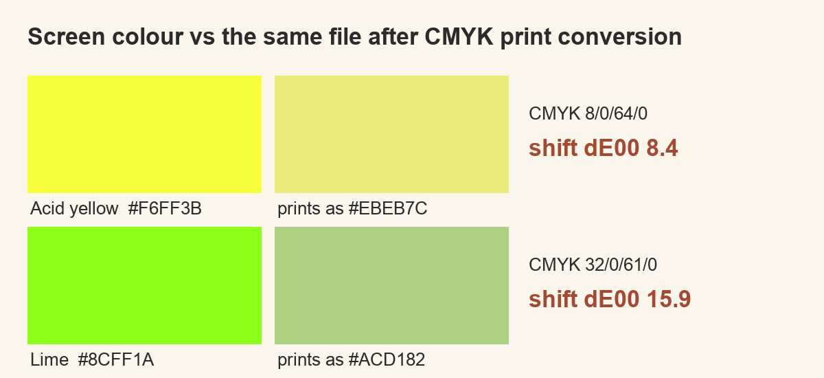
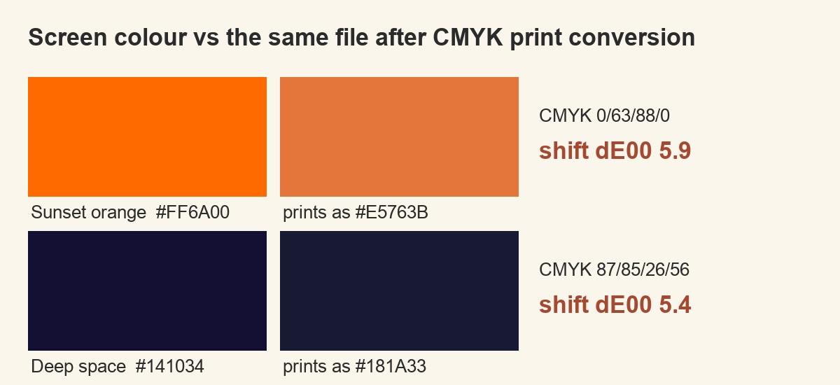
The order matters more than the total, because it tells you which part of your design to fix first. Ultraviolet moved 18.2 and lime 15.9 — both so far that the printed version reads as a different colour, not a duller one. Then a cluster in the eights: electric cyan 8.7, grape 8.6, electric blue 8.5, acid yellow 8.4. Sunset orange 5.9, hot pink 5.8 and deep space 5.4 follow. Magenta 3.2 and the peach pastel 3.5 sit just over the line, visible but liveable.
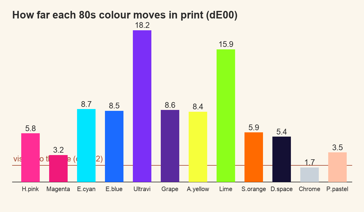
Chrome moved 1.7, and it is the only one that stayed under the line. It is also the only colour in the set that is not saturated. That is not a coincidence, and it is the most useful thing in the whole measurement: the further a colour sits from grey, the further it has to fall. A design built on ultraviolet and lime is asking the press for something the press does not have. The same design built on chrome, deep space and one saturated accent prints close to what you drew.
Why the recipes make this unavoidable
Look at what a printer actually mixes for these colours and the problem stops being mysterious. Hot pink comes out as almost pure magenta ink with a couple of percent of everything else. Electric cyan is under half cyan ink and nothing much besides. In both cases the mix has already run out of room: there is no fourth ink to add, no way to push further into the colour, because the brightest thing a press can do with magenta is put down all of it. Screen colour does not work that way — a backlit pixel keeps going well past where ink stops.
This is why raising the press temperature never rescues a neon design. Nothing about heat adds a colour that is not in the ink set. It only scorches the shirt while failing at the same thing. Every fix worth making happens in the file, before the file ever reaches the press.
Pulling the palette back yourself
The instinct is to correct only the colour that failed, and that is the mistake. Drop ultraviolet toward something a press can hold and leave the rest alone, and the design falls apart: the relationships between the colours were the design, and you have just broken them while keeping every individual colour technically fine. Move the whole set the same distance instead. The result reads darker than the screen version and correct against itself, which is what an eye actually judges.
In practice that means picking the worst colour in your design, finding how far it can actually travel, and taking every other colour the same fraction of the way. Five flat colours survive this far better than a gradient does, which is also how the decade printed its own merchandise — not because anyone preferred flat colour, but because a press in 1985 had the same limit yours does. Working inside it is not a compromise on the look. It is the look.
The garment is part of the palette
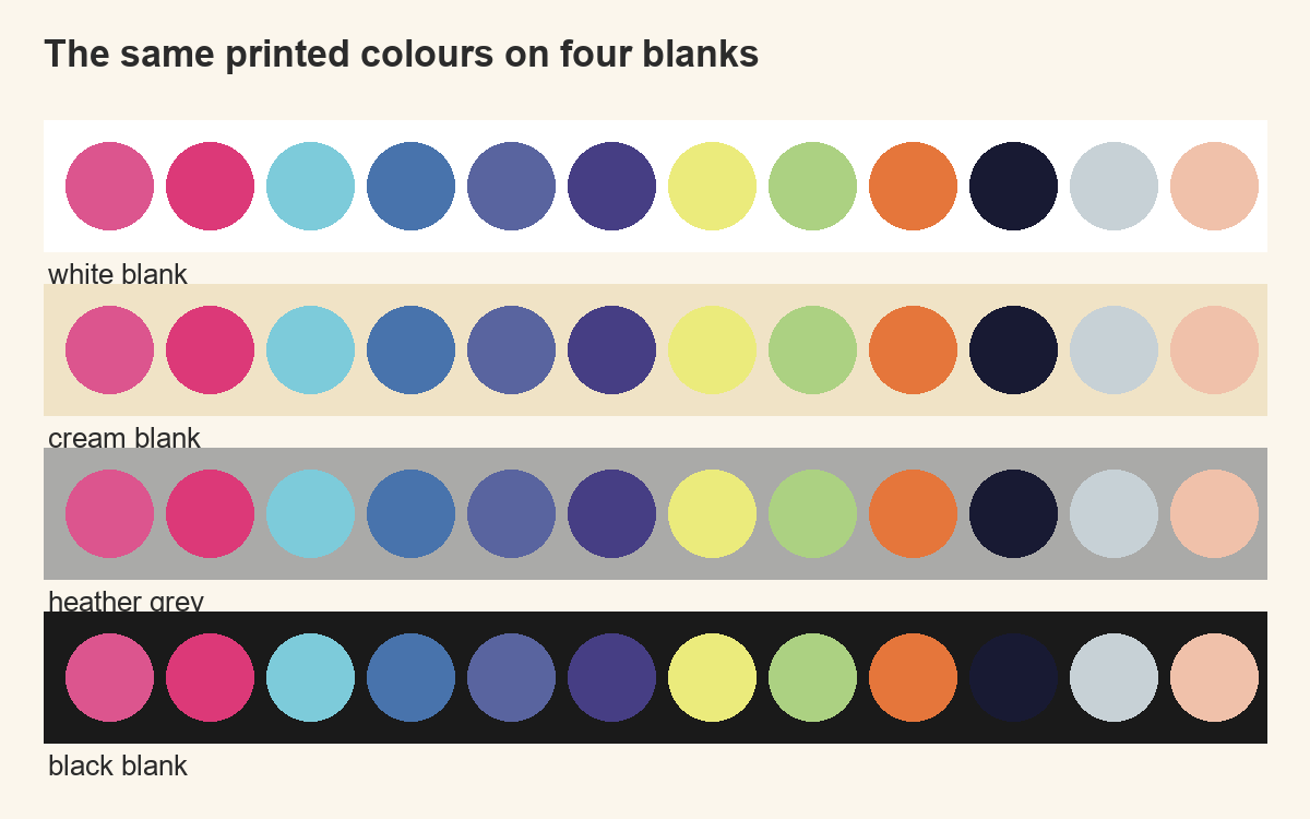
Sublimation ink has no white and no opacity. Whatever the fabric is, it sits underneath every colour in the design like a filter, and the white areas of your file are simply the fabric showing through untouched.
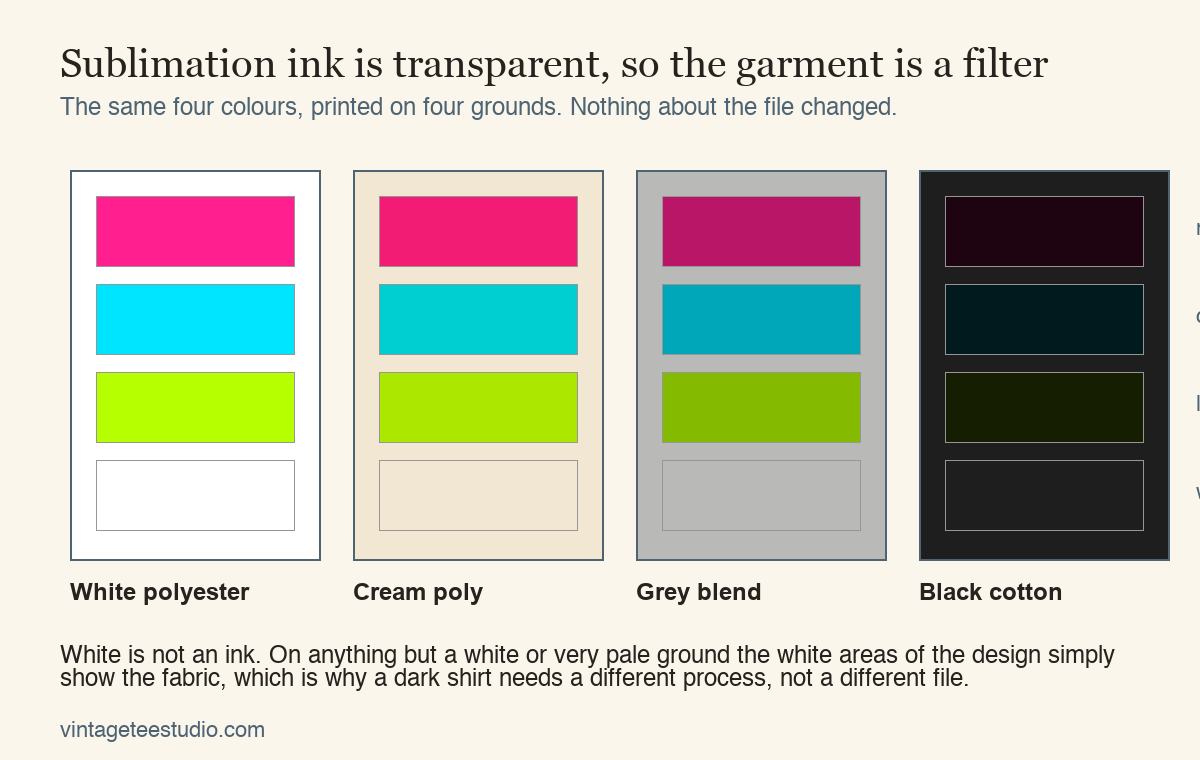
On white polyester you get the closest thing to the file. On a cream or natural blend the whole design warms up, which suits a faded 80s look and ruins a clean neon one. On grey everything goes down a step and the contrast between colours narrows. On black almost nothing survives, which is why a dark shirt is a different process, screen printing or a heat transfer with a white underbase, not the same file printed differently.
Polyester content matters too. Sublimation bonds to polyester and not to cotton, so a 50/50 blend takes roughly half the colour and gives you that washed vintage tone by accident. That can be exactly the effect you want for an 80s design, as long as you chose it rather than discovering it.
The thing worth internalising: the file is not the design. The design is the file plus the ink plus the fabric under it. Change the shirt and you have changed the artwork, without touching a single pixel.
See what a print-ready 80s file looks like
What to check inside the file before you print
- Colour mode. If the file is RGB, convert it and look at what happens, rather than letting the printer driver convert it silently at the last moment. The conversion is where the shift happens, so watch it happen.
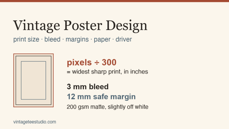
- Resolution at print size. Divide the pixel width by 300. That is the widest the design prints sharp. A 3600 pixel file gives a 12 inch chest print, which is about as large as most shirt designs go.
- Transparent background. Open the PNG on a dark background in your editor. A white box behind the artwork prints as a white box, and that is by far the most common thing people only discover after pressing.
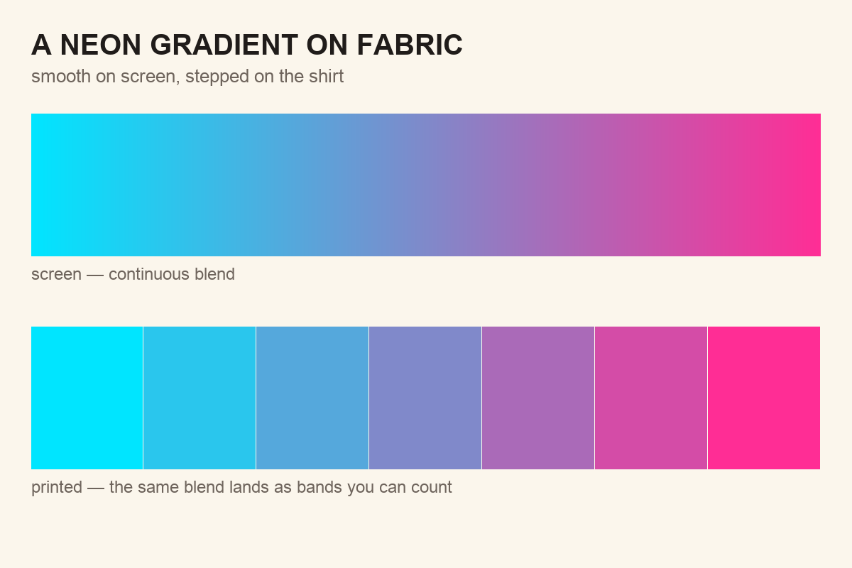
- Flat colour, not gradients. Printing in that era was spot colour, a limited number of flat inks. Four or five flat colours reproduce faithfully. A smooth neon gradient bands and shifts unpredictably.
- Type weight. Thin strokes lose their edges in the transfer. If the headline is the design, it needs to be heavy enough that losing a fraction of a millimetre on each side does not matter.
See faces that hold at chest-print size
Which type carries the decade
Strip an 80s design down and the shapes are simple, a grid, a triangle, a few flat blocks. The lettering is what dates it: the fat rounded strokes, the tight spacing, the outline and the drop shadow behind. It is also the part that has to survive everything above, so weight is the working criterion here, not just style.
Weight first. Set the word you care about at the size it will actually print, then look at the thinnest part of any letter. If that stroke is under about a millimetre on the finished garment, a transfer will thin it further and a screen will lose it outright. Fat rounded display faces are the decade’s own answer to this, and they were drawn that way for the same reason: the printing was rough, so the letters had to be generous.
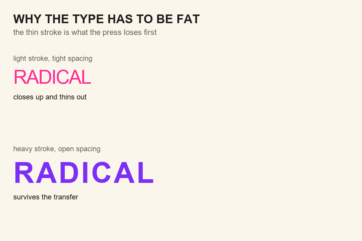
Spacing next. Eighties lettering sits tight, often overlapping, and that is fine on screen but it is where ink bleeds into itself on fabric. Open the tracking slightly more than looks right in the file, because the print will close it back up for you. If your design carries an outline or a drop shadow behind the type — and most of them should, it is the single most period-correct move available — that outline needs the same treatment: thick enough to survive, spaced far enough not to weld itself to the letter.
Last, restraint. One display face for the headline and one quiet face for the small line underneath is the whole system. Two display faces argue, and on a chest print you have no room for an argument. If a design already carries a heavy word and a script, it is finished; anything else you add is going to be the thing you regret when the shirt comes off the press.
Files that survive the shift — and how to use each one
Everything above is a constraint on the file you buy, so it is worth saying which kinds of file take the constraint well. Flat shapes with outlines survive. Gradients and neon blends are the ones that will make you re-print. These four sit on the right side of that line, and the note on each says what it is for rather than what it contains.
Unlimited creative assets. Access to AI tools.
Commercial licence included.
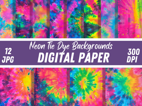
Get downloadsVintage Groovy Neon Tie Dye Backgrounds
Backgrounds are where the measurement above bites hardest, because a tie dye blend is a gradient by definition and a gradient is what bands on fabric. Use these the way the decade did — cropped small, behind lettering, rather than filling the whole print area. On a pale blank they hold; stretched across a full front they will show you every step in the blend.
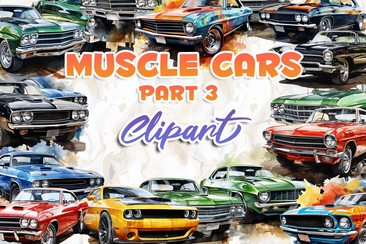
Muscle Cars Part 3
Heavy outlines and flat fills, which is exactly the construction that survives a transfer. The cars are drawn with enough black holding each shape together that a colour shift inside the fill barely registers — the outline is doing the reading, not the colour. That makes this the safest set here for a design going onto a coloured blank.
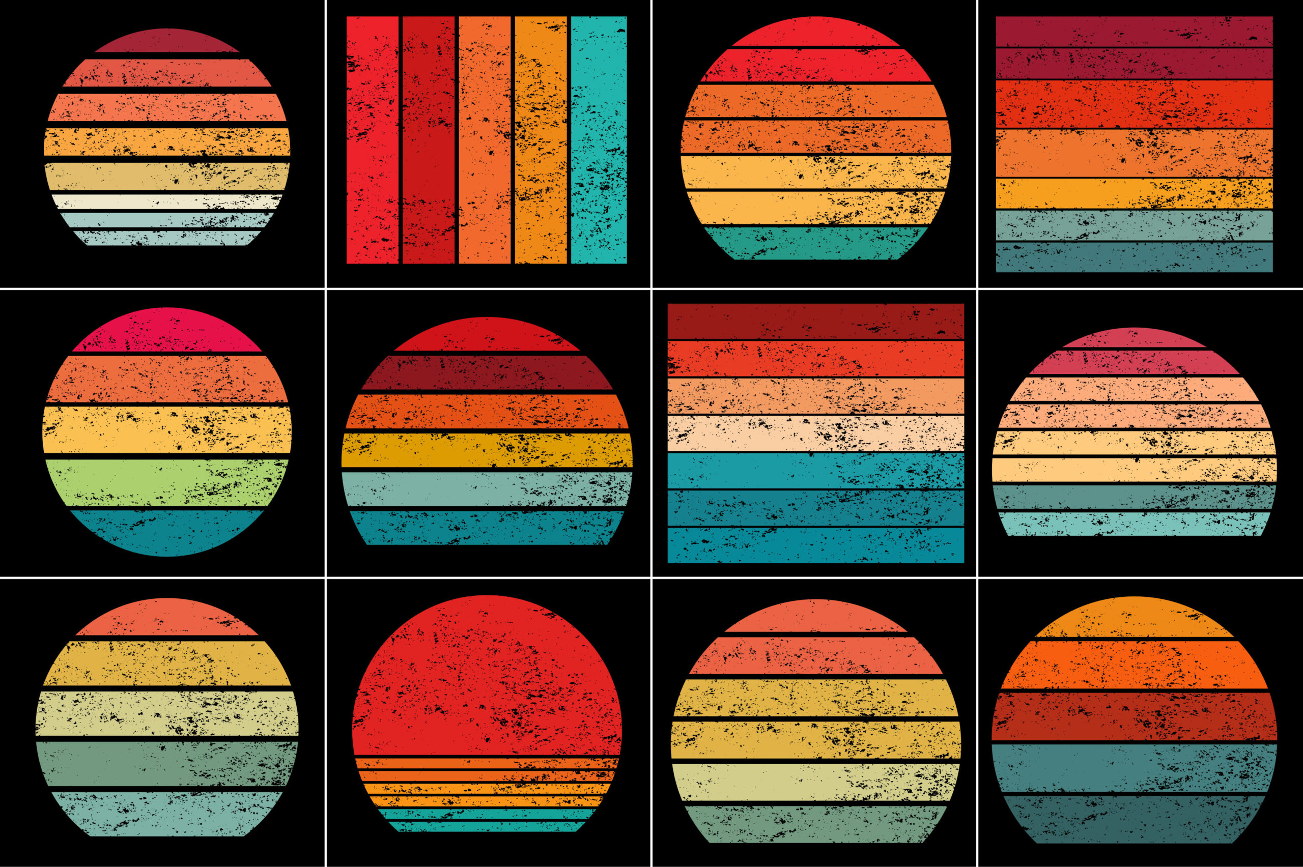
Retro Vintage Sunset Grunge Background
The sunset stripe is the decade’s single most reused device, and this version arrives already distressed, which quietly solves the banding problem: grain across a blend breaks up the steps a press would otherwise show you in clean rows. Set your type over the dark half rather than the bright half and the whole design gets easier to print. This is the one with the longest track record of the set.
Unlimited creative assets. Access to AI tools.
Commercial licence included.
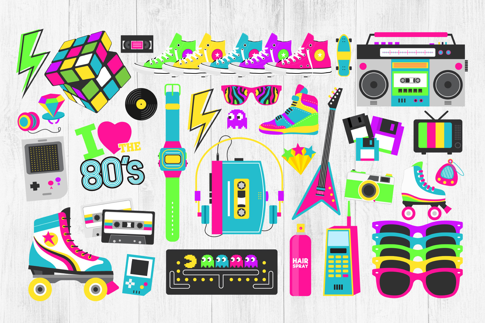
Get downloads80s Clipart, Neon 80s Clipart Bundle
The whole object vocabulary of the decade in one place — the shapes you compose a design out of rather than a finished graphic you are stuck with. Because the pieces come separated, you can drop the two elements built on the colours that fail hardest and keep the rest, which is a far quicker fix than correcting a flattened file. Best used as three or four pieces, not twenty.
A press routine that catches the problem early
Print one small test on the actual garment you are going to use, not on paper and not on a spare of a different blend. Ink on paper tells you almost nothing about ink on polyester. Press it with the settings you plan to use, let it cool completely, then look at it under daylight rather than under a bulb, because a warm indoor light hides the exact shift you are trying to catch.
If the colour has gone further than you can live with, the fix is in the file, not in the press. Raising the temperature to force more colour scorches polyester before it saturates. Correct the palette, print a second test, and keep the two side by side. Once you have that pair, you can predict what this shirt does to any design you buy afterwards, which is worth more than any single print.
Compare the 80s display faces side by side
Key takeaways
- The brightest 80s colours cannot be reached with ink. Pull them back in the file yourself so the whole palette shifts together.
- Sublimation ink is transparent, so the garment colour multiplies into every colour in the design and white is not printed at all.
- Flat spot colours reproduce faithfully, neon gradients band. Four or five colours is the historically correct and the safest choice.
- Test on the actual garment, cool it, judge it in daylight, then correct the file rather than the press.
Line up the type against your garment colour
Frequently asked questions
Why does my sublimation print look faded?
Most often the garment is not high enough in polyester, so only part of the colour has anywhere to bond. After that, the usual causes are a palette that sat outside the printable range to begin with, or a press cycle cut short before the ink fully gassed. Check the fabric content first, because that one cannot be fixed afterwards.
Can I print an 80s neon design on a black shirt?
Not with sublimation. The ink is transparent, so on black almost every colour disappears and the white areas show the fabric. A dark garment needs a process that lays down opaque ink or a white underbase, which means screen printing, direct to film or a vinyl transfer.
Do I still heat set the design before washing?
With sublimation the press cycle is the setting, and there is nothing extra to do afterwards. With a transfer or vinyl, follow the film maker’s cure instructions, and either way let the first wash be cool and inside out. Colour loss on the first wash usually means an incomplete press rather than a bad file.
What resolution should an 80s shirt design be?
Divide the pixel width by 300 to get the widest sharp print in inches. A 3600 pixel file covers a 12 inch chest print, which is roughly the practical maximum on an adult shirt. Flat colour holds up better than photographic detail if you have to stretch it a little.
Can I sell shirts made with these designs?
That depends on the licence attached to each file, and font licences are usually written separately from graphics licences. A personal use licence covers what you print for yourself. Selling finished garments, or handing the design to a client, needs a commercial or extended licence, so read that line before a production run rather than after.
The same colour arithmetic decides how a design behaves in sublimation designs generally, and the file checks above are the ones a printer applies to screen printing designs. If the 80s work you are making ends up on paper rather than fabric, the sizing and margin rules in vintage poster design take over from here.
Get the type that holds on fabric