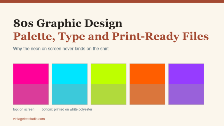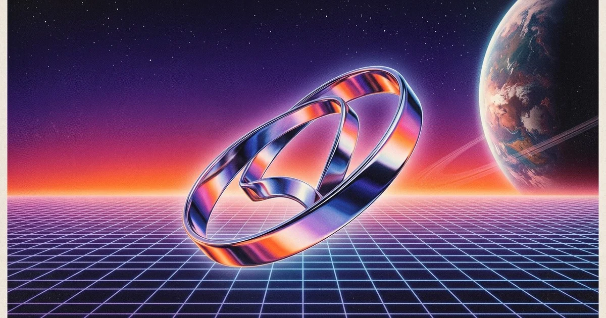
Why do neon colors print dull? Because a fluorescent screen color has no ink recipe behind it: CMYK tops out at one or two inks per hue, and the glow you see on the monitor comes from light emission a printer can’t reproduce. That sounds like the whole retro futurism look is screen-only, but the print test below says otherwise: most of a fifteen-frame sample survives the jump to fabric untouched. What actually breaks is three or four specific colors, one gradient technique, and a handful of resolution-bound line work, and each one below has a straight fix.
The era doesn’t die in print. Three colors do.
Colors look different when printed, so the usual verdict on this style is that it belongs on a screen and nowhere else. The measurement says otherwise. Run fifteen retro futurism frames that people actually save through a print conversion and the median frame moves 22.5% of its area past the point where a shift becomes visible. A strong shift shows up in only five of fifteen. The worst color is an acid lime, #A5FE1E, at 14.5 dE00, followed by a pure red, #F90907, at 6.2, and a lilac purple, #7454AD, at 6.0.
The median retro futurism frame moves 22.5% of its printed area past the point a shift becomes visible, but a strong shift only shows up in five of fifteen, and it comes down to three colors, not the whole palette.
That changes what you have to fix. You are not rebuilding the look, you are replacing three colors and reworking one gradient. The frames built on a dark base, #000000, #013C57, #1B1B1B, move on 0 to 4% of their area, which means the black-ground chrome poster you were afraid of is the safest thing in the set. The one technique in this style that never needed a fix in the first place is the flat starburst shape work. See the starburst and atomic shape set below.
The rest of this piece goes technique by technique: which parts of the style survive the jump to fabric, which ones break, and what you swap in when they do. The same conversion math applies to any sublimation design you’re prepping for print, not just this style.
Why do neon colors print dull?
Because a fluorescent color has no recipe in CMYK. Push a hot pink through the conversion and the ink mix comes back as 2/80/5/0. An electric cyan comes back as 46/0/7/0. Both are hitting a ceiling of one or two inks, and one or two inks is all the saturation the process has to give. There is no fifth channel underneath waiting to add the glow, which is why the printed result reads as a flat, ordinary version of the color you picked.
Acid lime is the extreme case in this sample: 14.5 dE00 between what you see and what comes back, several times the threshold where a person notices the difference at all. Neon green prints muddy for a mechanical reason, not because the file was exported wrong.
What follows from that is more useful than the explanation. It’s the same reason a t-shirt PNG built for sublimation needs a print-range palette from the start, not a screen palette adjusted after the fact. If neon dulls by ink physics, then no export setting rescues it, and the fix has to happen in the design: pick colors that live inside the printable range, and get the glow from contrast instead. Both of those are covered below: the palette rules in the next section, and a texture-based way to hide the loss in the halftone brush set further down, and both are cheaper than reprinting a proof.
A palette that survives the jump to fabric
Build the palette in two layers. The base carries the era: deep blacks and inky blues, the #000000 and #013C57 range that moved almost nowhere in the measurement. On top of that go two or three accents, and the accents are where the discipline goes. Pure red and lilac purple both drifted past 6 dE00. Acid lime is out entirely unless you are willing to see it land as a flat yellow-green.
The swap is not a downgrade. A slightly desaturated coral holds its identity in print in a way #F90907 does not, and next to a black ground it still reads as loud. Loudness in this style comes from the jump between the ground and the accent, not from how far the accent is pushed on its own.
| Risky on screen | Print-safe swap |
|---|---|
| Acid lime #A5FE1E, 14.5 dE00 | Drop it, or push it toward yellow-green and accept the flat result |
| Pure red #F90907, 6.2 dE00 | A slightly desaturated coral |
| Lilac purple #7454AD, 6.0 dE00 | A deeper, less saturated violet |
Here is the part that rarely gets mentioned: the frames that hold up best in print are the ones with the fewest accent colors. The dense multicolor VHS layouts, the frames stacking five or six saturated hues at once, are the ones carrying the largest shifted area. A three-color build gives the conversion less to break, the same restraint that keeps a 90s retro shirt PNG printing clean instead of muddy.
Hex codes are free and they are not a print file. You can read a palette off this page and still be stuck, because a flat PNG of a gradient is not something you can recolor, and anything pulled from a gallery or a stock page is not something you can legally sell. What you need is a layered or vector source with a commercial license, and that is a purchase, not a download: a ready layered background sidesteps the flat-PNG trap entirely, like the option below.
Five bands are what make chrome read as chrome
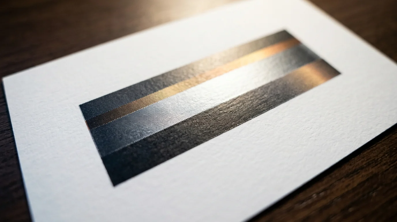
Chrome is the technique everyone expects to lose, and it is the one that came through cleanest. A nine-band chrome ladder, run through the same print conversion, kept all eight of its transitions above the threshold where the eye separates one band from the next: the weakest step measured 8.8 ΔE00, the strongest 36.0. Nothing collapsed into a single grey block.
The reason is that chrome is not a color, it is a sequence. Light band, dark band, light band, and the eye fills in metal. Ink reproduces a sequence of distinct steps fine. What ink cannot reproduce is a smooth glide, which is the next section’s problem.
So build chrome as bands, not as a soft airbrushed gradient with a highlight painted on top. Five to nine hard steps, each one clearly separate from its neighbours, and the letterform will still read as metal on a shirt, the same banded logic that makes a retro shirt PNG built for sublimation hold its edges after transfer instead of blurring into the fabric. If you have been avoiding chrome type on print work, the measurement says you were solving the wrong problem: a heavy display face gives those bands somewhere to sit, more on that with the font below.
Glow is contrast to the blank, not a color you can buy
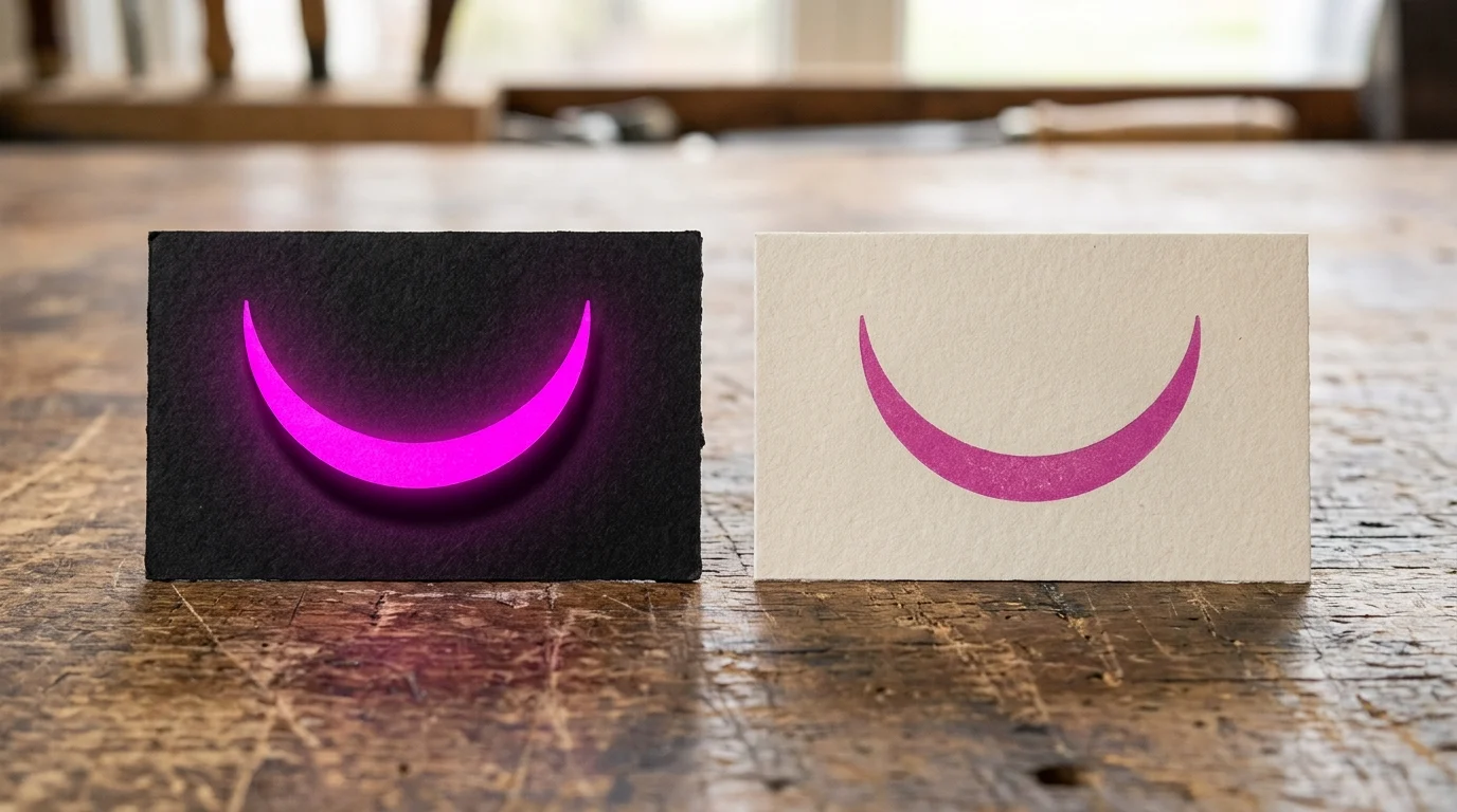
The word neon describes a relationship, not a pigment, and the numbers make that concrete. Electric cyan sits at 67.0 ΔE00 against a dark fabric and 24.2 against a white one. Acid lime: 75.6 against dark, 22.9 against white. Same ink, same file, roughly three times the separation, purely because of what is underneath it.
Hot pink is the exception worth knowing: 44.2 against dark and 41.8 against white. It is nearly blank-agnostic, which makes it the one accent you can carry across a whole product line without reworking the artwork per garment color.
That gives you a simple rule when picking blanks. A retro futurism design with cyan or lime in it belongs on black or navy. Put the same file on a white tee and the glow is gone, not because the print failed but because there is nothing for it to glow against. If the store only sells white, drop the cool accents and build the design around pink and a warm accent instead, the same blank-first thinking behind picking a sublimation shirt PNG for a specific garment color rather than a generic one. The same contrast rule is what makes the halftone dot below read on a dark blank instead of disappearing into it.
The soft gradient is where the file actually breaks
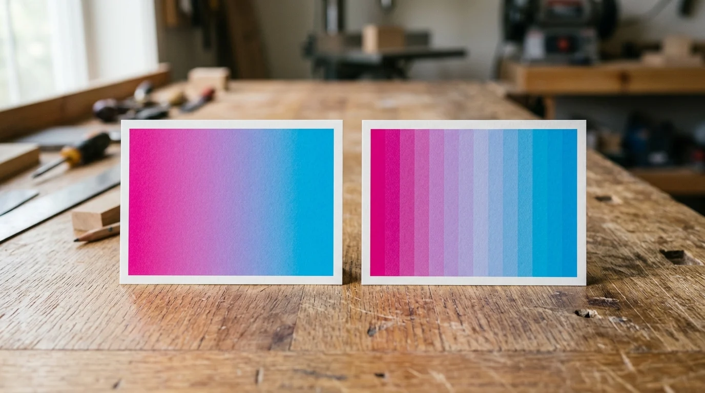
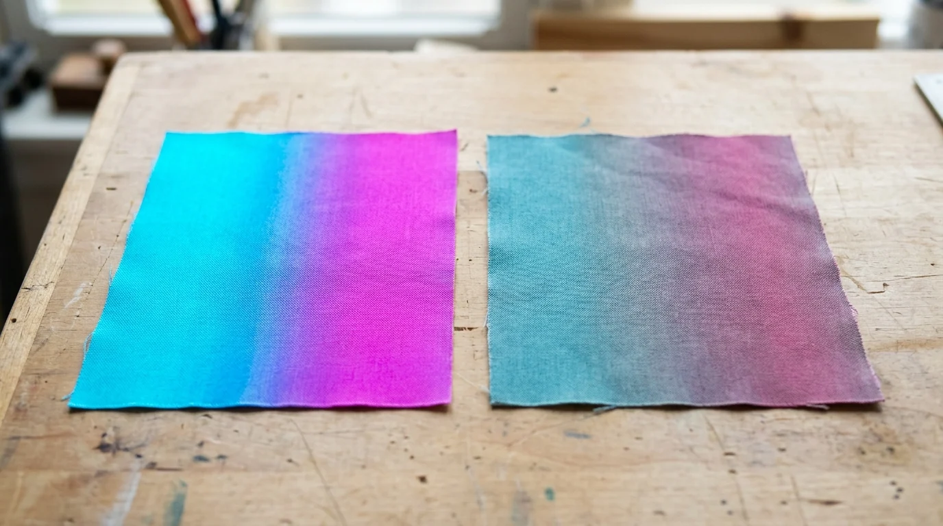
Take a clean cyan-to-magenta gradient, 256 distinct values on screen, and push it through the print conversion. It comes back with 217 values, and along the sweep those collapse into 49 visibly separate steps. An ultraviolet to sunset orange gradient does worse: 206 values, 39 steps. What you drew as a smooth glide arrives as a staircase.
Gradient banding when printing is not a resolution issue and adding pixels does not help. The values are gone before the file ever reaches the printer. Which is why the two working fixes are both design decisions: either commit to the bands and make the steps deliberate, the way the chrome ladder does, or break the transition with texture so the eye reads grain instead of stripes.
The second fix is the one most people want, and it is where a flat background image stops being useful. You cannot add grain underneath a gradient you only have as a merged JPEG, and you cannot shift its hue when the palette section above tells you the purple has to go.
The doubt worth naming before you buy anything: the catalog holds 29,422 items, and a preview thumbnail does not tell you whether a file arrives in layers or as one flattened PNG. That is the difference between a background you can fix and one you have to work around. The one below is where I’d start for this style, from the gradient and texture side of the catalog.
Unlimited creative assets. Access to AI tools.
Commercial licence included.
Get downloads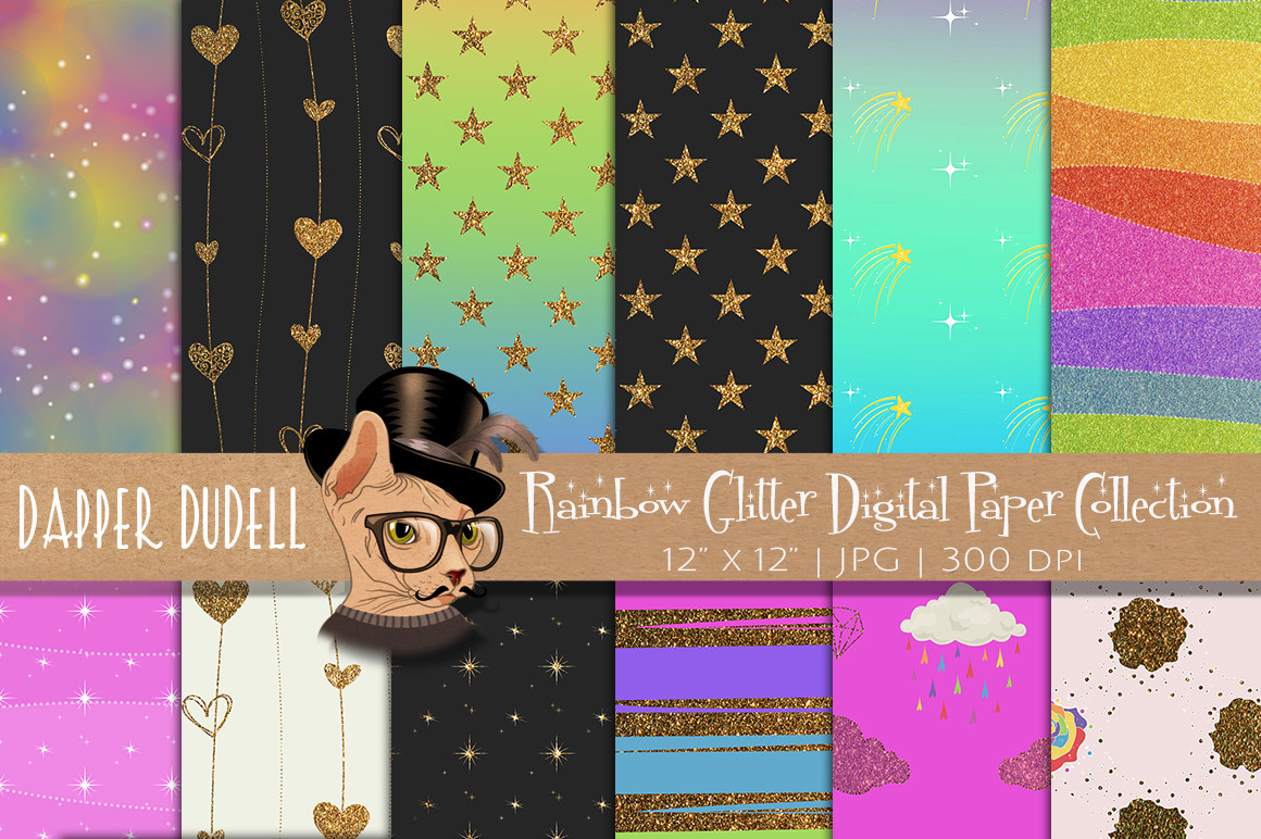
Rainbow Glitter Digi Paper Backgrounds
Layered gradient source instead of a flattened PNG, so the hue can shift and the grain can go underneath without starting the artwork over. Rated 5.0 across 3 reviews, with 313 saves already ahead of that.
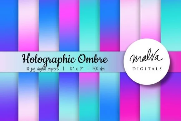
Holographic Neon Ombre Backgrounds
Eighteen ombre sheets built at 300 dpi and 12 by 12 inches, so the transition is already at print density instead of being stretched up to it afterwards. Rated 5.0 across 2 reviews, with 300 saves already ahead of that.
A coarser halftone dot is what makes a frame read as period
A halftone in this style is doing period signalling, not shading. Old print could not hold a fine screen, so the dot was large and visible, and that visible dot is what the eye now reads as “printed in another decade”. A modern filter set to a fine screen produces something technically correct and historically wrong.
It also solves the banding problem from the previous section. A coarse dot laid over a gradient gives the transition somewhere to hide, and the staircase that measured 39 steps stops being the thing you notice.
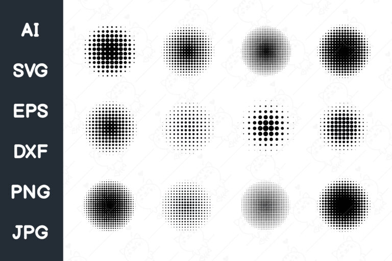
Where the free answer runs out: a halftone applied as a live filter is tied to the resolution you applied it at, and it re-renders differently the moment you resize the artwork for a different print area. A brush or a texture set gives you the dot as artwork you place and scale on purpose.
| Live filter | Brush or texture set |
|---|---|
| Tied to the resolution you applied it at | Placed as artwork, scales the way any shape does |
| Re-renders every time you resize for a new print area | Stays the size and weight you drew it at |
| Fine screen unless you set it by hand | Coarse dot built in from the start |
Unlimited creative assets. Access to AI tools.
Commercial licence included.
Get downloads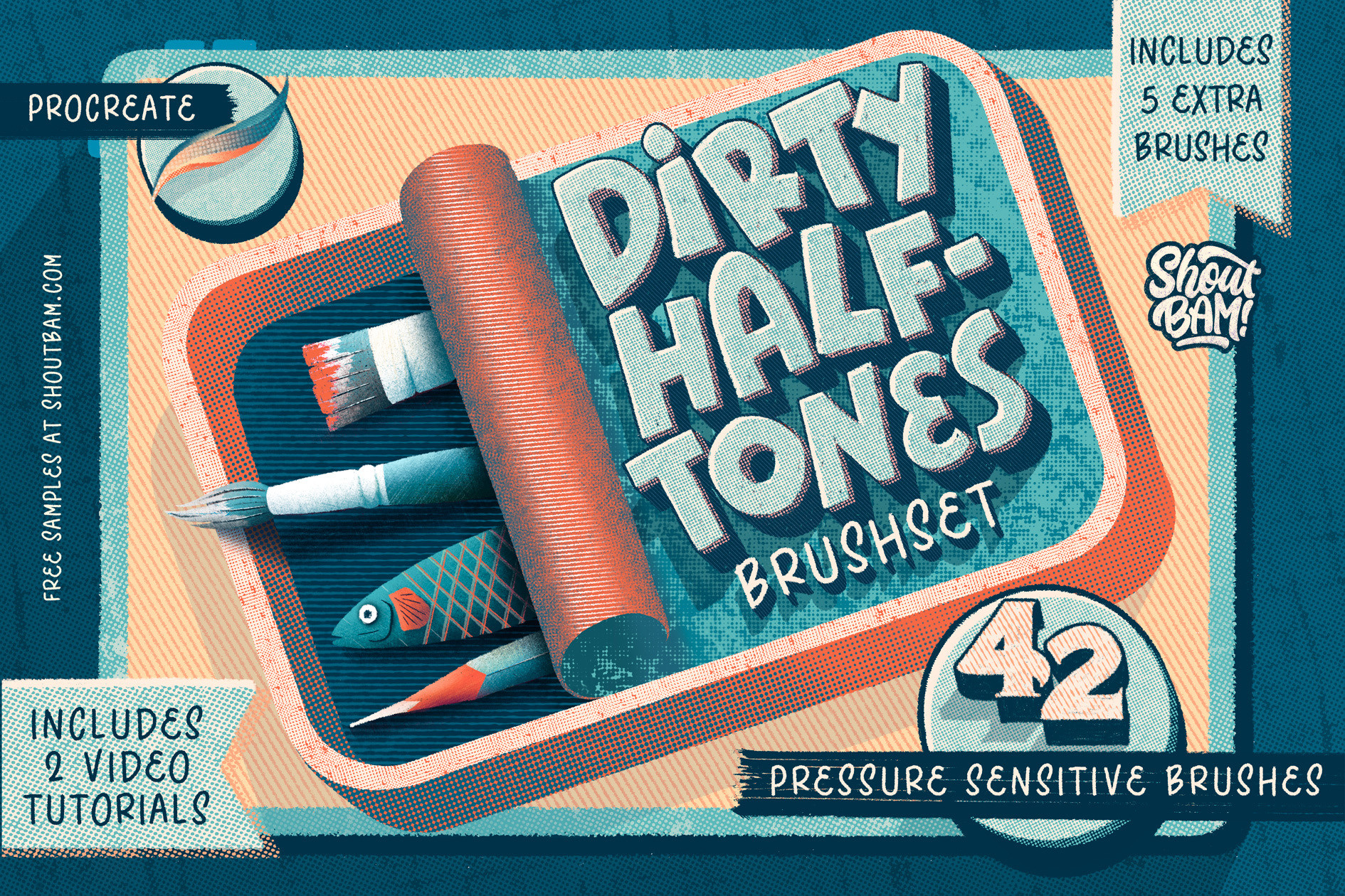
Dirty Halftones Brush Set
Brushes rather than a filter, which means the dot stays the size you drew it when the artwork gets scaled to a different print area. Rated 5.0 across 2 reviews, with 487 saves already ahead of that.
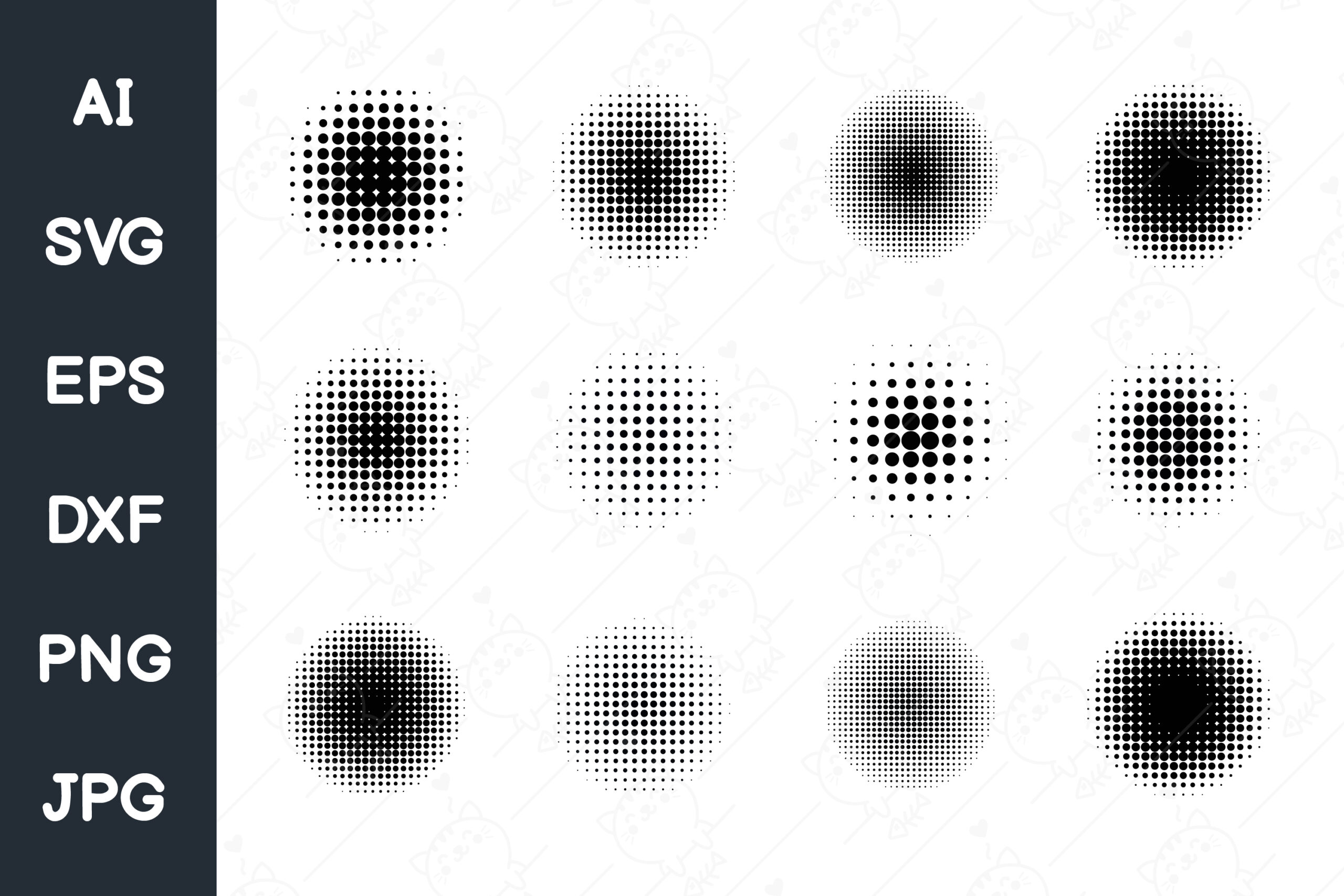
Pop Art Comic Style Circle Halftone
Circle halftone in the coarse comic register, the kind of dot that survives on fabric instead of disappearing into the weave. 5.0 across 3 reviews, 174 saves.
Chromatic aberration is a period marker, not a defect
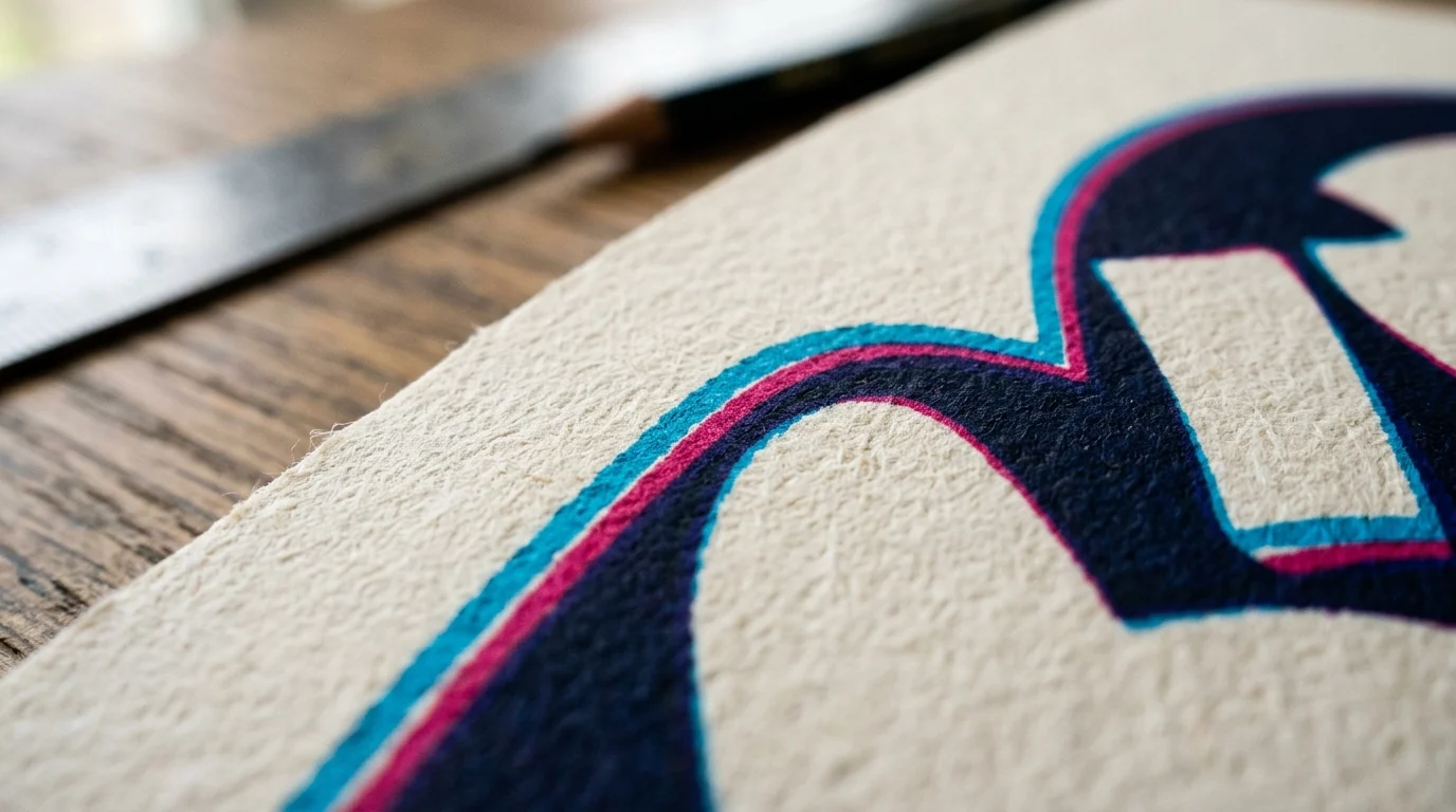
The colored fringe along an edge, red pulling one way and cyan the other, is a lens artifact that became a style cue. On screen people read it as a nod to old optics. In print it behaves differently from every other technique here, because it is the one effect that depends on offsetting colors that the conversion is going to shift anyway.
Keep the offset generous. A one-pixel fringe is a screen effect, and on fabric it either disappears into the weave or reads as a printing error, which is the worst outcome available: the viewer blames your file. Push the separation until it is obviously intentional and the ambiguity goes away.
Use cyan against a warm accent rather than red against green. Cyan held 67.0 ΔE00 against a dark ground, so the fringe stays legible after conversion. A red fringe is drawing on the pure red that already drifted 6.2 dE00 on its own, and a fringe is a thin line with no area to spare. If that feels like more effect work than a given piece needs, the vintage display font below carries the era in the letterform itself, no extra effect required.
The fastest font to start a chrome build from
Chrome needs mass. The band sequence that measured well needs somewhere to live, and a thin face gives each band a few pixels of width, which is where the effect turns into mush at print size, the same weight problem that shows up on an 80s design built around thin script instead of a heavy display face. A heavy display face with wide, simple counters holds five to nine bands per letter without the letter closing up.
| Thin script | Heavy display face |
|---|---|
| A few pixels per band, closes up at print size | Five to nine bands per letter, counters stay open |
| Chrome effect turns to mush | Chrome effect reads as metal from arm’s length |
Retro futuristic fonts split into two useful groups here: chunky geometric faces built for exactly this treatment, and vintage-inflected display faces that carry the era on their own and need less effect work on top. Both of the fonts below have held up across enough shirt and poster projects to be a safe starting point rather than a gamble.
Unlimited creative assets. Access to AI tools.
Commercial licence included.
Get downloads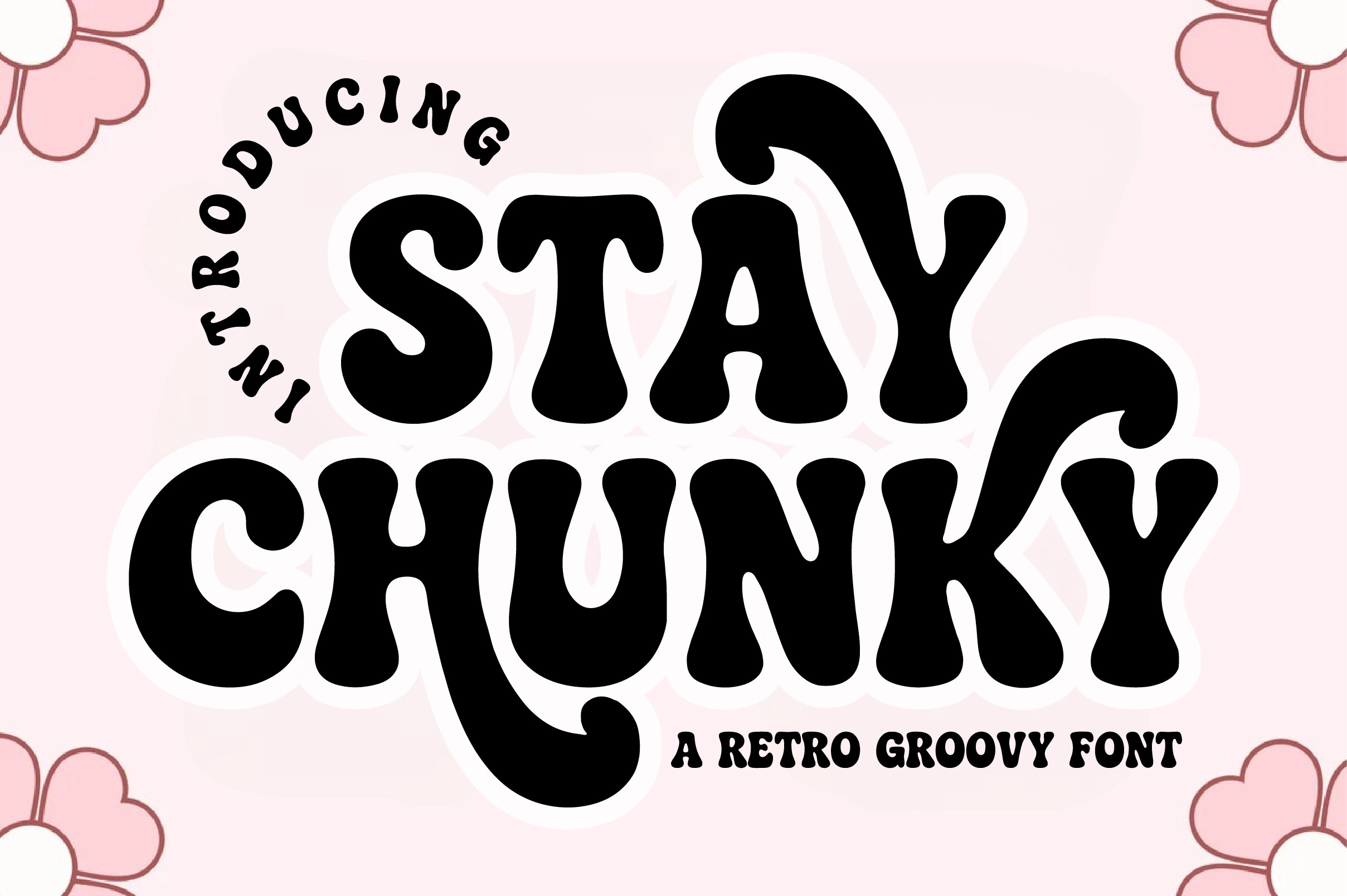
Stay Chunky Font
Heavy geometric weight with the counter space a banded chrome fill needs, which is what makes it a faster starting point than adding weight to a lighter face. 4.6 stars across 28 reviews.
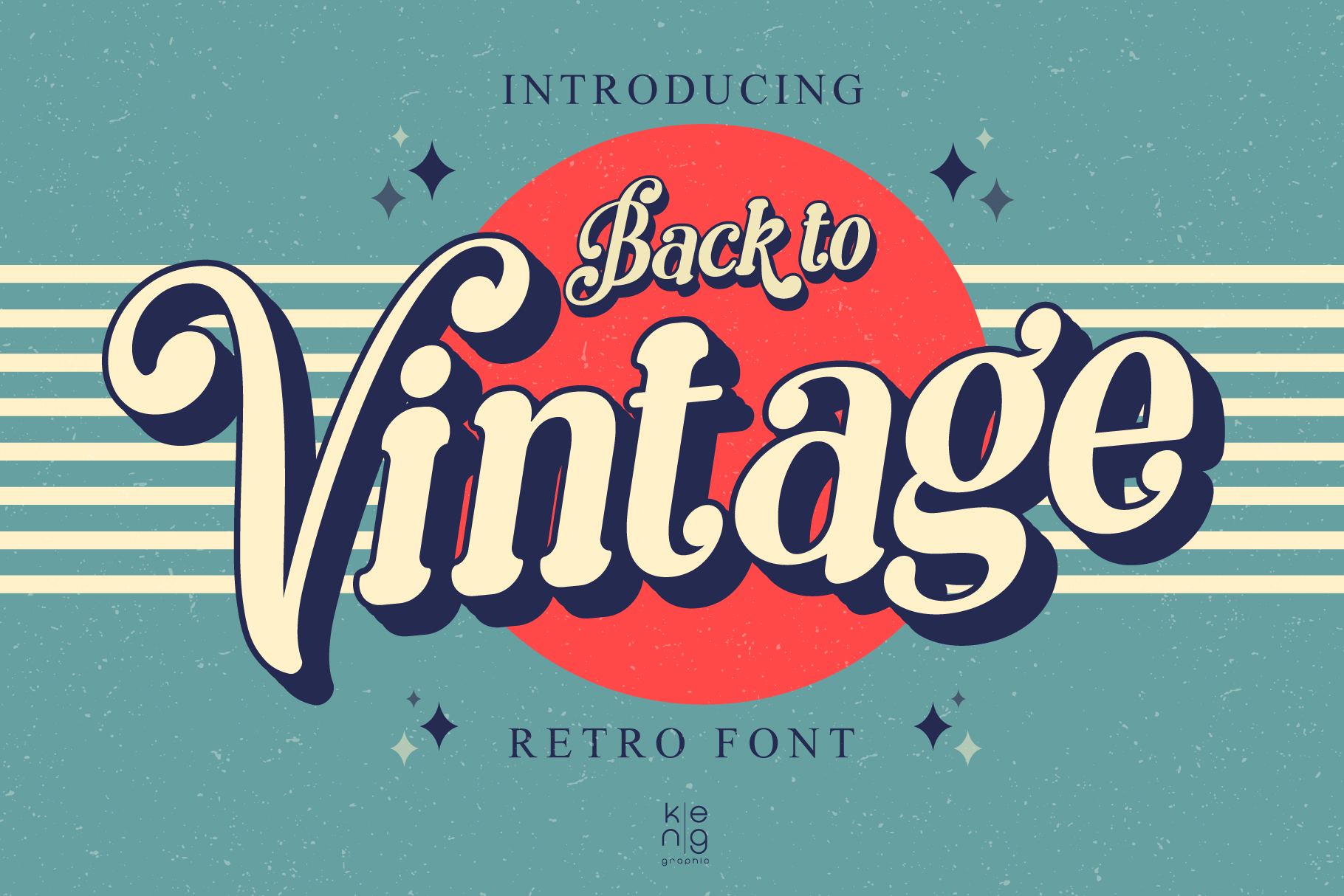
Back to Vintage Font
Carries the era in the letterform itself, so it holds up when you decide the chrome treatment is one effect too many for a given piece. 5.0 across 27 reviews.
Check the license before you sell either one. A display face on a shirt is the part of the artwork most likely to need a commercial grant, and that grant is separate from the download, the same check that applies to any 90s bootleg shirt design before it goes on a storefront.
One shape set is worth keeping permanently on hand
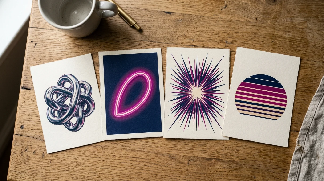
Across the fifteen frames in the sample, six techniques carry the whole style: chrome gradient, halftone, CRT scanlines and noise, thin line grids and orbit paths, dense multicolor VHS layouts, and mid-century starbursts. Five of those six fight the print process in one way or another. The starbursts are the exception. Flat vector, no gradient, no fine screen, no thin line to lose, so it prints exactly as drawn.
That makes a starburst and atomic-shape set the highest-value thing in your library for this style, because it is the only element you never have to re-test. Everything else earns a proof; these do not, the same flat-vector safety net worth keeping on hand for a vintage frame color combo or any other border-and-shape build.
Unlimited creative assets. Access to AI tools.
Commercial licence included.
Get downloads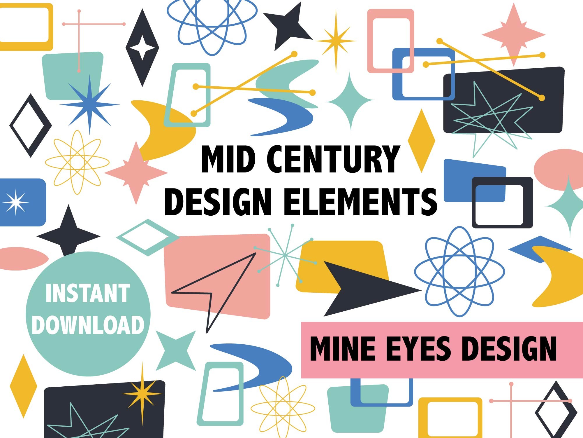
Mid Century Starburst & Atomic Clipart
Flat vector shapes, the one technique in the sample that never needed a fix for print. Rated 5.0 across 4 reviews, with 582 saves already ahead of that.
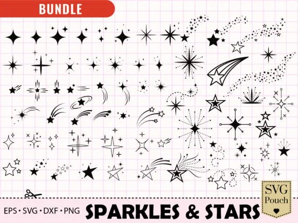
Sparkle & Starburst SVG Bundle
Sixty-six burst and flare shapes as vector, with EPS and DXF alongside the SVG, so the same star scales to a garment print without the edge going soft. Rated 5.0 across 4 reviews, with 583 saves already ahead of that.
Do the resolution math before you resize, not after
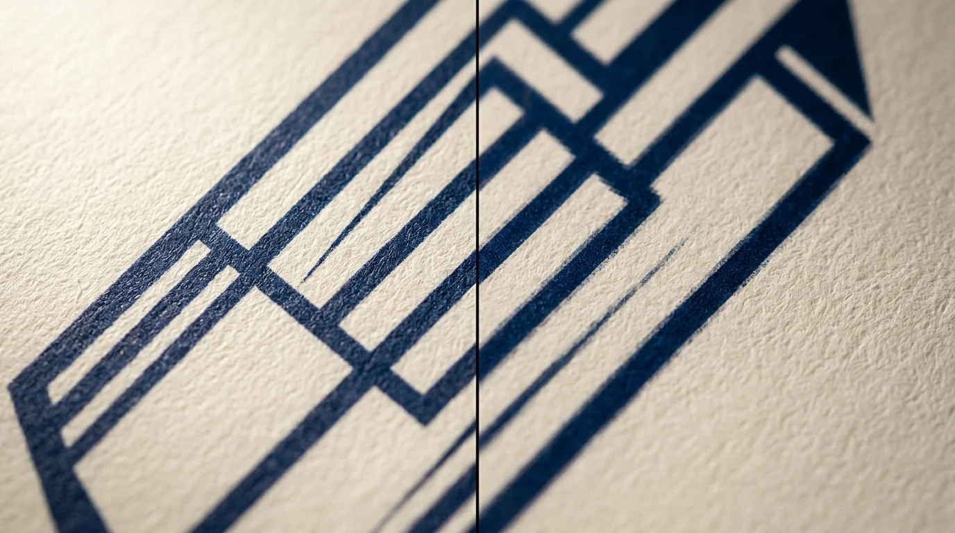
Thin line grids and orbit paths are two of the six techniques, and they are the two that die quietly. Nothing looks wrong on screen at full size, and the line simply is not there on the garment.
The arithmetic is worth doing once. A DTG or sublimation print area at 300 DPI, the density where a printed edge stops looking soft at arm’s length, comes to roughly 4500 by 5400 pixels. Scale a frame you designed for a screen down to fit that area and every line width scales with it. A grid that read as delicate at full size arrives as a broken dotted line.
Which is why the order matters: set the canvas to the print area first, then draw the grid at the weight it will actually be printed at. Working the other way and resizing at the end is how a technique that measured fine in isolation still fails on the shirt.
The same logic applies to scanlines and noise. Both are built from repeating thin elements, both are resolution-bound, and neither survives an aggressive downscale. A dot placed as artwork instead of applied as a live filter, like the circle halftone set above, sidesteps the problem entirely, it scales the way any other placed shape does.
The checklist before a file goes to print
Everything above collapses into one pass over the artwork. The left column is what the free answer on this page gets you. The right column is where it stops and what replaces it.
| What you can do with hex codes and rules | Where that runs out |
|---|---|
| Swap acid lime, pure red and lilac purple for in-range accents | Fine on your own artwork. A palette read off a gallery image gives you no file and no right to sell it |
| Rebuild chrome as five to nine hard bands | Needs a display face with the mass to hold them, licensed for commercial use |
| Match cyan and lime designs to dark blanks | Nothing to buy. Just check the blank before the proof |
| Break gradient banding with texture | Impossible on a flattened background. Needs a layered or vector source |
| Set the halftone dot coarse | A live filter re-renders on resize. A brush or texture set does not |
| Draw grids at print size, not screen size | Nothing to buy. Set the canvas first |
| Sell the finished design | Every asset in the file needs a commercial license, and the download alone is not one |
Two rows above are worth double-checking before you buy anything: the gradient row and the halftone row. If you’re starting from a flat, merged photo instead of a layered file, the layered gradient background above closes that gap directly, and the halftone brush set closes the one next to it.
If the goal is a finished physical product rather than a file you list yourself, a print-on-demand storefront handles the blank, the print and the fulfilment, and your job stops at the artwork.
Shop Finished Retro Futurism Prints
FAQ
Why do neon colors print dull?
A fluorescent color needs light emission that ink cannot produce, and in CMYK it converts to a mix that tops out at one or two inks: hot pink comes back as 2/80/5/0, electric cyan as 46/0/7/0. The saturation has nowhere to come from. Acid lime is the worst offender measured here at 14.5 dE00 between screen and print.
What is retro futuristic design?
It is a design language that uses an earlier era’s idea of the future: chrome, starbursts, neon grids, atomic shapes, VHS artifacts. It is not a period style being reproduced accurately. It is the future as the past imagined it, which is why it reads as nostalgic and forward-looking at the same time.
What is futurism, and is it the same thing?
No. Futurism proper is an early twentieth-century art movement about speed, machinery and motion. Retro futurism borrows its optimism and some of its visual energy, but it is a later, softer, more decorative thing built out of mid-century and eighties imagery.
When did futurism start and end?
The original movement ran through the early decades of the twentieth century and had faded well before the mid-century, so the chrome-and-starburst material this style draws on actually comes after it, not from it.
What is a futurism website, or a retro futurism website?
Usually a site using the visual language: dark ground, neon accents, grid horizon, chrome type. Worth knowing that the screen versions lean on glow and animation, and those are exactly the parts that do not transfer to a printed product.
Do colors always look different when printed?
Some shift is unavoidable, but the amount is smaller than the reputation suggests. Across fifteen frames the median area moving past the visible threshold was 22.5%, and only five of the fifteen showed a strong shift. Dark-ground frames moved on 0 to 4% of their area. If you want the shift risk at zero, build the frame around flat vector shapes like the starburst shape set instead of a gradient or a photo-based background.
What colors should I use for a neon grid?
Cyan on a dark ground, which measured 67.0 ΔE00 of separation against dark fabric versus 24.2 against white. Skip acid lime for the grid lines specifically: it shifts the most of anything measured, and grid lines are thin, so there is no area to absorb the shift.
How do I make lines look like they are glowing?
Contrast, not color. The measurement is unambiguous: the same ink separates roughly three times better against a dark blank than a white one. Glow is a relationship between the mark and the ground, so choose the blank first and design the accent second.
Does chrome type work on a shirt?
Yes, if it is built as bands. A nine-band ladder kept all eight transitions above the visible threshold after conversion, from 8.8 to 36.0 ΔE00. A soft airbrushed chrome with a painted highlight is what fails, because smooth transitions are what the process loses.