Short answer: if your sublimation print came out pale, the file is usually fine and the shirt is the problem. Sublimation ink only bonds to polyester, so a 50/50 blend keeps roughly half the color and cotton keeps none of it. Every design below was picked on three checks anyone can verify before buying: a 300 DPI file, a transparent PNG background, and a stated print size big enough for an adult front. One popular pick failed those checks and is named further down.
You pressed at the temperature the blank supplier told you to press at. You peeled hot. The shirt came off the press looking right. Then it went through one wash and came back looking like it had been worn for three summers, and not in the good way.
That’s the moment most people go looking for better sublimation designs. Usually they don’t need one. The file did its job; the fabric quietly threw most of the ink away.
Start with the set that survives the blend
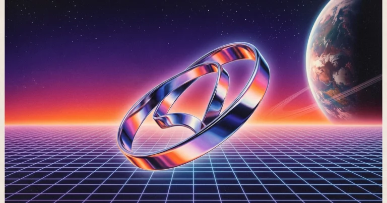
Transparent retro PNGs in one zip, from a shop that puts out retro sublimation sets by the dozen. Worth knowing before you buy: the backgrounds in the previews are display only, so what arrives is the artwork alone.
Sublimation ink does not stick to cotton, and cotton is where your color went
Sublimation works by turning solid ink into gas and letting that gas bond with polyester fibers. Cotton fibers have nothing for it to bond to. The ink sits on the surface, and the first wash takes it.
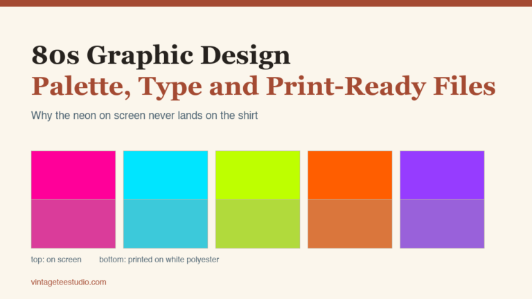
The result is arithmetic you can do before you press anything. An 80% polyester shirt takes the dye on 80% of its fibres, so you keep 80% of the vibrancy the design showed on screen. A 50/50 blend keeps half of it. On 100% cotton the dye has nothing to bond to: the design looks fine for five minutes and is essentially gone after the first wash.
So before you blame a design file, read the blank’s tag. That one line explains most faded prints.
The 65/35 blend is how the vintage look is made on purpose
Here’s the part almost nobody tells beginners, and it changes how you shop for designs: the soft, washed, slightly distressed retro print everyone wants is a fabric decision, not a file decision.
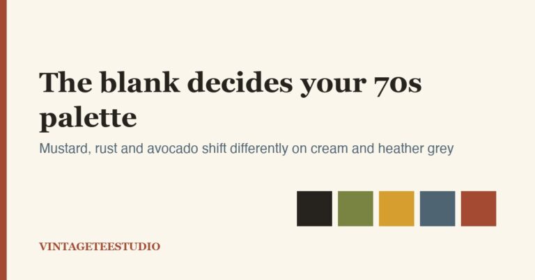
Blank suppliers describe the 65/35 blend as a look, not a compromise. At that ratio the print lands faded rather than bold, which is exactly the worn finish a lot of buyers are shopping for. If you want colour that pops instead, push the polyester count as high as the blank allows.
So the blend fades your print for you. If you buy a heavily distressed PNG and press it on a 65/35 tee, you get two layers of fade stacked on each other and the artwork turns to mush. If you press a clean, saturated design on that same blend, you get the retro look people actually save on Pinterest.
Crisp file on a 65/35 blend gives you vintage. Distressed file on 100% polyester gives you vintage. Distressed file on a blend gives you a print nobody can read from across a room.
| Blank | What the ink does | Which files suit it |
|---|---|---|
| 100% polyester | Holds all of it: brightest possible result | Distressed and grainy retro art, halftones, heavy texture |
| 65/35 poly-cotton | Holds most of it, fades on its own in the wash | Clean line work and solid shapes; skip anything already distressed |
| 50/50 or lower | Muted, below the 65% floor suppliers recommend for apparel | Nothing worth the blank |
| Black or navy anything | Nothing visible; see below | Nothing. Sublimation cannot go here. |
No sublimation design will ever show up on a dark shirt
This one costs people money every week. Sublimation ink is transparent: it tints the fabric rather than covering it. Dark blanks are the beginner error that follows from that. On black or navy the design simply does not show up, and on a coloured blank the print picks up whatever is underneath it. Light fabric is not a style choice here, it is what makes the design visible at all.
There is no design file, no press setting and no extra pass that fixes this. Dark garments are DTF or screen print territory. If the mockup you’re imagining is white artwork on a black tee, buy for that method instead, because the picks below are not it.
What makes a file actually sublimation-ready
Three properties, all listed on the product page before you buy:
- 300 DPI. This is the mark of a file prepared for print rather than for a listing thumbnail. A 72 DPI web graphic blown up to 11 inches shows its pixels the moment it is on fabric.
- Transparent PNG. From the same guide: for sublimation, PNG (Portable Network Graphics) is the industry standard, because “unlike JPEGs, which save with a solid white or colored background, PNG files support transparency.” A JPEG bakes a white box around your artwork, and on a colored tee that box prints.
- A stated pixel or inch size. Divide pixels by 300 and you get your maximum print width. A 3000 × 3000 px file is exactly 10 inches: a standard adult front print, with nothing left over for scaling up.
One habit that is not the file’s fault: you must mirror the image before printing, because the paper goes face-down onto the blank. Skip it and your text prints backwards on a perfectly good design.
The same three checks apply to every file you buy, whether you’re shopping for a sublimation shirt png or a full retro shirt png for sublimation bundle.
Check which files ship transparent at 300 dpi
Six vintage sublimation designs that pass all three checks
These are the designs from Creative Fabrica’s vintage sublimation catalog that cleared the checks in the lead: 300 DPI, transparent PNG, and a print size stated on the page. Six passed; the count is what survived, not a round number. Each verdict says who it’s for, and where a listing leaves something out, that’s named too.
Unlimited creative assets. Access to AI tools.
Commercial licence included.
Get downloadsVintage Sublimation PNG Designs
Best if you want several retro looks from one purchase. Transparent PNGs delivered as a zip, from a shop that puts out retro sublimation sets by the dozen. Worth knowing before you buy: the listing states the background images in the previews are for display only and are not included, so what arrives is the artwork alone.
Pin Up Girl Clipart Vintage Sublimation
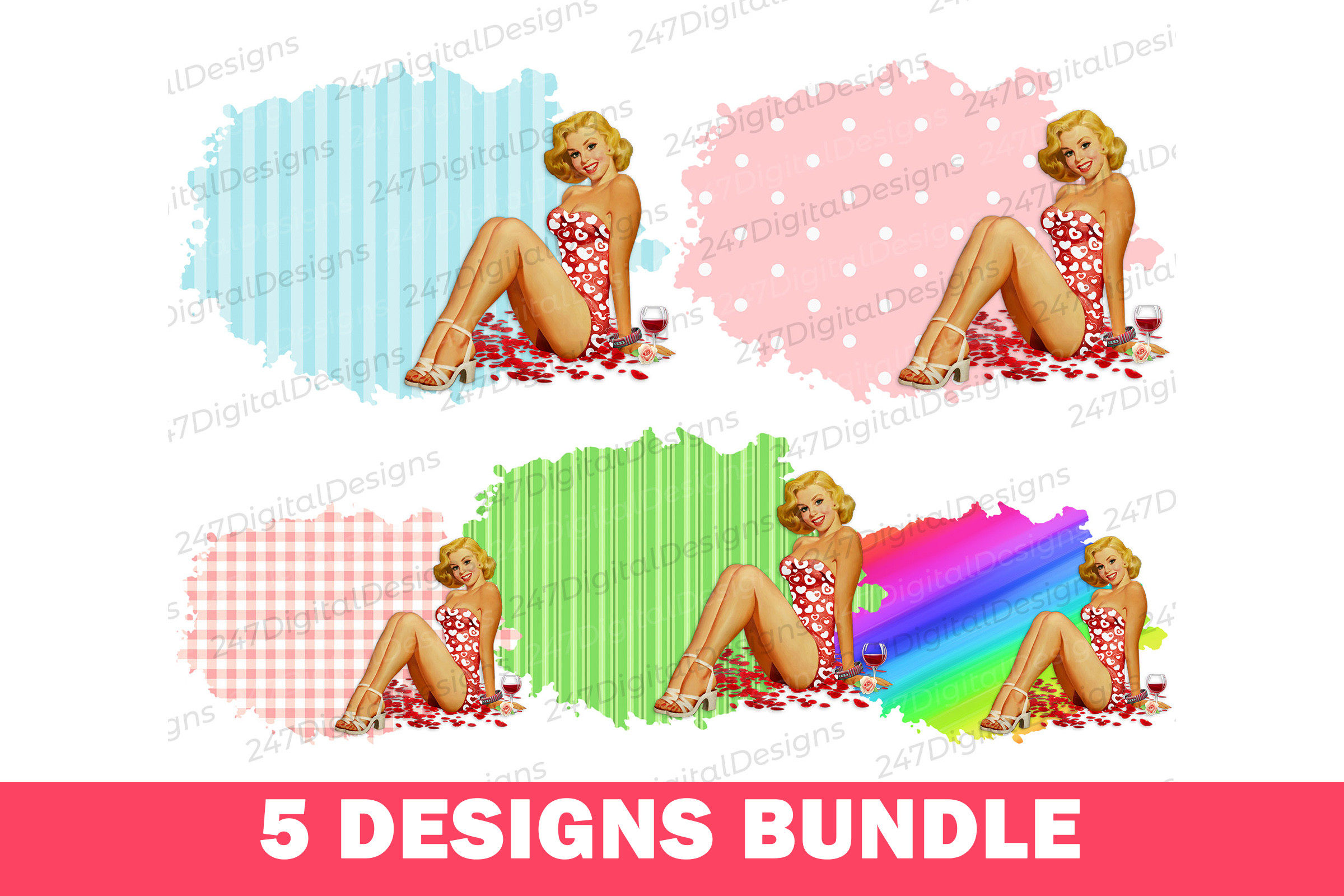
Best if you’re printing 50s pin-up and diner-era artwork. Five separate 300 DPI PNGs with transparent backgrounds, built around a distressed retro texture. That texture is the catch: press these on 100% polyester, where the fabric adds no fade of its own, or the distressing doubles up and the linework closes in.
Mama Mini Vintage Sublimation Designs
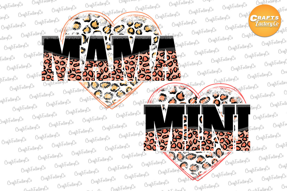
Best if you sell mother-and-child sets. The listing gives a real size, 14 × 14 inches at 300 DPI, which works out to 4,200 pixels square, so you can scale down to a toddler tee and still keep full resolution. The honest limitation is on the page: it’s a printable PNG only and cannot be edited, so you’re printing it as drawn.
Unlimited creative assets. Access to AI tools.
Commercial licence included.
Get downloadsSaltwater and Sunshine Png
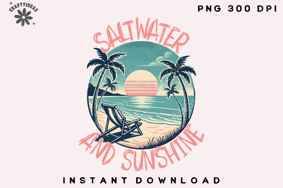
Best if you’re stocking a summer or beach-town shop. A single 300 DPI transparent PNG, and the only listing here that states commercial use is allowed in plain words, which matters if the shirts are going into a store rather than a closet. It ships as a PNG alone: no SVG or DXF, so it is not a cutting file.
Mini Lightening Bolt Sublimation
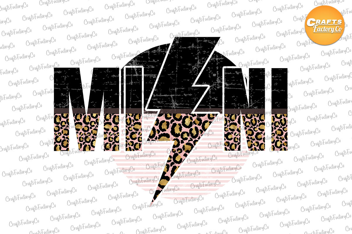
Best if you want left-chest and sleeve placements, not a full front. Same 14 × 14 inch, 300 DPI transparent file as the Mama Mini set, from the same designer, which makes it the natural second piece when you want a small mark on the pocket area and a large one on the back. It has the fewest saves of anything here, so treat it as a companion rather than a headline design.
Retro Mom Heart of the Family Png
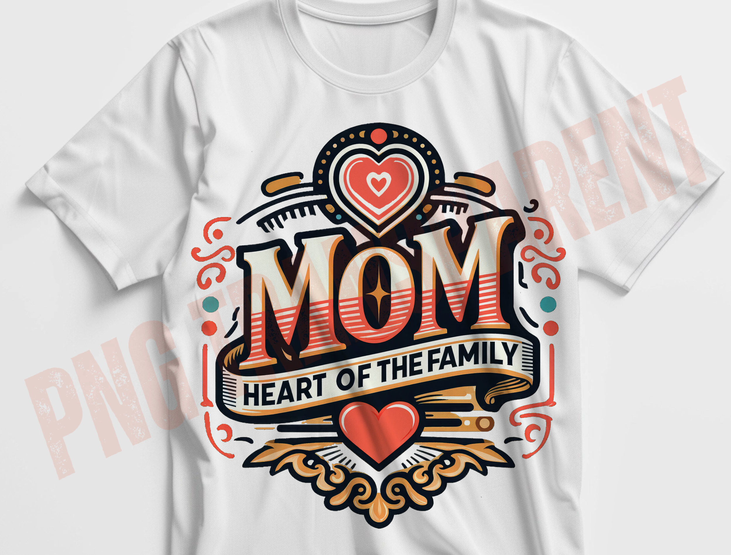
Best if you want one clean full-front adult print. The listing gives 3,000 × 3,000 pixels at 300 DPI, which is exactly 10 inches: a standard adult front and nothing wider, so plan the placement rather than the scaling. Clean shapes and readable lettering, which makes it one of the few here you can safely press on a 65/35 blend and let the fabric do the fading.
The design I left out, and why
Watercolor Spring Flowers 20oz Tumbler came up in the same search and looks lovely. It’s out because it’s a tumbler wrap, artwork laid out for a curved 20 ounce blank, sized and shaped for that seam. Press it flat on a tee and the composition stretches wrong. It’s a good file for the job it was made for, and that job isn’t shirts.
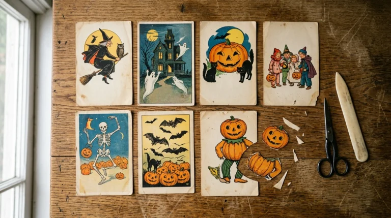
A vintage Halloween bundle got cut for a different reason: almost nobody had saved it. On a marketplace where saves are the only public signal of whether other makers actually use a file, a listing with a single save tells you nothing, and a first-time buyer shouldn’t be the one testing it.
Browse the full vintage sublimation catalog to run the same three checks on your own shortlist.
What to do after the press, so the print survives the customer
Two habits, both from the suppliers above, both free:
Wash the shirt inside out. That is the golden rule for any custom apparel: it keeps the print off the drum and off other garments. And wash in cold or lukewarm water; heat is what pushed the ink into the fibers in the first place, and repeated hot washes work against you.
If you sell these, put those two lines on the care card. A print that fades in the customer’s laundry becomes a review about your design, not about their washing machine.
Key takeaways
- Faded print, correct settings? Check the blank’s fiber content before you replace the design.
- Polyester percentage is roughly the percentage of color you keep. Below 65%, suppliers stop recommending it at all.
- A 65/35 blend produces the vintage fade by itself; pair it with clean artwork, not distressed artwork.
- Sublimation is invisible on black and navy. That is a method limit, not a file problem.
- Buy on three visible checks: 300 DPI, transparent PNG, a stated size. Pixels divided by 300 is your print width in inches.
- Mirror before printing. Wash inside out, cold.
See the bundles behind these picks
Sublimation designs: common questions
Why does my sublimation look faded?
Almost always the blank. Sublimation ink bonds only to polyester, so an 80% polyester shirt returns about 80% of the vibrancy and a 50/50 blend about half. If the fiber content is right and it still looks pale, the next suspect is press time or temperature, not the design file.
Do I still heat set the design before washing?
No. Sublimation is not a surface layer that needs curing the way heat transfer vinyl or DTF does; the press step already bonded the ink inside the fibers. Nothing extra happens before the first wash.
Can I stop a design from cracking or fading if I don’t want the distressed look?
Yes, by choosing the blank rather than the file. Press on 100% polyester and the ink holds everywhere, so the print stays saturated. The cracked, faded finish comes from cotton content in the blend releasing ink in the wash, so the higher the polyester, the less of it you get.
Can I sublimate a vintage design onto a black shirt?
No. The ink is transparent and tints the fabric instead of covering it, so on black or navy the design is effectively invisible. Dark garments need DTF or screen printing.
Is PNG or JPEG better for sublimation?
PNG, and it isn’t close. JPEG saves with a solid background, so a white box prints around your artwork on any colored blank. PNG supports transparency, which is why it’s the standard format on every sublimation listing worth buying.
Can I sell shirts made from these designs?
Check the licence line on each listing before you press a batch, because the wording is not identical across designers. Of the six above, Saltwater and Sunshine is the one that states commercial use in plain words on its product page; for the rest, read the licence section on the listing itself rather than assuming the marketplace covers it.
What size should a sublimation design be for an adult t-shirt?
Divide the file’s pixel width by 300. A 3,000 pixel file gives you 10 inches, which covers a standard adult front; a 4,200 pixel file gives you 14 inches, enough for an oversized front or a back print with room to scale down.
Browse the vintage sublimation designs yourself