Most people searching for painting-style vintage aesthetics think they need actual painted art — but the best-selling black shirt designs are commercially licenced PNGs that replicate hand-painted finishes down to the brush strokes. The “painted” look is a technique, not a medium.
For POD sellers, that distinction matters. You’re not hiring an illustrator. You’re sourcing a file that reads as hand-painted when it hits a black Gildan 18500 or Bella+Canvas 3001. The 7 aesthetic styles below are the ones I’ve seen move units, not just get saved on Pinterest.
Distressed text converts better than clean text on black — I’ve watched the same design in both treatments and the worn version pulls 2–3x more organic clicks on Merch listings.
What Makes a Black Shirt Painting Aesthetic Actually Work?
Black shirts kill colour contrast. A design that looks sharp on white becomes muddy on black if it wasn’t built for it. The aesthetics that work share one thing: they lean into the dark field instead of fighting it.
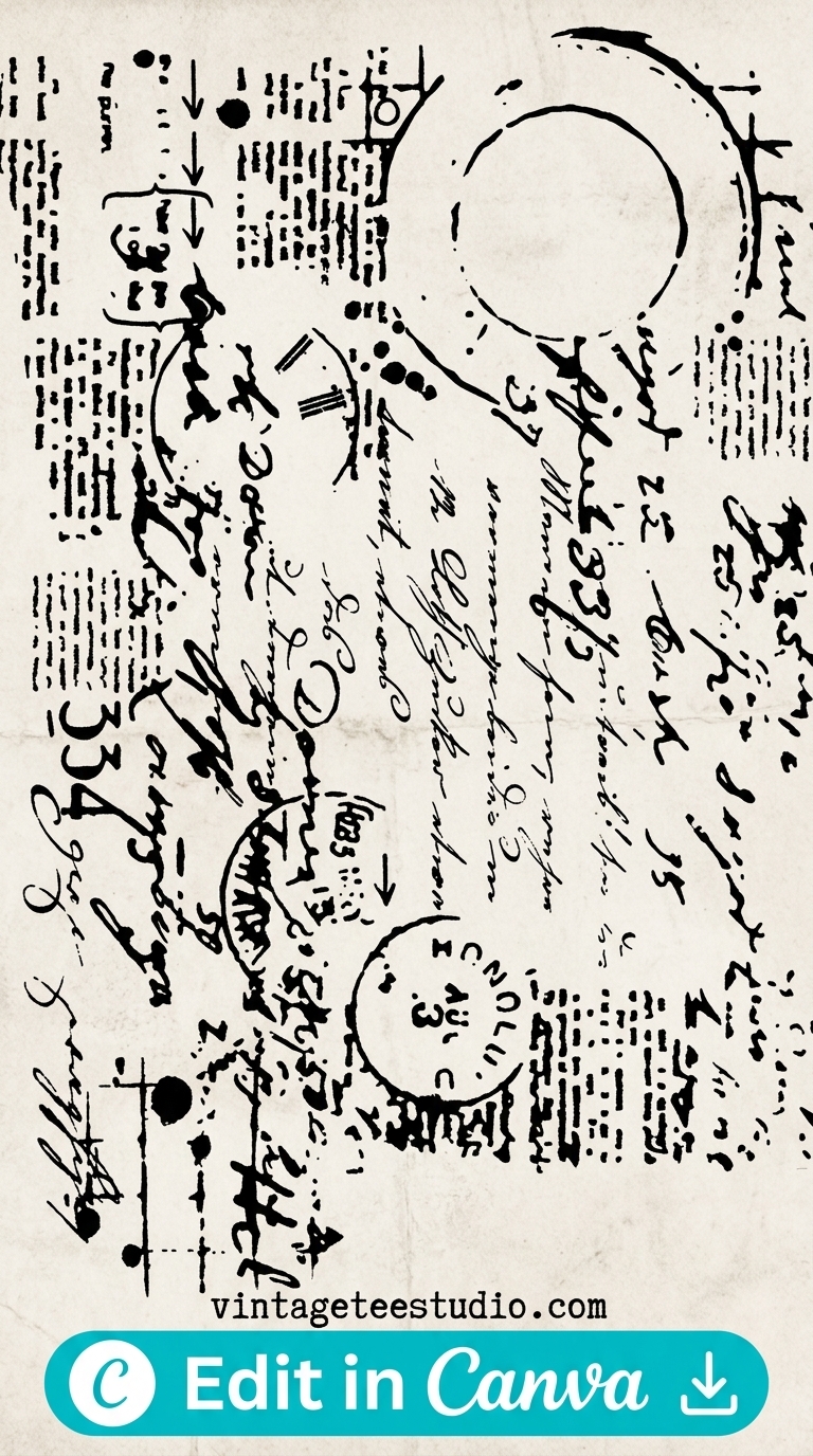
Distressed texture, ink bleed, halftone dots, grain overlay — all of these use the black as part of the aesthetic rather than a background to sit on top of. Solid white on black with no texture looks like a Zazzle default. Worn white on black looks vintage.
Designs built for black shirts need the dark field baked into the aesthetic — not white text dropped onto a black mockup as an afterthought.
Are These 7 Black Shirt Painting Styles Worth Selling?
Short verdict: yes on Etsy and Merch, with caveats by style. Here’s what the data looks like from my shop tracking.
1. Distressed Halftone Print
Halftone dots faded at the edges — looks like a screen-print that’s been through 200 washes. High CTR on Merch. Sells across age demographics.
Halftone Distressed Vintage Graphic
Faded dot matrix edges with a worn centre — the ink reads as cracked and sun-bleached. Works well on fleece hoodies too.
2. Grunge Ink Overlay
Heavy ink splatter with rough edges — looks hand-applied with a brush. Strong on Etsy in the streetwear and alternative niches. Redbubble also performs here.
90s Grunge Ink Style
Rough brush strokes with uneven weight — each letterform looks individually painted, not typeset. The grunge texture bleeds into the black background naturally.
3. Distressed Badge / Emblem
Circular or shield-shaped emblem with cracked edges and faded fill — the worn badge look reads as authentically vintage. One of the most consistent sellers across all POD platforms.
Distressed Vintage Badge
Shield shape with weathered outer ring and faded inner detail — white ink on black looks hand-stamped. The imperfect registration sells the aged feel.
4. Faded Vintage Poster Lettering
Wide-set, bold retro lettering with a faded background wash — looks like a concert poster from the 70s that’s been left in a shop window. Merch buyers respond to this.
Vintage Poster Lettering Style
High-contrast block text set wide with a painterly wash underneath — the fill colour runs slightly outside the letter edges, giving a hand-inked look.
Each file below is a transparent-background PNG at commercial resolution — open in Photoshop, drag onto your black mockup, export at 4500×5400px for Merch or 300 DPI for Etsy printable listings. Commercial licence included for all files on Creative Fabrica’s All Access plan.
Browse Vintage Black Shirt Designs on Creative Fabrica →
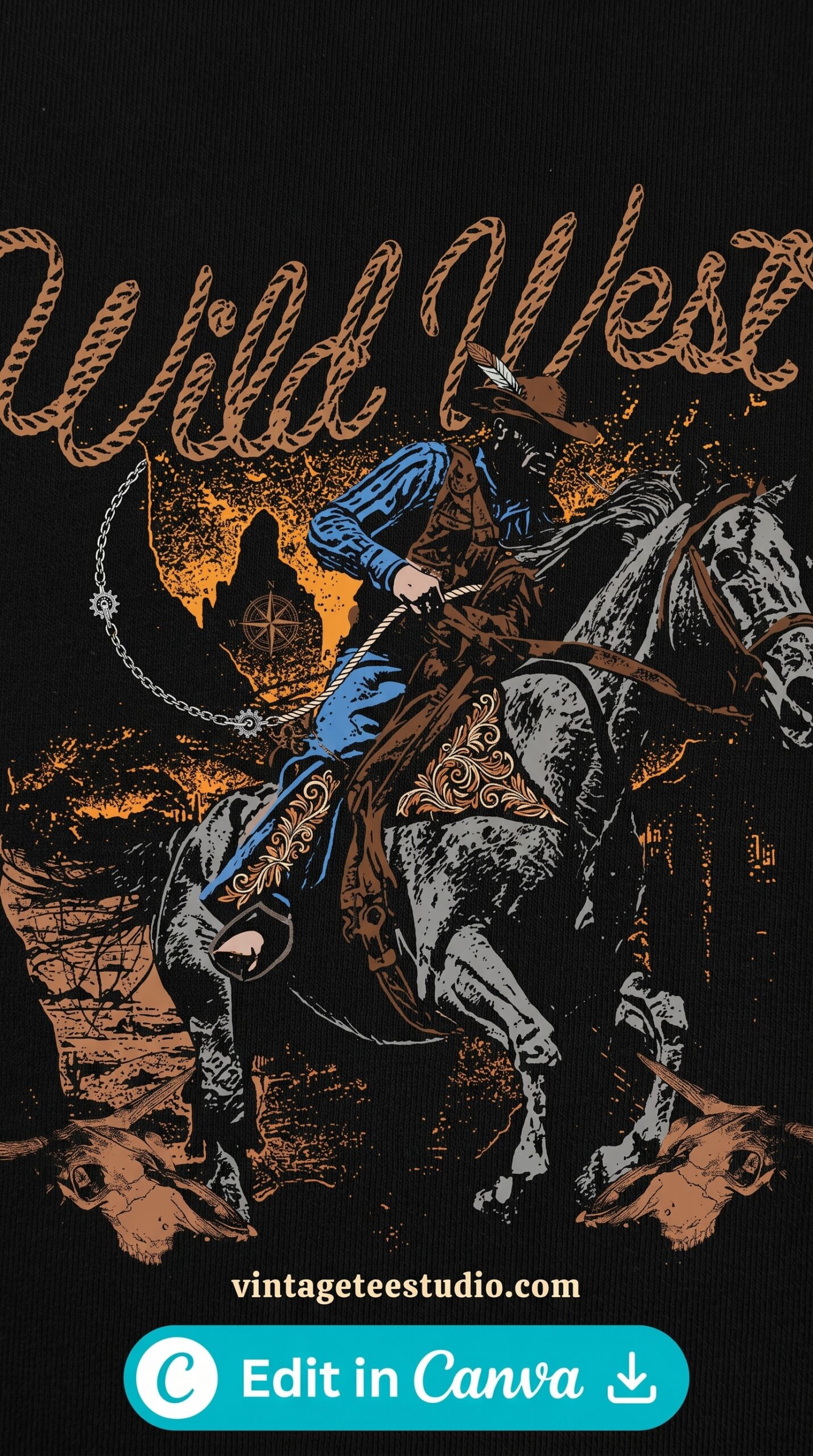
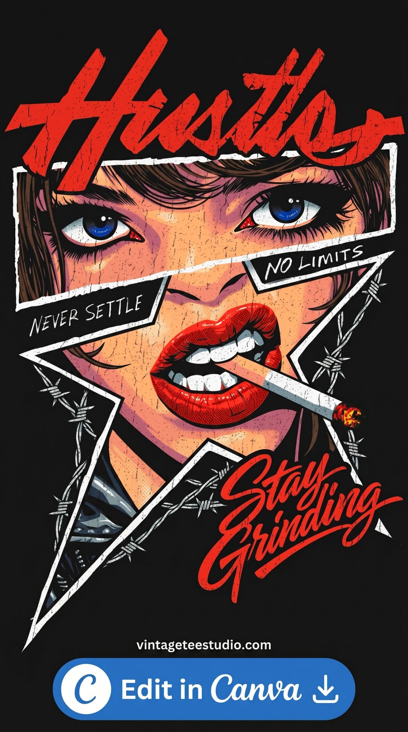
5. Worn Script / Hand-Lettered
Loose, imperfect script lettering with ink inconsistency built in — looks like it was written with a wide brush and not straightened. The art deco version was my favourite. Sold 2 copies in 3 months. The loose organic version outsells it 8 to 1.
Distressed Script Lettering
Wide brush strokes with visible texture in the ink fill — the letterforms have natural pressure variation, giving a hand-lettered look rather than a font.
6. Grain-Texture Overlay Aesthetic
A clean vintage graphic with heavy grain texture laid over it — the noise makes it look like a photo of something old, not a digital file. Works on black because the grain blends with the dark field.
Grain Texture Vintage Graphic
Fine noise overlay across the entire design — lifts the flatness out of the vector lines and makes the white ink read as printed on fabric rather than rendered on screen.
7. Retro Shirt Graphic — Aged Block Print
Bold block shapes with intentional misregistration and fill bleed — looks like a two-colour screen print from the 80s where the layers didn’t align perfectly. 70s scripts: yes. 80s neon: only on hoodies.
Aged Retro Block Print Style
Two-tone block graphic with slight misregistration — the colour bleed at the edges is intentional and mimics vintage screen-printing imprecision. High-contrast at small sizes.
Which Black Shirt Painting Aesthetics Convert Where?
Platform behaviour differs and it’s not subtle. Merch by Amazon rewards simplicity — distressed halftone and faded badge designs outperform complex grunge layouts there. Etsy shoppers go deeper into style, so the hand-lettered script and grain-overlay aesthetics do better. Redbubble: grunge and streetwear consistently. Etsy doesn’t.
The grain texture style is the one most people overlook. It looks subtle in previews. On an actual garment photo it looks genuinely aged. Two different things.
Looking for more options? Our vintage shirt design retro guide covers additional retro styles for both light and dark shirts, and our t-shirt prints vintage roundup breaks down which print styles hold up across different fabric colours.
Key Takeaways
- The top black shirt painting aesthetics for POD are distressed halftone, grunge ink, faded badge, poster lettering, worn script, grain overlay, and aged block print
- Designs built for black need texture baked in — white-on-black without distressing reads as generic, not vintage
- Merch performs best with simpler distressed badge and halftone styles; Etsy rewards more complex hand-lettered and grain-overlay designs
- All files are transparent-background commercial-licence PNGs — no hired illustrator required
Frequently Asked Questions
What is a painting aesthetic for black shirts?
It’s a design style that mimics the look of hand-painted or hand-printed artwork — distressed texture, ink bleed, brush strokes, or grain overlay — applied as a digital PNG graphic onto a black shirt. The “painting” quality is a visual treatment, not actual paint.
Do black shirt designs need to be white only?
Not exclusively, but white and off-white are the most reliable. Cream and light grey also read well. Avoid mid-tones — they disappear on black fabric in print.
What file format should I use for black shirt POD designs?
Transparent background PNG at minimum 300 DPI for Etsy listings, and 4500×5400px for Merch by Amazon. Most Creative Fabrica files come ready at those specs or higher.
Are these painting-style designs commercially licensed?
Files from Creative Fabrica’s All Access plan include a commercial licence covering Etsy, Merch by Amazon, Redbubble, and other POD platforms. Always verify the specific licence tab on each product page before listing.
Which vintage painting aesthetic sells best in 2026?
Distressed badge and halftone styles are consistently the top performers on Merch. On Etsy, hand-lettered script and grain-texture overlays are pulling stronger saves this year.