You upload a design, it prints, and the shirt comes back looking like a corporate promotional item. Flat. Digital. Nothing like the worn-in vintage look you were going for. The file looked right on screen. The print looks wrong in hand.
This is the most common POD problem in the vintage niche. The issue isn’t the printer or the platform. It’s the file — specifically, how the file simulates the physical printing processes that created authentic vintage t-shirt prints in the first place.
Here’s how to get a vintage t-shirt print that actually looks vintage, with design file characteristics that make the difference.
What Makes a Vintage T-Shirt Print Look Authentic?
Three physical processes created vintage t-shirt print aesthetics. Understanding them tells you exactly what to look for in design files.
Screen printing degradation: In real screen printing, the mesh has a specific thread count. Ink passes through the mesh openings and misses them randomly, creating a halftone-like grain in flat colour areas. This grain is non-uniform — denser near the centre of large flat areas, lighter near ink-boundary edges. Digital files that replicate this will have visible texture inside the colour, not just at the edges.
Ink fading: Washing removes ink from fabric. The fade is not uniform — raised fabric areas (texture, seams near print edges) lose ink faster. This creates a specific micro-pattern of ink loss that differs from a smooth colour gradient fade. Authentic vintage print files simulate this uneven micro-fade, not a smooth opacity gradient.
Print registration shift: Screen printing uses multiple passes for multiple colours. They never register perfectly. The slight misalignment between colour layers creates a characteristic “off-register” look — a 1–2px shift visible at ink boundaries. This is one of the most recognisable signals of an authentic screen print. Digital files that include this slight misregister read immediately as screen-printed.
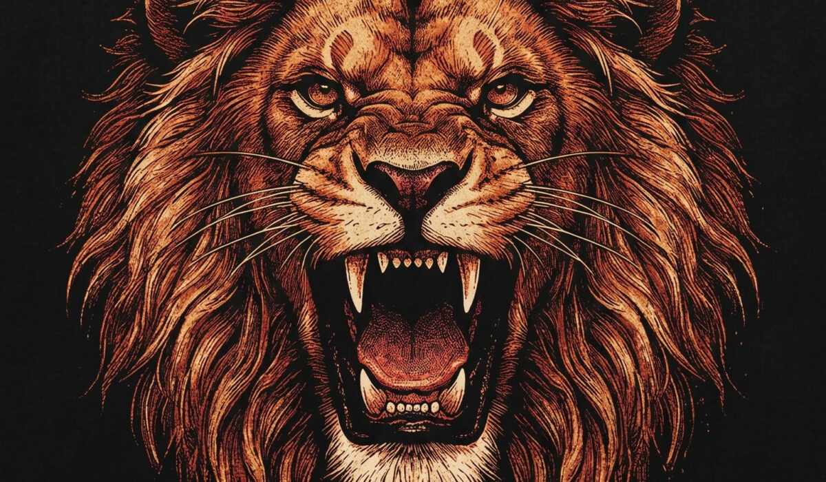
Screen-Print Simulation — Baked In
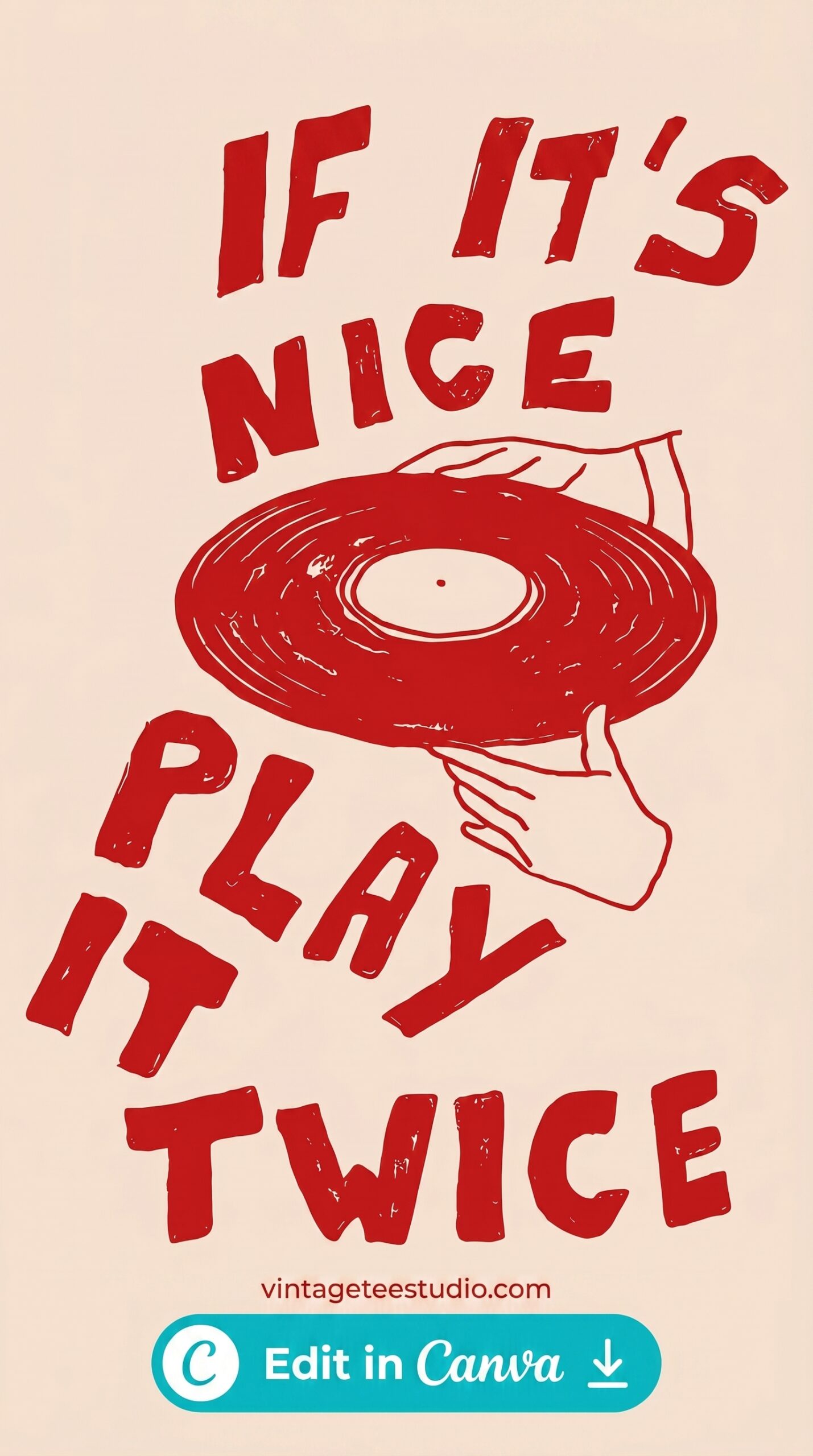
A design with grain texture distributed non-uniformly across the fill areas — heavier ink drop-out near the center of flat zones, cleaner at stroke outlines. The texture is in the file structure, not a layer on top. This is what authentic vintage print simulation looks like.
Distressing Techniques — What Works and What Looks Fake
Before and after: the two approaches to vintage t-shirt print distressing.
| Technique | What it produces | Does it look authentic? |
|---|---|---|
| Overlay distress (texture layer on top of clean design) | Uniform texture across entire design including edges — same grain density everywhere | No — reads as digitally processed, not screen-printed |
| Baked-in screen print simulation | Non-uniform grain inside fill areas, cleaner on stroke outlines, variable density | Yes — mimics the physical properties of real screen printing |
| Smooth gradient fade (opacity reduction) | Even fade from 100% to partial transparency, smooth edges | No — real fading is uneven and follows fabric texture, not a gradient |
| Micro-fade with halftone grain | Halftone dot pattern creates the appearance of colour fading with fabric texture interaction | Yes — the halftone pattern is physically accurate to offset and screen printing |
| Off-register colour shift (slight misalignment between layers) | 1–2px boundary shift at colour separation edges | Yes — the most immediately recognisable screen-print signal |
Halftone Grain — Authentic Fading Effect
A vintage print design using halftone dot patterns to simulate colour fading — the dots thin out progressively, mimicking how fabric texture interacts with ink loss during washing. Not a gradient. An actual halftone breakdown.
Heat Transfer vs. Screen Print for Vintage Effects
Most POD platforms use DTG (direct to garment) or sublimation, not traditional screen printing. Understanding the difference matters for vintage print accuracy.
DTG on a white shirt: print quality is high, colour accuracy is good, but the print can look slightly “digital” — perfectly flat, no ink variation between passes. The vintage simulation has to come entirely from the design file. The printer won’t add it.
DTG on a dark shirt: the printer lays down a white base coat first. This base coat adds a slight texture that actually helps vintage designs — the base coat imperfection plus the design grain compound to create a less-perfect, more printed appearance.
Sublimation: ink becomes part of the fabric. Completely flat. Even more “digital” in appearance than DTG. Vintage effects on sublimation shirts need to be even more aggressively built into the design file to compensate for the flatness of the process.
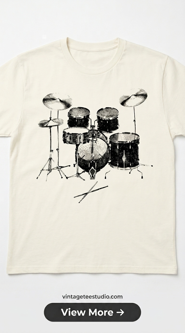
Each design file below is a commercial-licence PNG from Creative Fabrica — built with authentic vintage print simulation techniques, not overlay distress. Upload directly to your POD provider without modification.
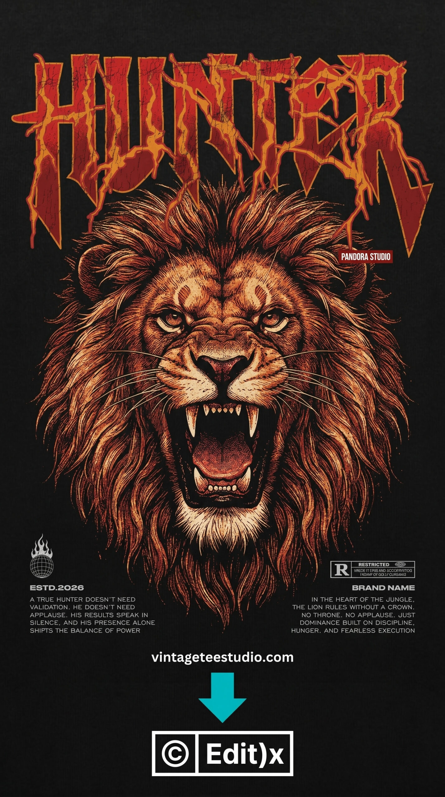
Distressed Badge — Authentic Print Technique
A badge design with variable ink density — the grain is heavier at the center of the fill areas and lighter at the boundary strokes. This distribution is the physical signature of a real screen-print pass, not a uniform texture overlay.
Grain Texture — Interior Fill Distribution
The grain in this design lives inside the flat fill zones — the colour areas, not the edges. This placement creates the screen-printing micro-degradation effect that buyers recognise subconsciously as authentic vintage, even if they can’t articulate why.
Browse Vintage Shirt Print Files →
File Formats and What to Look for Before Downloading
When evaluating a vintage print design file, five things to check:
1. Does the grain live inside the fill areas or only at the edges? Interior grain = authentic. Edge-only distress = overlay.
2. Is there visible halftone dot structure in any gradient transitions? If yes, the file simulates actual print production. If the gradients are smooth, it doesn’t.
3. Is there any slight misalignment between colour layers? Check at 200% zoom — a 1–2px off-register shift at colour boundaries is a positive sign.
4. Does the file come as PNG with transparent background or white background? For dark shirts: transparent. For white shirts: white background prevents edge halo on DTG.
5. What’s the resolution? 300dpi at 4500×5400px minimum for Printful and Printify. Lower resolution makes vintage grain texture look like JPEG compression, not screen printing.
For more on print styles and their commercial performance, our vintage t-shirt print styles guide covers the full range, and our vintage t-shirt art article goes deeper on the artistic side of print design.
Key Takeaways
- Authentic vintage t-shirt prints use three physical processes: screen-print ink degradation, fabric-texture-driven fading, and off-register colour shift — all must be simulated in the design file
- Overlay distress (texture layer on top of a clean design) always looks digital — grain must be baked into the fill areas of the design, not applied as a surface layer
- DTG printing does not add vintage character — all vintage effects must come from the design file, not the printing process
- Before downloading a file: check for interior fill grain, halftone structure in gradients, and off-register colour boundaries at 200% zoom
Frequently Asked Questions
How do I get a vintage print look on a t-shirt?
Use design files with authentic print simulation built in — not overlay distress. The grain should live inside the flat fill areas of the design, and any gradient transitions should use halftone dot patterns rather than smooth opacity fades. The file does the work; the printer doesn’t add vintage character.
What is screen-print simulation in a t-shirt design file?
Screen-print simulation replicates the physical imperfections of real screen printing — non-uniform ink grain in flat colour areas, halftone structure in gradients, and slight off-register between colour layers. These characteristics make a digitally-produced design read as screen-printed rather than digitally printed.
Why does my vintage t-shirt design look flat when printed?
The most common cause is overlay distress — a uniform texture applied over a clean design. This creates even grain across the entire image, which looks synthetic in print. The fix is to use a design file where the grain is baked into the fill areas non-uniformly, matching how real screen printing degrades over time.
What resolution do vintage t-shirt print files need?
300dpi at 4500×5400px for Printful and Printify standard adult sizes. Below 200dpi, the vintage grain texture starts to look like JPEG compression artefacts rather than authentic print degradation — the file needs enough resolution for the grain to render as intentional.
Does sublimation work for vintage t-shirt prints?
Sublimation produces a very flat, digital-looking print because the ink becomes part of the fabric with no surface texture variation. Vintage effects need to be much more aggressively built into the design file for sublimation than for DTG. High-grain, high-distress files work better than subtle ones on sublimation substrates.