Short answer: a screen prints one colour at a time, so the number of flat colours in a file decides what it costs you to print, and the file format decides whether you can separate those colours at all. Every design below was picked on two checks you can run on the listing before buying: an editable vector file is included, and the artwork is built from flat colour rather than gradients. One popular pack failed both and is named further down, along with the reason its own description contradicts its file list.
You bought a bundle called screen printing designs, unzipped it, and got one flat PNG of a seven-colour sunset. Nothing inside was separated. Nothing was on its own layer. The preview showed it on a black tee, so you assumed the file knew it was going on a black tee.
That is the gap between artwork sold for print-on-demand and artwork you can actually burn onto a screen, and almost no listing explains it. Here is what to look for instead.
Start here if this is your first screen
The only design in this group that ships a black-only version alongside the colour artwork. One screen, no separation work, no registration to align, and you can print it the same evening you download it.
A screen carries one colour, and that is the whole buying decision
Every ink colour in your design needs its own mesh screen, its own film positive, its own pass on press, and its own registration lined up by hand.
So a six-colour retro sunburst is not one design. It is six screens, six exposures, six alignments, and six chances for the registration to drift. Every extra spot colour adds cost and one more thing that can land a millimetre off.
Printing on a dark garment adds one more. The white underbase that stops the shirt from swallowing your colours is a white layer printed first on dark garments and it counts as an additional screen. That is why the same file is a one-screen job on a natural tee and a two-screen job on black.
Count the flat colours in the preview before you look at anything else. That number, plus one if the garment is dark, is how many screens you are committing to.
The file has to survive being turned into film, not just look sharp on screen
Screen printing goes through a physical intermediate step that sublimation and DTF skip: your artwork becomes a film positive, and that film gets burned into emulsion. Anything too fine to expose cleanly disappears there, not on press.
The numbers both sources agree on:
- Vector first. Vector is the non-negotiable standard for spot colour work, because separations are made by splitting shapes, and a flattened raster has no shapes to split.
- 300 DPI at final print size for any raster element, and 1200 DPI for halftone film positives. A file that is 300 DPI at four inches is 100 DPI at twelve.
- Halftones in the 45 to 55 LPI range for garment inks on standard mesh counts. That is coarse, and it is why photographic shading rarely reads on fabric.
- No live gradients. A file with unconverted gradient fills should never go to a spot colour print job: gradients have to be converted to halftone artwork by hand before delivery.
That last one catches most retro artwork. The faded sunset stripe that makes a design look like it came off a 1974 tour shirt is often a gradient, and a gradient is not a colour a screen can hold. Someone has to turn it into dots first, and if the file arrives flattened, that someone is you.
| What is in the zip | What happens on press | Buy it for |
|---|---|---|
| SVG, EPS or AI, flat colours | Separates in minutes, one screen per colour | Screen printing, any garment colour |
| SVG plus a one-colour black version | Ready as-is for a single screen | Your first print, and short runs |
| Vector with gradients | Needs halftone conversion before film | Only if you are comfortable in Illustrator |
| Flattened PNG, no vector | Nothing to separate; redraw or send to DTF | DTF and sublimation, not screens |
Check which files ship print-ready
The worn look you are paying extra for is two squeegee passes
This is the part that changes how you shop. Distressed, cracked, faded artwork carries a premium on every marketplace. On a screen press you get the same finish for free, by pulling less ink.
The comparison has been printed rather than argued. Lean on the squeegee and cover the design four or five times before lifting the screen and you lay down a thick, solid coat of ink, the kind that cracks as the garment is washed and worn. Pull the same screen twice with lighter pressure and less ink goes through: lift it and the design already looks worn.
The flaw everyone tries to avoid is the effect everyone is buying. In her words, white ink has a natural tendency to look faded on dark fabrics and can also crack when washed and stretched, and her advice for a vintage finish is to lean into exactly that, with the note that as you wash and wear your shirt, you’ll notice it continues to have more cracking.
Which gives you a rule when you shop: buy clean artwork and fade it on press, or buy distressed artwork and pull it heavy. Do both and the design closes up into mud. It is the same trap that catches people choosing sublimation designs, where the poly-cotton blend does the fading for you and pre-distressed art doubles it.
Find clean artwork you can fade yourself
Where these files stop working
Screen printing has a floor for detail, and it sits much higher than a screen preview suggests. Strokes want 1 to 1.5 pt, roughly 0.35 to 0.5 mm, depending on mesh count, and chest type wants 6 to 8 pt minimum. The reason is physical: lower mesh counts and larger halftone dots cannot hold thin lines, fine detail or small type.
Three things fall through that floor regularly, and all three are common in retro artwork sold for shirts:
- Speckle and grain textures. The scattered dots that read as vintage wear are usually far below the stroke minimum. They either clog with emulsion or wash out of the screen entirely, and you find out after burning the screen.
- Hairline stripes in sunburst backgrounds. They look even in the preview, then print thick at the wide end and broken at the narrow end.
- Thin script and small subtitle text. Below 6 pt on a chest print, the counters in letters like a and e fill in.
If a design you love has all three, it is not a bad file. It is a DTF file, or a white vintage shirt design where the fine texture sits on light fabric with no underbase fighting it.
Four picks, and what each one costs you in screens
Every design here includes an editable vector file, so the colours can be separated. Under each one is the honest count: how many screens it is as drawn, and what it becomes if you simplify it.
Unlimited creative assets. Access to AI tools.
Commercial licence included.
Get downloadsRetro Vintage Sunset T-Shirt Design SVG
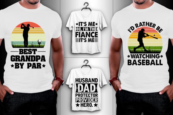
Best if this is your first screen. The only listing in this group that ships a one-colour version outright: alongside the four editable SVG and EPS files, the pack includes four black-only PNGs of the same artwork. That black version is a single screen, no separation work, no registration to align. The full-colour version is a five to six screen job, so treat the pack as two different products in one zip. Worth knowing before you buy: the file list on the page is the only detail the seller gives, so read it line by line. Open the previews at full size and count the colours yourself.
Galentine Gang Retro T-Shirt Design
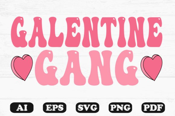
Best if you want thick shapes that cannot fail. Groovy wavy lettering in two pinks with white highlight dots, and every stroke in it is far above the 1.5 pt floor, so nothing here is at risk of dropping out of the screen. It arrives as AI, EPS, SVG, PNG and PDF, which is the widest format list in this group. Two screens on a light garment, three on a dark one once the underbase is counted.
Bear Silhouette Retro T-Shirt Design SVG
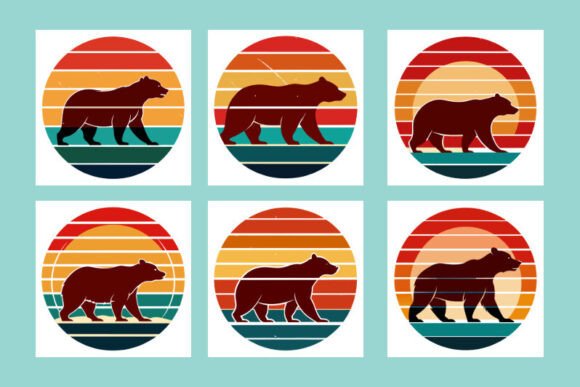
Best if you sell the same design six ways. Six sunburst variants of one bear silhouette, all flat colour with no gradient anywhere, in SVG plus PNG and JPG at 4000 × 2663 pixels, which is 13 inches wide at 300 DPI. As drawn each variant is six or seven screens. The useful move is to open the SVG, delete every stripe colour but one, and print the silhouette over a single band: one screen, and it still reads as the same design.
Unlimited creative assets. Access to AI tools.
Commercial licence included.
Get downloadsRetro Vintage Beach T-Shirt Design SVG
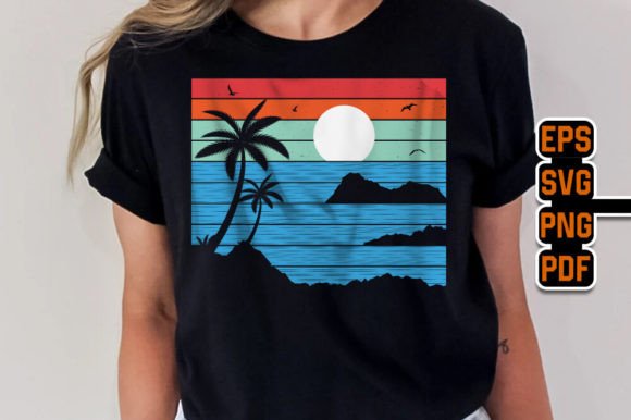
Best if you print on dark garments and want the fade built in. The distress here is cut into the stripes as visible gaps rather than sprayed on as fine grain, which is the version of a worn texture that actually holds on a screen. Files are EPS, SVG, PDF and a 4500 × 5400 pixel PNG, so 15 inches wide at 300 DPI. Read its licence line first: the licence says outright that you cannot resell the designs as digital products, which rules out reselling the file itself but not printed shirts.
See what a full bundle includes
The design I left out, and why
Catch the Wave, Summer Vibes Retro is the better looking design of the lot: a surfer inside a breaking wave, palm trees, a striped sunset, mocked up on a black tee. It is out because of what the listing actually delivers.
Under You Will Get it lists one item: a single print-ready PNG. Three lines further down, in the same description, it promises Editable Vector Files EPS 10, and SVG. Both statements are on the same page. Whatever the seller meant, you cannot separate a flattened PNG into screens, and the multi-colour distressed artwork on a dark shirt would need an underbase plus five or six colours if you redrew it.
That contradiction is worth learning to spot, because it is a copy-paste artefact repeated across hundreds of listings. The file list under You Will Get is the part that is specific to the product. The paragraph of features underneath is frequently boilerplate the seller reuses on every upload.
Browse the full retro design catalog and run the same two checks on your own shortlist.
How to check a design before you buy it
- Read the file list, not the feature paragraph. Look for the line that begins You will get or Files included and count the formats named there. SVG, EPS or AI means separable. PNG alone means not.
- Count the flat colours in the largest preview. Add one if you are printing on a dark garment. That is your screen count.
- Zoom the preview to full width and look at the thinnest element. If the finest line is hairline at preview size, it is below the stroke floor at print size.
- Divide the stated pixel width by 300. That is your maximum print width in inches, and it is the size the 300 DPI claim applies to.
- Find the licence line on the listing itself. Printing shirts and reselling the digital file are different permissions, and sellers word them differently.
Browse the vintage shirt designs
After the print, before the wash
One step gets skipped more than any other, and it is the one that decides whether your print survives its first laundry. Heat setting is not optional on a water based ink print: skip it and the design washes out.
Water-based ink has to be cured with heat before it goes anywhere near water. That is the opposite of sublimation, where the press step already finished the job. If you are moving between the two methods, this is the habit to carry across.
Key takeaways
- Colour count, not resolution, is what a screen printing design costs you. One screen per colour, plus one for the underbase on dark garments.
- No vector file means no separations. A flattened PNG is a DTF or sublimation file being sold under the wrong name.
- Gradients are not printable colours. They have to be converted to halftone dots, and garment halftones sit at a coarse 45 to 55 LPI.
- Strokes under 1 to 1.5 pt and text under 6 to 8 pt do not survive the screen, whatever the preview shows.
- The worn finish is two squeegee passes instead of four or five. Buy clean art and fade it on press, or buy distressed art and pull it heavy, never both.
- Cure water-based ink with heat before the first wash.
Screen printing designs: common questions
What file format do I need for screen printing?
A vector file: SVG, EPS or AI. Colour separations are made by splitting the shapes in the artwork onto separate screens, and a flattened PNG or JPEG has no separate shapes left to split. Raster elements inside a vector file are acceptable at 300 DPI at the final print size, but the artwork itself should be vector.
How many colours can I screen print at home?
As many as you have screens and registration patience for, but each colour is a separate screen, film positive and pass on press. One and two colour designs are where home setups stay pleasant. If a design needs five or six, it is usually cheaper in time to simplify it in the SVG than to print it as drawn.
Can I screen print a PNG design?
Not directly. Someone has to redraw or trace it into vector shapes first, and auto-trace on a distressed texture generally produces thousands of tiny fragments that will not expose cleanly. If the pack you bought is PNG only, it is a better fit for DTF or sublimation than for a screen.
See designs bold enough to hold
Why did my thin lines disappear from the screen?
They were below the mesh floor. Strokes need roughly 1 to 1.5 pt depending on mesh count, and lower mesh counts with coarser halftone dots do not hold small details, thin lines or small type. The line was in the film and did not survive exposure or washout.
How do I get a faded vintage look without buying distressed artwork?
Pull less ink. Two passes with light pressure lets less ink through the screen and lifts off a design that already looks worn, where four or five heavy passes give solid coverage that cracks later instead. White water-based ink on dark fabric is the easiest place to see the difference.
Can I sell shirts printed from these designs?
Printed shirts, generally yes, but check the licence line on each listing rather than assuming. The beach design above states in plain words that you cannot resell the designs as digital products, which is a different restriction from printing and selling garments. Sellers word this inconsistently, so read the product page itself.
Do I need to mirror artwork for screen printing?
No. That is a sublimation and heat transfer habit, where the printed sheet goes face down onto the blank. Screen printing pushes ink through mesh directly onto the garment, so the design goes on the screen the same way round it goes on the shirt.
Browse the screen printing designs yourself