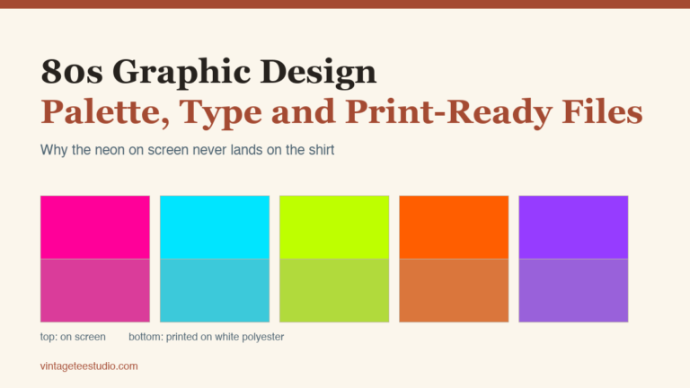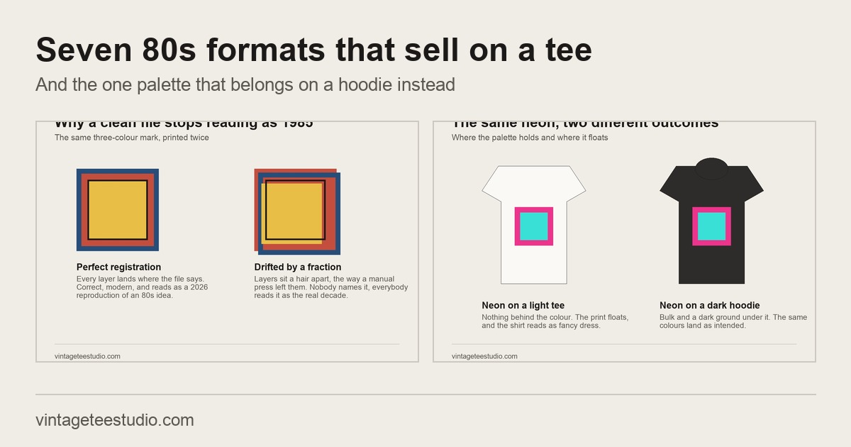
Quick answer: The 80s shirt graphics that actually sell are not the neon ones. Seven formats carry the era without it: retro varsity, halftone screen print, distressed band artwork, worn logo, transitional 70s to 80s wordmark, halftone-faded graphic, and outdoor heritage badge. Neon belongs on hoodies, and that single split explains most of the difference between a design that moves and one that sits.
The 80s shirt aesthetic is the most recognisable on the print-on-demand market and the most misread. Ask anyone to picture it and you get neon, hair bands, a sunset grid. That is the costume version of the decade, assembled decades later out of the three things people remember. The shirts people actually wore in 1985 were varsity blocks, team emblems and misregistered screen prints in four muddy colours, and those are the formats that still hold up on a garment today.
The format to start with, before the other six
Retro varsity graphic: bold block letters, a felt-patch border, a banner or shield holding the whole thing together. It is the one 80s format that reads correctly on both a light and a dark garment without a second version of the file, which is why it is the safest first purchase of the seven. Everything below is a variation on how much wear you want visible.
What actually defines an 80s shirt, once the neon is set aside
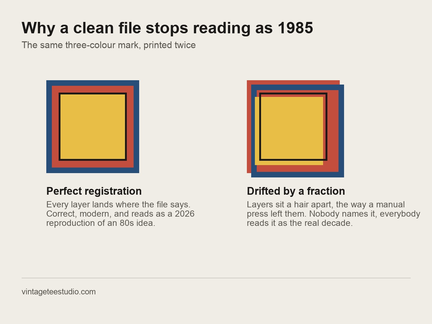
Strip the costume version away and the decade has a specific graphic language: varsity lettering, band graphics, sports emblems, geometric backing shapes, and the halftone dot that a commercial press left behind. Those elements came from the printing technology of the time rather than from taste. Four-colour separations on a manual press drifted a fraction of a millimetre, so edges doubled slightly; ink sat on top of the cotton rather than in it, so it cracked along the fold lines first. A design that reproduces those artefacts reads as 80s to a buyer who cannot say why. A design that reproduces only the palette reads as fancy dress.
That is the practical reason the neon question keeps coming up and keeps getting answered the same way. Neon on a hoodie works, because the garment is bulky, the print sits on a dark ground, and the whole object is already a costume piece. The same palette on a tee has nothing to anchor it. Open the current 80s shirt files and the split is visible in the previews: the graphic-heavy listings are mocked up on tees, the neon ones on hoodies, and the sellers did not decide that by accident.
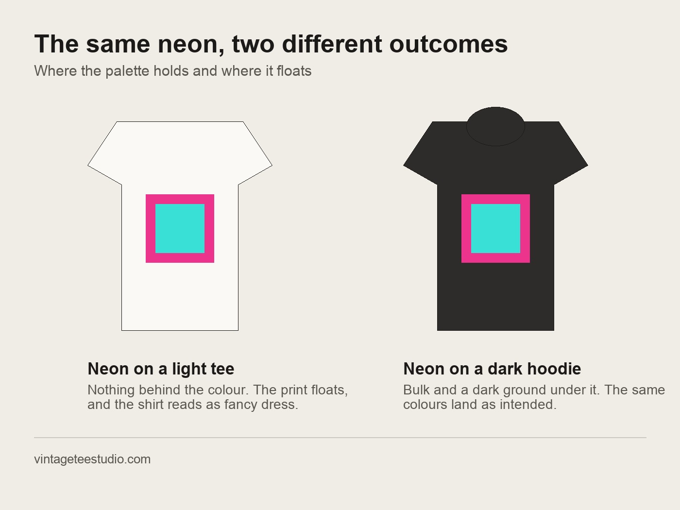
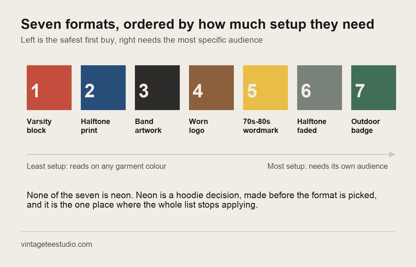
The division worth remembering: 80s neon sells on hoodies. Varsity, band-style and halftone screen print sell on tees, across platforms. Picking the wrong side of that line is the single most common way an accurate 80s design still fails to move.
The 7 formats that carry the era on a tee
Each of these is a distinct graphic language, not a palette swap of the one above it. They are ordered by how forgiving they are for a first buyer: the varsity block at the top needs the least setup, the outdoor badge at the bottom the most specific audience.
Unlimited creative assets. Access to AI tools.
Commercial licence included.
Get downloads1. Retro varsity graphic
Block letters with a felt-patch border and a banner element, dimensional enough to imitate an iron-on. The most platform-agnostic of the seven: it holds on cream, white and black without recolouring, and it does not depend on the buyer recognising a specific reference.
2. 80s halftone screen print
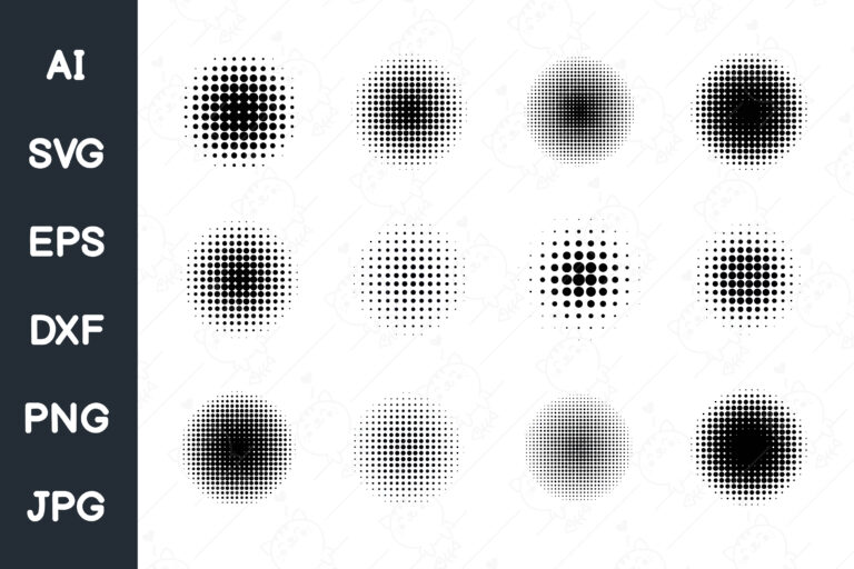
Multi-colour print with the halftone dot left visible and the layers slightly out of register. The misalignment is the point; a perfectly aligned version of the same artwork loses the era immediately. High contrast at chest-print size, which is where most of these files are judged.
3. Distressed band-style artwork
Heavy lettering with rough worn edges, the ink reading as hand-pulled rather than digital. Irregular stroke weight is what sells it. A narrower audience than the varsity block, but a repeat-purchase one: buyers in the rock and alternative categories tend to come back for a second and third file.
4. Worn 80s logo format
An emblem in period style with geometric framing, distressed fill and cracked interior detail. It carries the decade without a single bright colour, which is the useful property here: it works on the garment colours that neon cannot survive.
5. Transitional 70s to 80s wordmark
Wide slab serifs with a geometric backing shape and a warm palette shading toward the brighter end. It sits on the seam between two decades, which widens the audience rather than splitting it, and it holds on cream as well as on black.
6. Halftone distressed graphic
The washed version: dot-matrix fade at the edges, halftone pattern in the fill, reading as a shirt that has been through the machine several hundred times. It works at two distances, as a worn print across a room and as visible texture up close.
7. Outdoor heritage badge, 80s treatment
A circular emblem with a mountain or club motif in a bolder colour treatment than its 70s equivalent. The most specific of the seven, and the one that reaches two categories at once: vintage and outdoor lifestyle.
What this list does not tell you
An honest limit before the file specs. These seven are format categories, not individual verified listings, and a category can be right while the specific file inside it is wrong. Two designs in the same varsity format can differ enormously in whether the edges hold at print size, and that is not visible in a thumbnail scaled to a grid. Open the preview at full size before buying, every time, and look at the edge of the lettering rather than at the composition.
The second limit is that the neon-on-hoodies split is a pattern read off how sellers mock up their own files, not a figure from a sales report anyone publishes. It has been consistent everywhere on this platform, and it matches how the garments behave physically, but treat it as a working rule rather than a measured one. If your own listings say otherwise, your listings win.
The way to settle it for your own shop is to buy one file from the safest format and put it on both garments. Start with the varsity file
How to check an 80s shirt file before you download it
1. Open the preview at full size, not in the grid
Grid thumbnails hide edge quality. The distressing on a band-style graphic either has real irregular texture or it is a filter applied over clean vector edges, and that is only visible at full scale.
2. Confirm the background is genuinely transparent
A PNG can be saved with a white rectangle behind the artwork and still be called transparent in the listing text. On a dark garment mockup this shows up instantly as a box around the design.
3. Check the pixel dimensions against the platform
4500 by 5400 pixels is the working size for Merch by Amazon; 300 DPI at the intended print dimensions is the bar for a printable listing elsewhere. A file below that upscales badly and the halftone dot is the first thing to break.
4. Match the format to the garment before the palette
Decide tee or hoodie first, then pick the format, then worry about colour. Doing it in the other order is how a technically correct 80s design ends up on the wrong product.
The same test that decides whether a mark survives a small print applies here as well, and it is covered in vintage logo design. The halftone question runs through screen printing designs, and the file preparation side is in t-shirt PNG for sublimation.
What designs actually count as an 80s vintage shirt?
Varsity graphics, halftone screen prints, distressed band artwork and worn logo formats. The neon-and-hair-band version is a later reconstruction of the decade, not what the shirts of the period mostly looked like.
Does 80s neon ever work on a tee?
Rarely, and it needs a dark ground and a bold graphic underneath it to hold. On a hoodie the same palette works far more often, because the garment is already reading as a costume piece.
What is the difference between 80s vintage and 90s grunge shirt styles?
80s vintage leans on bold colour, varsity lettering and geometric shapes. 90s grunge uses rougher typography, heavier distressing and darker palettes. Both sell, to noticeably different buyers.
What file format do I need for these designs?
A transparent PNG at 4500 by 5400 pixels for Merch by Amazon, or 300 DPI at the intended print size for a printable listing elsewhere.
Why does misregistration matter in a halftone print?
Because it is the artefact of the press that produced these shirts originally. A perfectly aligned reproduction of the same artwork loses the period signal, even though it is technically the cleaner file.
Browse the current 80s shirt files