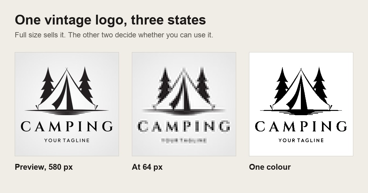
Short answer: a vintage logo design has to survive two things the listing preview never shows you: being shrunk to a 64-pixel avatar, and being flattened to one colour for a screen, a stamp or an embroidery file. I put 30 vintage logo files from a single search page through both. Nineteen stayed readable at 64 pixels. Nineteen held their shape at one colour. They were not the same nineteen, and that gap is the whole buying decision.
A logo almost never gets used at the size it was drawn. It gets used at 64 pixels next to a username, embroidered an inch and a half wide on a cap, and burned into one screen for a run of tees. The preview shows the mark at about 580 pixels wide, on white, in full colour, which is the one context where every file looks competent.
The one that passed both tests with the least effort
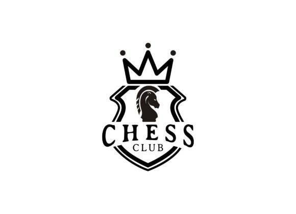
Classic Chess. A chess piece is one of the few objects whose outline alone identifies it, so there is nothing left to lose when the mark gets small or flat. If you have not decided yet where your logo will end up, this is the shape that costs you the least when you find out.
Test one: 64 pixels, because that is how most people will see it
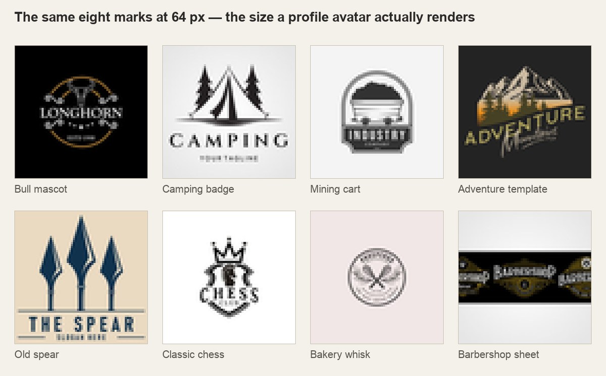
I rendered all 30 previews into 64-pixel squares, the size of an avatar, a favicon, a tab icon. Pass meant two things at once: you can still tell what the object in the mark is, and the brand word is still legible. Mark-only designs were judged on the mark alone.
 Pin it
Nineteen passed. Eleven collapsed. The eleven failed in four repeating ways:
- Hairline strokes. Engraving-style line work is the fastest way to make a mark feel expensive at full size, and the first thing to vanish at small size. One pixel of stroke is not one pixel of ink.
- Pale gold or pastel on cream. The palette that reads as aged at full size has almost no contrast left once the shape is a thumbnail.
- Bundle sheets. Several listings are twelve or forty marks laid out on one preview. At 64 pixels the whole sheet becomes grey texture and you learn nothing about any individual mark inside it.
- Dense text rings. Words curved around a circular badge are the signature of the form and the first thing to turn into a smudge.
What passed shared one shape: a single solid silhouette, plus at most one short word in heavy capitals. That is a narrow description, and it is worth applying it as a filter before you read a single product description, open the vintage logo results and shrink the previews first, then decide what you like.
Test two: one colour, because that is how it gets printed
Then I pushed the same 30 previews through a hard threshold. Full desaturation, extreme contrast, every pixel either black or white. That is roughly what a design has to do to work as a one-colour screen print, a rubber stamp, an embroidery file or a foil block.
 Pin it
Nineteen held their shape. Eleven fell apart. The failures were different in character from test one: shading built out of colour rather than line, two mid-tones sitting next to each other that both crushed to black, and gradients standing in for form.
The two sets of nineteen are not the same nineteen. A hipster mushroom mark read perfectly at 64 pixels and dissolved into a blob at one colour. A witch-themed mark did the exact opposite: unreadable small, rock solid in black and white. Passing the thumbnail check tells you nothing about whether the file will screen print.
That cross is the part no listing will tell you, because both properties are invisible in a full-colour preview at 580 pixels. It is also why looks vintage is a useless buying criterion. What you are actually buying is a shape with enough mass to survive being made small and being made flat. The mining cart badge is the cleanest example of that construction in the set, filled blocks instead of outlines, which is why it came through the threshold with nothing lost: look at how it is drawn before you judge any other badge on this page. If you already know the mark is heading for a screen, the same logic runs through the whole order. It is what decides which screen printing designs a printer will take without a redraw.
Before the picks, the honest limitation
I tested previews, not the files themselves. Some of those previews are mockups, some are sheets of many marks, and they were rendered on a high-density screen, which flatters fine detail. So my count runs generous: if anything more than 11 of 30 would fail in real use, not fewer. Treat 19 out of 30 as a ceiling, not a score.
Six vintage logo designs that passed both tests
These are six of the nineteen that survived the thumbnail and the one-colour threshold, picked one per use case rather than by looks. Every one of them is a single dominant silhouette. That is not a coincidence, it is the whole finding. One thing they were not picked on: none was judged by ratings, reviews or download counts, because those numbers say how many people bought a file, not whether it holds up at 64 pixels.
Unlimited creative assets. Access to AI tools.
Commercial licence included.
Get downloadsCountry Western Bull Cattle, a retro mascot logo design
A front-facing bull head with the horns carrying most of the visual weight. It is the clearest example in the set of why a retro mascot survives shrinking: the silhouette is recognisable from the outline alone, so losing interior detail costs you nothing. Best if you are branding something that will end up embroidered on caps. One thing to watch: its preview is white on black, so budget a minute to invert it before anyone quotes you for print.
Camping Icon and Symbol, the outdoor badge that stays readable
Tent and trees inside a plain frame, no curved text ring. That missing text ring is exactly why it passed test one while several better-looking badges did not. Best if you need one mark that works as an app icon and as a patch without redrawing it.
Badge Coal Mining Cart, a vintage badge logo with real mass
The cart is drawn as a filled block rather than as outlines, which is what carried it through the one-colour threshold intact. If you want the classic badge look but intend to print it in a single ink, this is the construction to copy. Best for workwear, brewery and trade branding.
Unlimited creative assets. Access to AI tools.
Commercial licence included.
Get downloadsAdventure Template, a retro logo you can rename
Built as a template, so the wordmark is meant to be swapped for yours. Test it again after you swap it: the shape passed with its own short word set in heavy capitals, and a long business name in a lighter weight will undo that. Best if you are naming something now and want the layout decided for you.
Old Spear, the minimal end of vintage logo work
Almost nothing to it: one object, one weight, no frame. That is why it survives everything, and also why it will not carry a brand on its own without a wordmark next to it. Best as a secondary mark, a stamp or a hang-tag icon rather than a primary logo.
Classic Chess, a clean outline that identifies itself
The safest pick in the set for anyone who has not decided where the logo will be used, for the reason at the top of this page: the outline carries the whole identification. Best for clubs, cafes and anything that wants a crest without a coat of arms.
Two that failed, and why they are the ones people click first
The balloon whisk bakery mark. Search for a bakery logo in a vintage style and you turn up a lot of whisk-and-wheat emblems; this one is the archetype. It failed test one and passed test two, which is the exact combination that catches people out. The whisk is a fan of thin wires inside a ring of curved text, so at 64 pixels the ring becomes a grey band and the wires become a smear. Under the one-colour threshold it holds, because the wires stay separate and the ring stays open. So it will stamp on a paper bag and it will not work as your profile picture. If a bakery mark is what you came for, none of the six above is bakery-specific. Run the same two tests across the bakery results and keep the ones without a text ring.
The barbershop set. A sheet of barbershop marks is good value on paper and failed test one for a structural reason: the preview is a contact sheet, so no individual mark inside it is legible at thumbnail size and you cannot judge what you are getting. The same is true of the large retro bundles and the logo creation kits full of badges and stamps. They may well contain excellent marks. You simply cannot tell from the listing, and that uncertainty is the thing you are buying.
None of that makes bundles wrong. It makes them a different purchase: you are buying raw material to build with, not a finished mark to use. Judge them on whether the pieces are editable, not on the preview.
Run the two tests yourself, in about thirty seconds
1. Save the preview and shrink it
Drag the listing preview to your desktop and set its width to 64 pixels. On a phone, pinch it down until it is roughly the size of a profile picture. If you cannot say what the object is, stop there.
2. Strip the colour
Open it in any editor and pull saturation to zero, then push contrast to the maximum. Everything becomes black or white. If shapes merge into each other or a limb disappears, the file will not screen print, stamp or embroider in one colour.
3. Check what is actually in the download
Look for an editable vector file in the file list, not only a flat image. Without it you cannot recolour, resize past the supplied resolution, or separate colours for print, and you cannot outline the text if a font was used.
4. Read the licence line before the review count
The question is whether the licence covers using the mark as a business identity and putting it on things you sell. Some design files are licensed for personal or print-on-demand use in a way that does not extend to trademarking a logo.
Thirty seconds per candidate, and it is what separates a considered pick from a coin flip. Line up a few candidates and run them through both before you open your wallet.
What the file list has to contain
The doubt worth naming is the plain one: you buy the file, open the zip, and find it unusable. That is not paranoia, it is the most common outcome when the only thing you looked at was the preview. The two tests catch the design problems. The file list catches the rest:
- Vector included. An editable vector is what makes the mark resizable and separable. A high-resolution image is not a substitute.
- Transparent background. A white square behind the mark is a white square, not a transparent one, and it will show on anything that is not white.
- Fonts outlined or named. If the wordmark is live text and the font is neither included nor outlined, you will open the file to a substituted typeface.
- One mark or a sheet. Decide which you are buying before you click, not after.
Two of the six above ship as templates rather than finished marks, so the font question decides whether they are usable on day one. Check the file list on the templates before you pick between them. And if the mark is heading onto fabric rather than a screen, the same shape rules meet a different set of constraints in sublimation designs, where how a file handles white decides the result.
Questions
Does a vintage logo design need to be a vector file?
For a logo, yes. A vector is the only version you can scale to a sign and down to a favicon without redrawing, and the only one from which colours can be separated for one-colour printing or embroidery. A raster image is fine as a graphic, but it is not a logo asset.
Why do retro logo designs fall apart at small sizes?
Because the style is built from the things that disappear first: hairline engraving strokes, curved text rings and low-contrast aged palettes. In my sample of 30 files, 11 stopped being readable at 64 pixels, and those three traits accounted for almost all of them.
Can I use a retro futurism logo for a business identity?
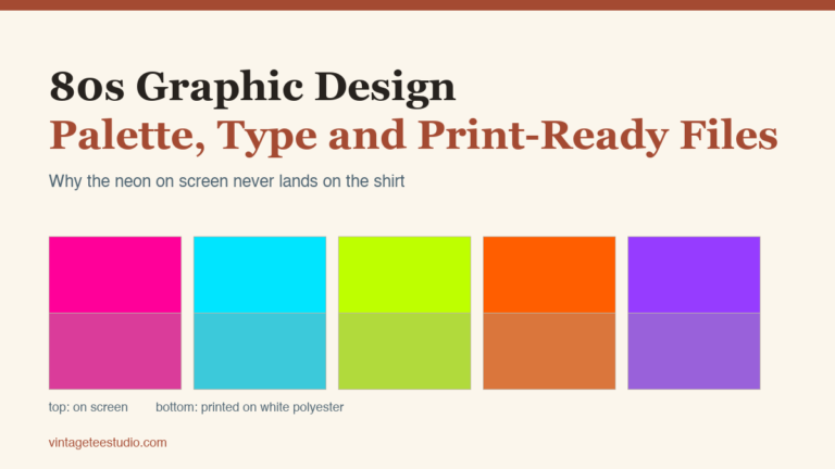
Technically yes, and structurally it is one of the riskier choices, because that look leans on gradients and glow, both of which vanish under a one-colour threshold. To keep the style, hold on to a flat single-colour version of the same mark for print and stamps. The same trade-off shows up across the whole style. It is what makes 80s logo design a one-colour problem before it is a colour one.
Are vintage label sets the same thing as a logo?
No, and the distinction costs people money. Label sets are designed to sit on packaging at a readable size, often with a text ring and fine borders. They rarely reduce to an avatar. Buy them for packaging and pick a separate simpler mark for your identity.
How many vintage logo designs should I compare before buying one?
Enough to run both tests on a few. Out of the 30 I checked, 19 passed the size test and 19 passed the one-colour test, but only the overlap is safe for general use, so looking at three listings and picking the prettiest is close to a coin flip.
Every mark above was chosen on those two tests and nothing else. Compare them against the rest of the set. Shrink the previews before you read a single description.