The vintage band punk 80s shirt aesthetic is one of the most specific and most loyal buyer niches in POD. Buyers here know exactly what they want: the worn screen-print feel of an 80s concert tee, the DIY punk graphic energy, the distressed heavy metal lettering. These buyers are not casual.
Getting this niche right means serving the visual language precisely, not approximating it. Here’s what converts.
What Defines the Vintage Band Punk 80s Shirt Aesthetic?
The 80s punk and heavy metal tee aesthetic has three visual signatures: the worn screen print (faded, cracked, or peeling at the edges), the aggressive typography (heavy irregular letterforms with jagged edges), and the dark colour palette (black base with white or red ink being the dominant combination).
The DIY element is also critical. 80s punk graphics had the feel of photocopied flyers that were blown up and printed on shirts. A too-clean design violates the aesthetic even if the typography is correct.
A clean, precise design in a heavy metal font is not a vintage punk tee. The DIY imprecision — ink bleed, photocopier grain, misregistration — is what makes the aesthetic credible to buyers who actually lived through it or grew up idolising it.
Which Vintage Punk 80s Band Shirt Designs Convert for POD?
1. Distressed Band-Style Heavy Lettering
Heavy irregular letterforms with rough edges and visible ink bleed — the concert tee typography that reads as silk-screened by hand in 1984. The top format in the vintage punk and metal shirt niche on Etsy.
Unlimited creative assets. Access to AI tools.
Commercial licence included.
Get downloads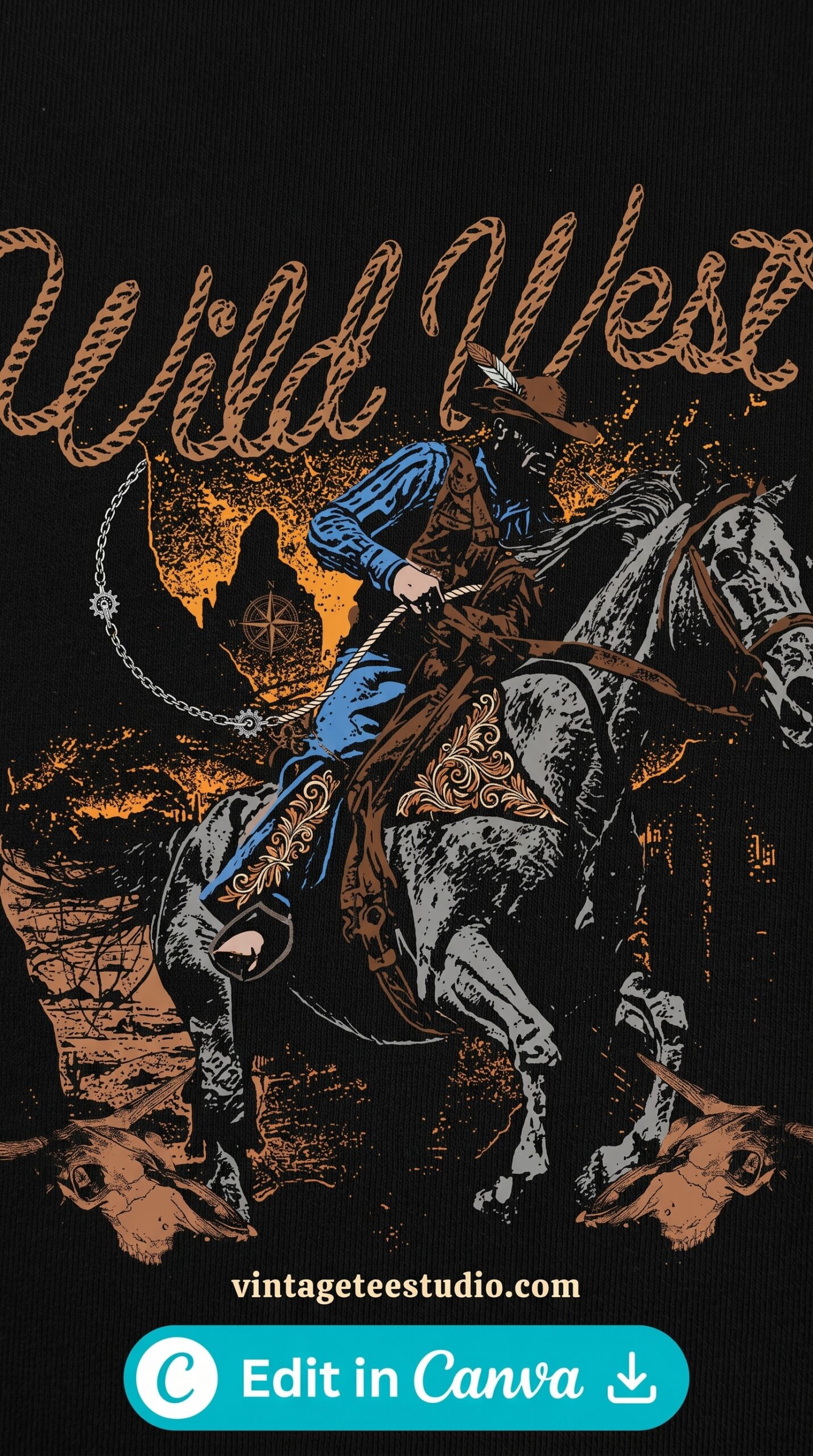
Distressed Heavy Lettering
Rough brush-stroke letterforms with heavy ink bleed and spatter — uneven stroke weight and rough edges. The look of a hand-silkscreened 80s band tee rather than a computer-typeset print.
2. Worn Vintage Concert Print
A vintage concert tee-style graphic — the central illustration with a tour date treatment below or above — in worn, cracked, faded condition. Etsy buyers in the alternative and punk niches save these heavily and convert at a high rate.
Unlimited creative assets. Access to AI tools.
Commercial licence included.
Get downloads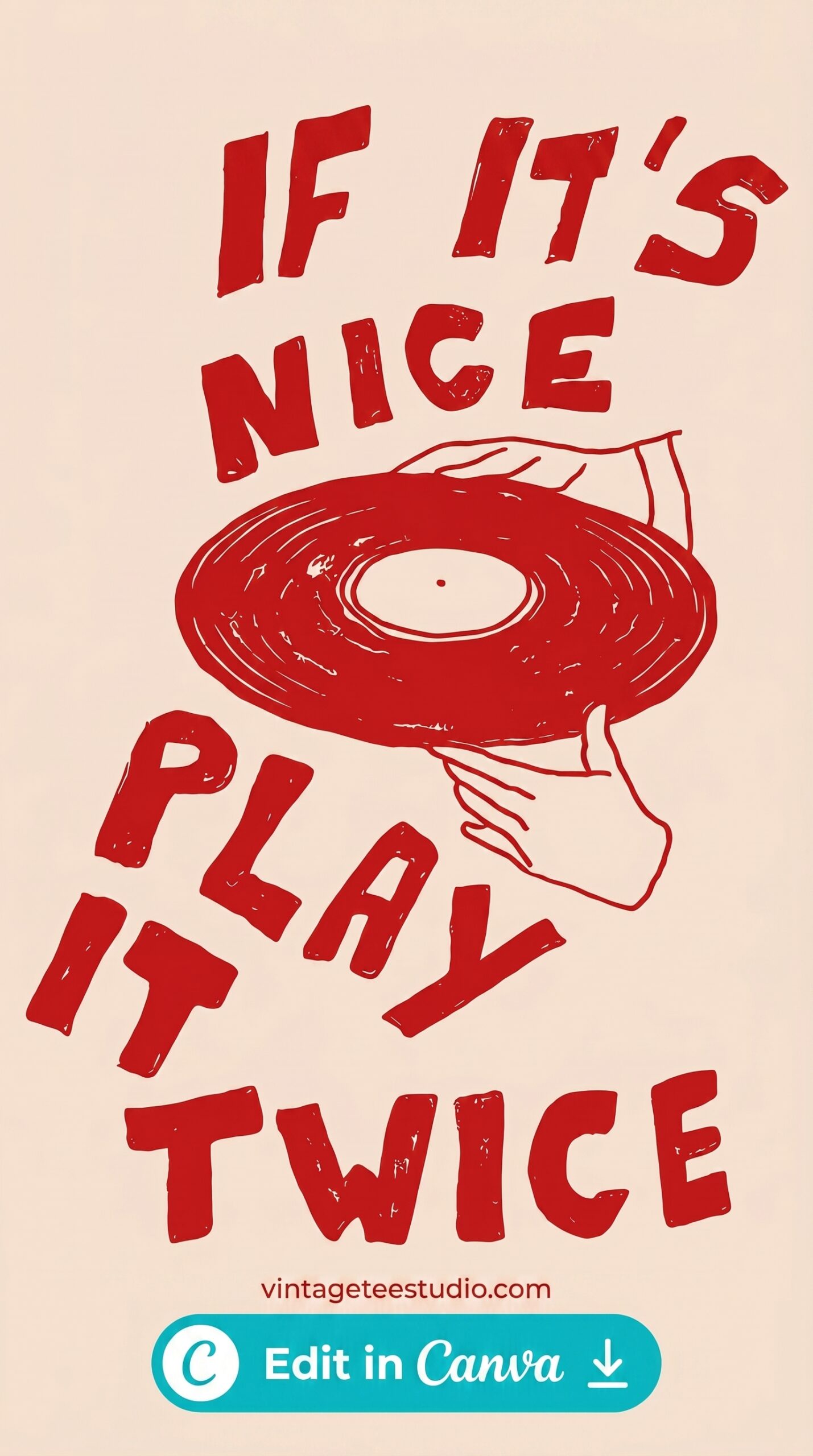
Worn Concert Tee Print
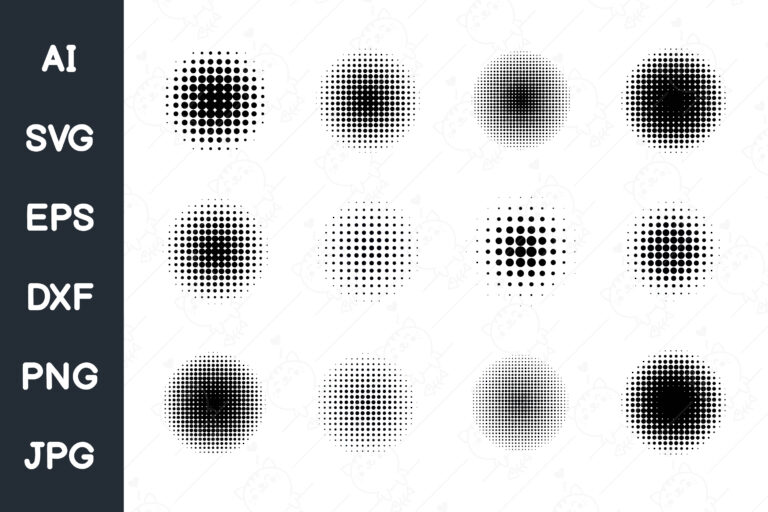
Halftone concert-style graphic with faded dot-matrix edges — reads as a genuine 80s tour merchandise tee that’s been worn to every show since 1987. The dots are visible at close range.
3. DIY Xerox-Aesthetic Graphic
High-contrast black-and-white design with a photocopied aesthetic — the visual quality of a flyer run through a 1983 Xerox machine and blown up to shirt size. The grain and contrast noise is intentional and essential.
Unlimited creative assets. Access to AI tools.
Commercial licence included.
Get downloads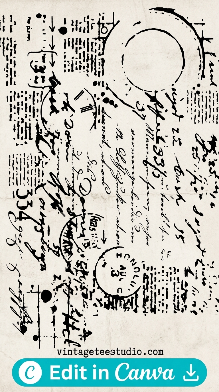
DIY Xerox-Aesthetic Graphic
High-contrast graphic with heavy grain overlay — the noise mimics the visual quality of photocopied punk ephemera blown up to print scale. The imprecision is the point.
Each file is a transparent-background PNG — optimised for dark (black or charcoal) shirt mockups. Export at 4500×5400px for Merch. Commercial licence from Creative Fabrica’s All Access plan covers Etsy, Merch, and Redbubble.
Browse Vintage Punk Band Shirt Designs →
4. Faded Tour-Style Artwork
A back-of-shirt style tour dates treatment in a faded, worn format — the long city list with dates, cracked at the edges. The tour-art aesthetic is specific to the 80s band tee world and converts for the buyers who know it.
Unlimited creative assets. Access to AI tools.
Commercial licence included.
Get downloads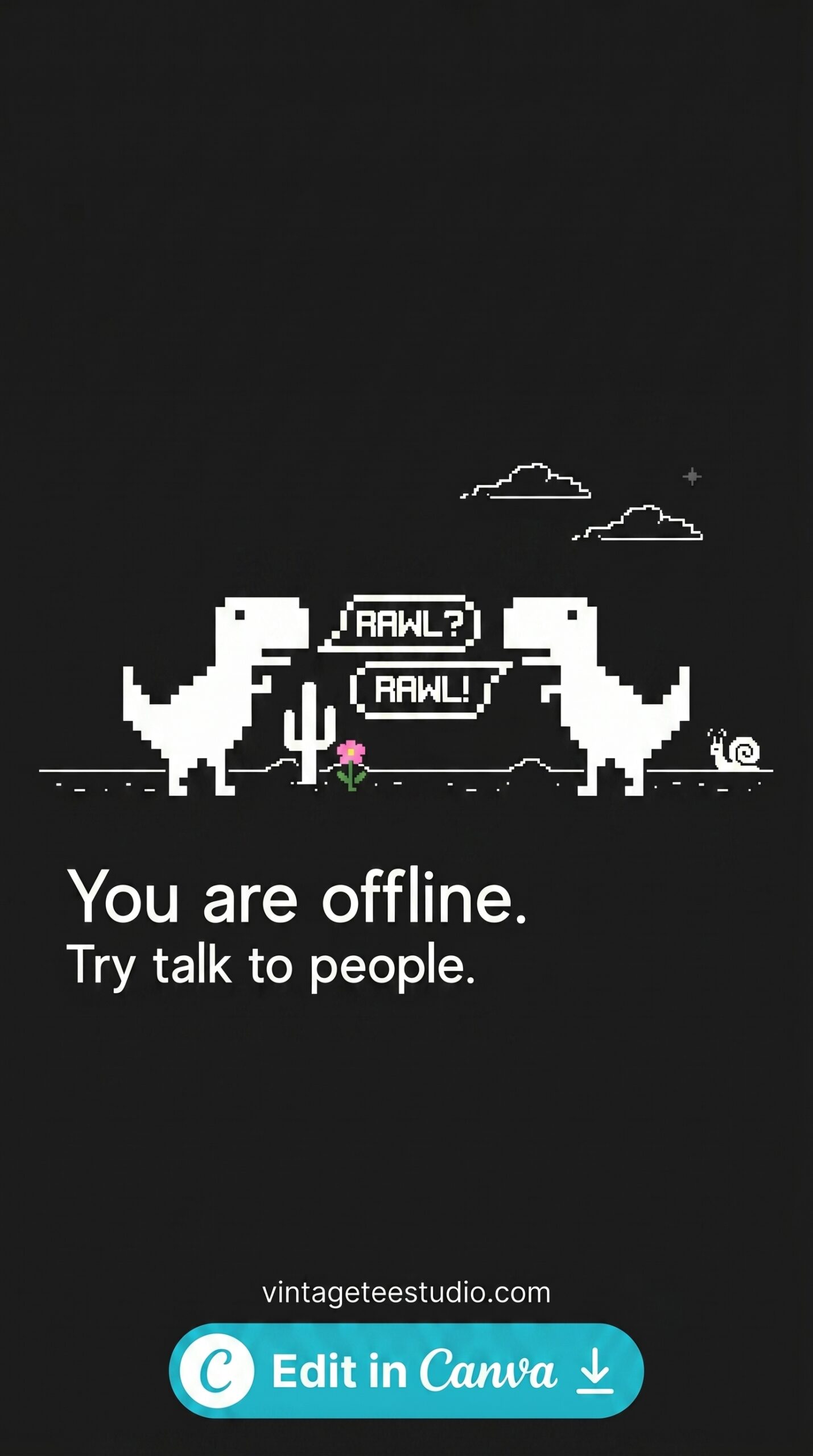
Faded Tour-Style Artwork
Wide-format graphic in tour-merchandise style with a painterly wash and worn edges — the ink bleeds at the borders and the fill shows visible cracking. Reads as a genuine aged band tee.
5. 80s Horror-Style Graphic Treatment
Dark illustration with a horror or occult visual reference — the crossover between 80s punk/metal and horror imagery is a strong recurring niche in vintage band tee design. Specific buyer, but repeat-purchase.
Unlimited creative assets. Access to AI tools.
Commercial licence included.
Get downloads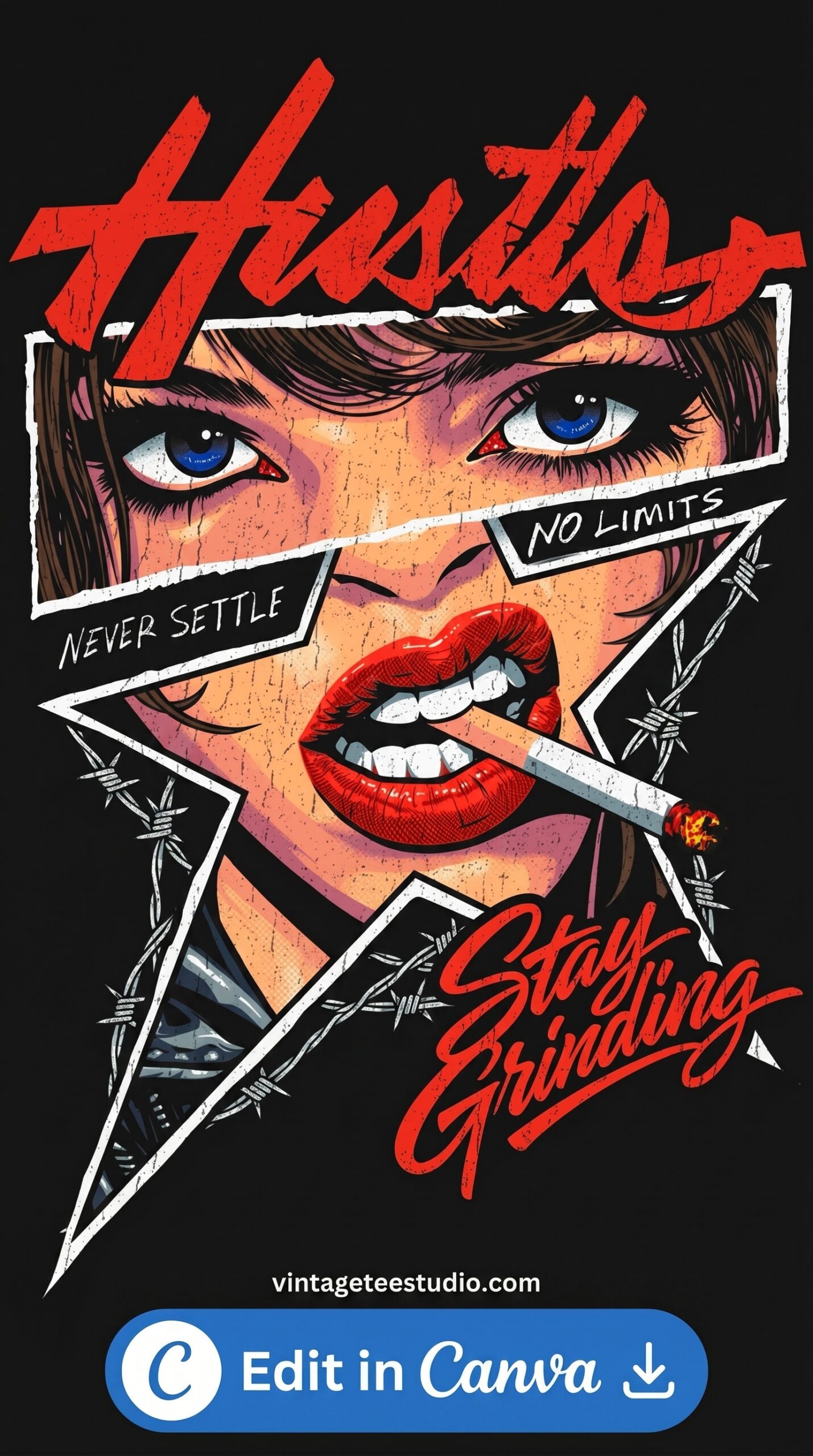
80s Horror-Style Graphic
Dark retro graphic with horror or macabre visual reference — rough linework and heavy ink treatment. The 80s band-horror crossover aesthetic that converts in the alternative and metal niche.
6. Vintage Punk Badge Format
A circular badge with punk graphic content — the badge format applied to punk aesthetics creates an interesting tension between the “official” format and the DIY content. Converts in both the punk and the vintage badge keyword categories.
Unlimited creative assets. Access to AI tools.
Commercial licence included.
Get downloads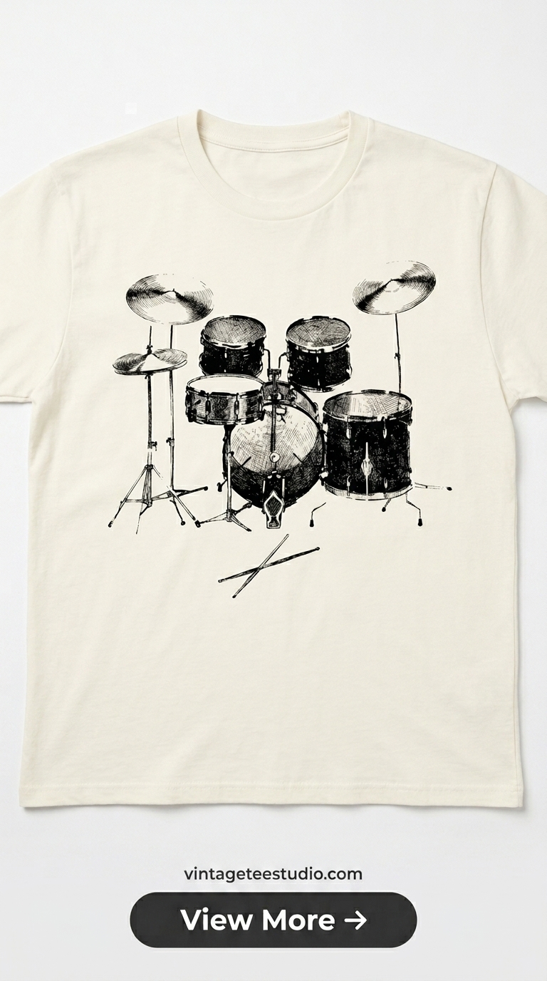
Vintage Punk Badge Format
Distressed circular badge with punk or alternative content — the contrast between the traditional badge format and the aggressive graphic content is a visual element in itself.
7. Worn Grunge Typography — 80s Band Style
The late-80s transition point where punk aesthetics met grunge — heavy irregular lettering with ink splatter, but less precisely drawn than pure metal lettering. This style is slightly more accessible to casual buyers than the full metal aesthetic.
Unlimited creative assets. Access to AI tools.
Commercial licence included.
Get downloads
Worn Grunge Band Typography
Brush letterforms with heavy ink bleed and visible spatter — the 80s-to-early-90s punk-grunge transition style. More accessible than pure heavy metal typography while retaining the aggressive energy.
Looking for more? Our 90s bootleg shirt design guide covers the adjacent 90s alternative aesthetic, and our vintage t-shirt art page goes deeper on the full range of retro graphic art styles that span the punk, metal, and alternative niches.
Key Takeaways
- Top vintage band punk 80s shirt designs: distressed heavy lettering, worn concert print, DIY xerox-aesthetic, faded tour artwork, 80s horror style, punk badge, grunge typography
- The punk and metal buyer notices design quality — imprecision is intentional, but the right kind of imprecision (ink bleed, grain, misregistration), not general sloppiness
- The DIY xerox-aesthetic element is what makes 80s punk graphics credible to buyers who know the source material
- All files are transparent-background commercial-licence PNGs optimised for dark garments
Frequently Asked Questions
What is a vintage band punk 80s shirt design?
A graphic tee design using the visual language of 80s punk and heavy metal concert merchandise — heavy irregular typography, worn screen-print treatment, DIY xerox aesthetic, and dark colour palette.
Do vintage punk band shirt designs sell on Etsy?
Yes — the vintage punk and heavy metal aesthetic has loyal buyers on Etsy who repeat-purchase across the niche. Designs that authentically capture the visual language of 80s band tees convert better than approximate versions.
What makes a vintage 80s band shirt design look authentic?
Ink bleed, photocopier grain, misregistration between layers, and heavy irregular letterforms. Clean, precise designs in a metal font don’t pass muster with buyers who know the original aesthetic.
What file format do I need for vintage punk shirt POD designs?
Transparent PNG at 4500×5400px for Merch, or 300 DPI for Etsy printable listings. Optimise the design for dark (black or charcoal) shirt mockups — the punk aesthetic requires a dark base.