Why Era-Specific Vintage Design Art Converts Better Than Generic “Vintage”
Generic vintage doesn’t work. A shirt that looks vaguely old doesn’t trigger the same response as one that looks specifically like it came from a 1977 summer music festival or a 1989 high school athletics programme. The specificity is what makes it feel real.
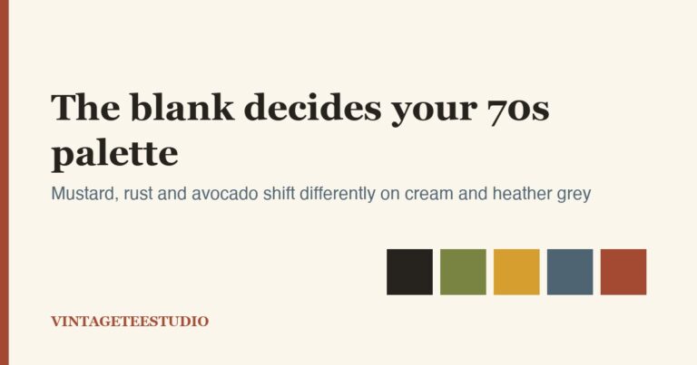
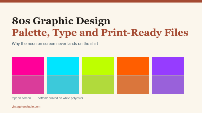
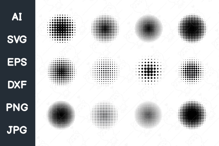
70s design art uses warm earth tones, rounded lettering, psychedelic motifs, and a soft, sun-washed quality. 80s design art goes bolder — blocky lettering, strong contrast, neon accents, heavy halftone fills. 90s grunge uses rough textures, faded darks, and a worn-out, anti-commercial feeling. Each has its own buyer.
Unlimited creative assets. Access to AI tools.
Commercial licence included.
Get downloads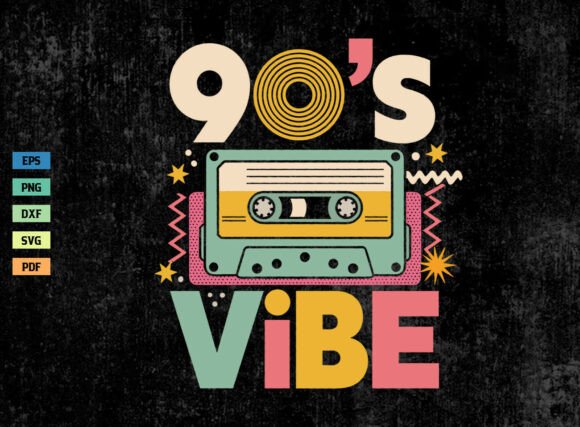
70s Festival Design Art PNG
Classic 70s composition: warm ochre and rust palette, rounded slab-serif lettering, soft halftone shading. The textbook vintage design art format that runs consistently on Merch.
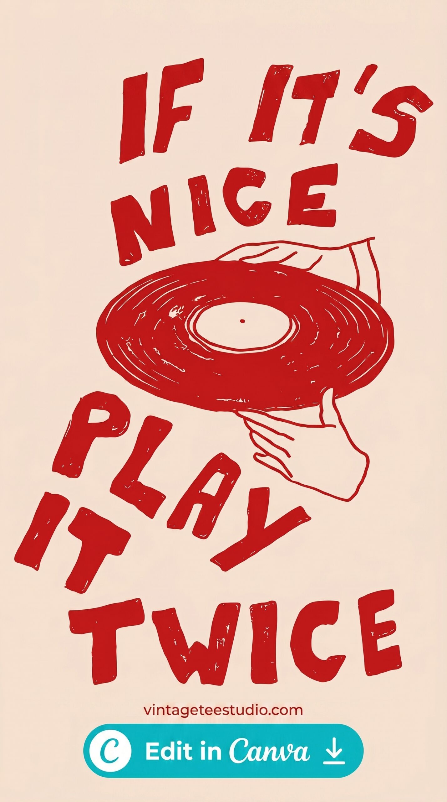
80s Halftone Design Art PNG
Heavy halftone dots over bold lettering — the signature 80s concert tee look. High contrast, intentional grain. Converts well on Merch by Amazon in the music and nostalgia niches.
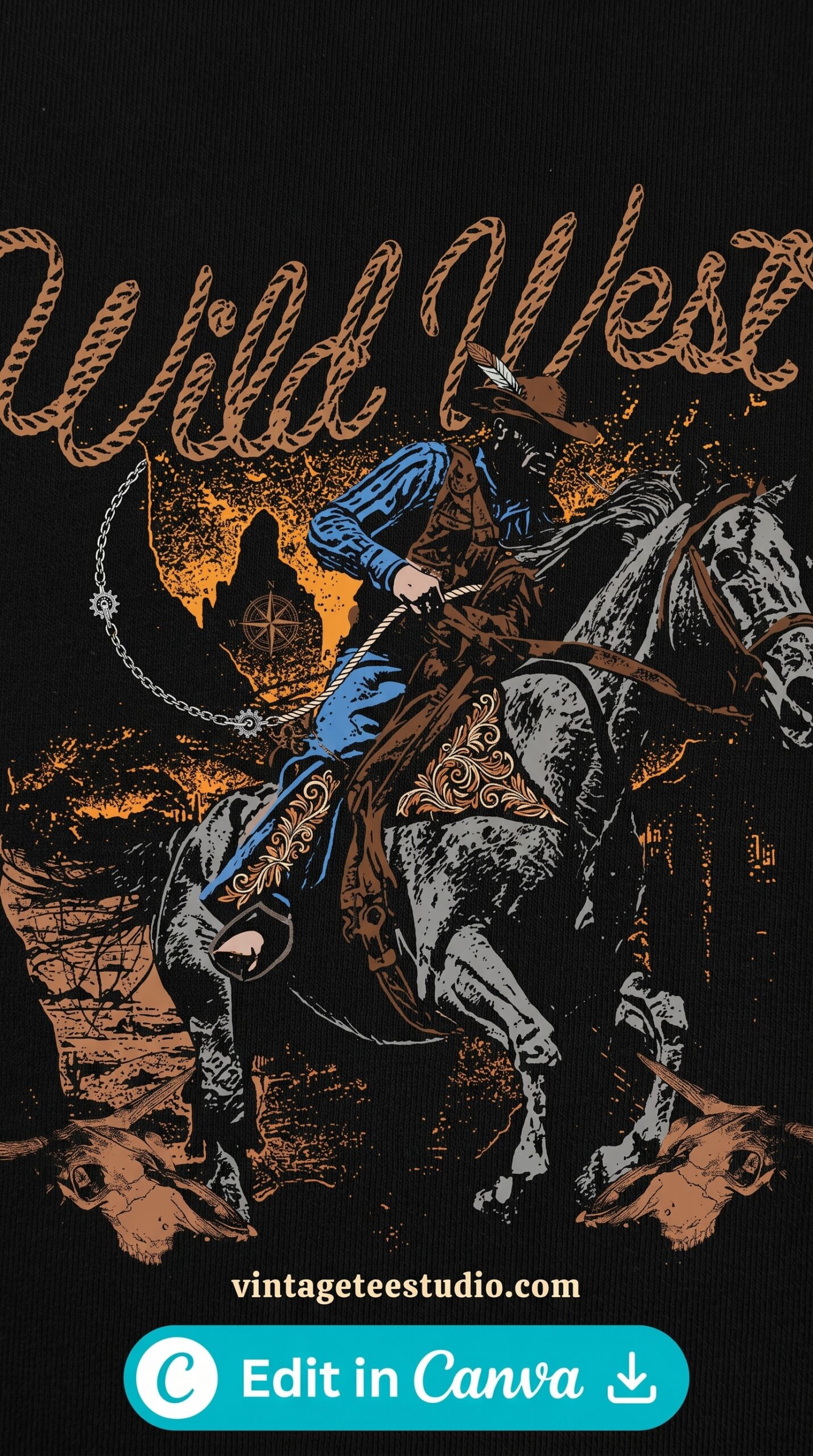
90s Grunge Design Art PNG
Rough texture, washed-out darks, anti-corporate feeling. The 90s band-tee aesthetic. Etsy buyers in their 30s and 40s recognise this immediately.
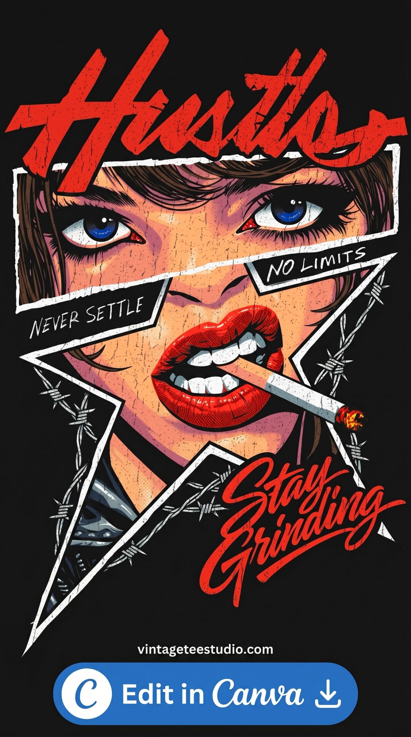
Retro Vintage Design Art PNG
Distressed retro composition with worn edges and faded fill. Works across eras — reads as authentically vintage without being era-specific.
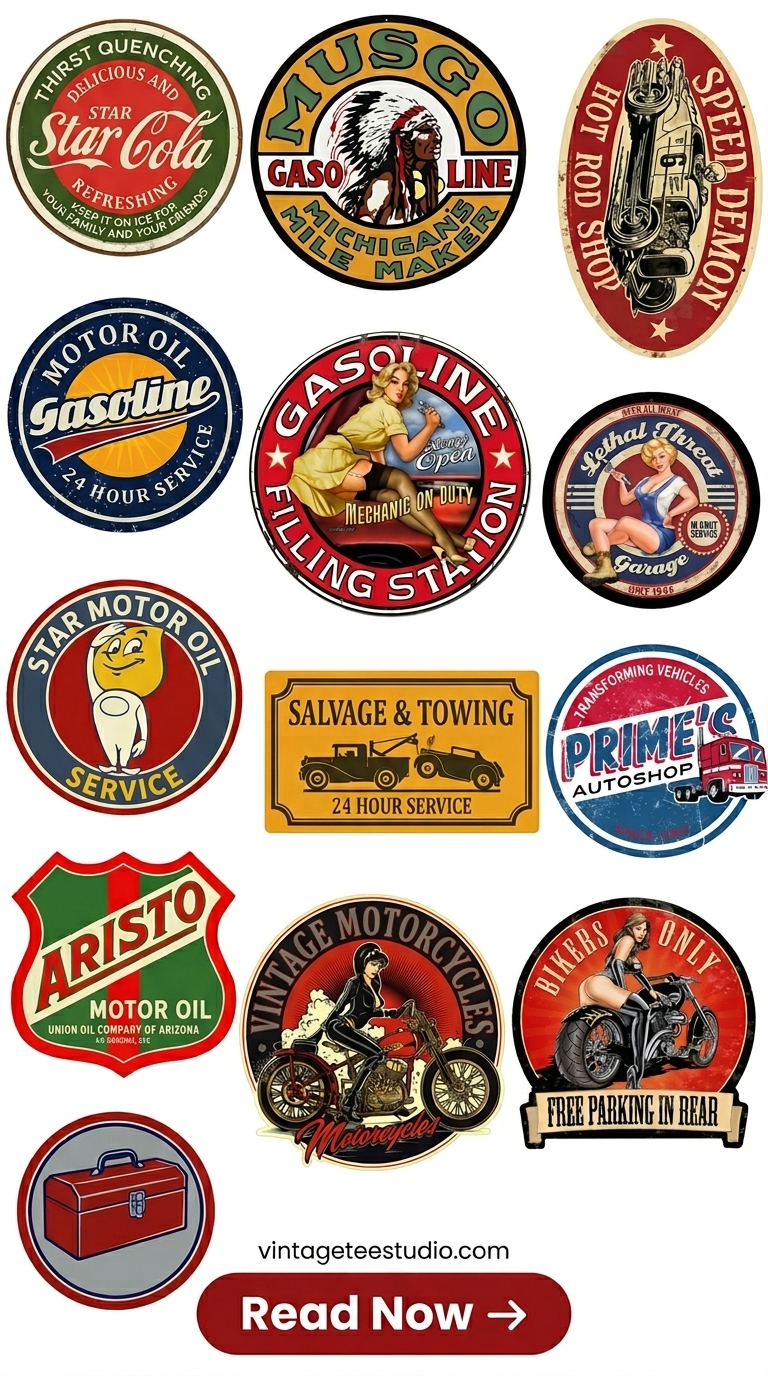
Vintage Americana Design Art
Eagle, banner, and stars composition in a sun-faded Americana style. One of the most consistent gift-purchase designs in the vintage niche.
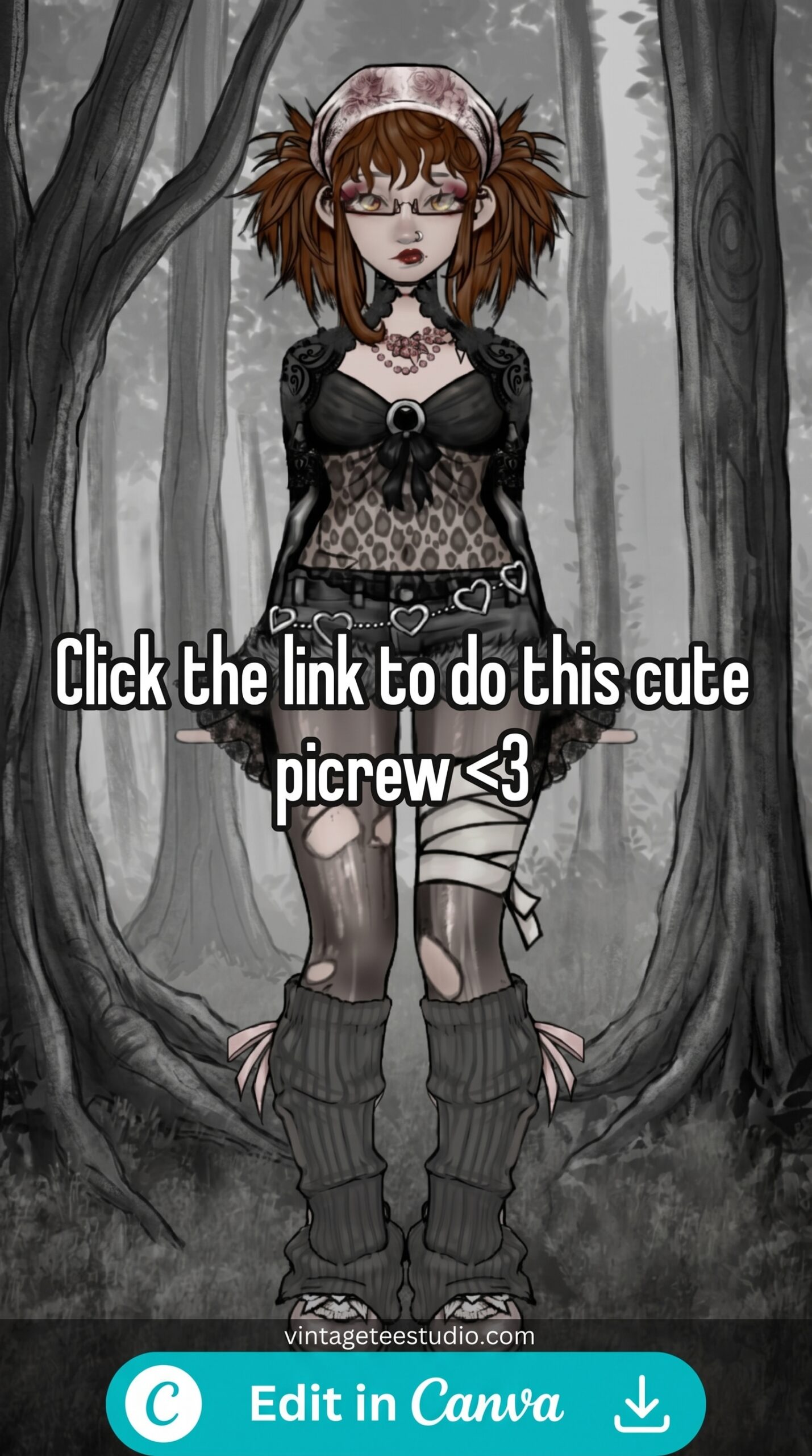
Vintage Nature Art Tee PNG
Mountain and sun composition with a weathered, adventurous quality. Strong in the outdoor lifestyle niche on Redbubble and Etsy.
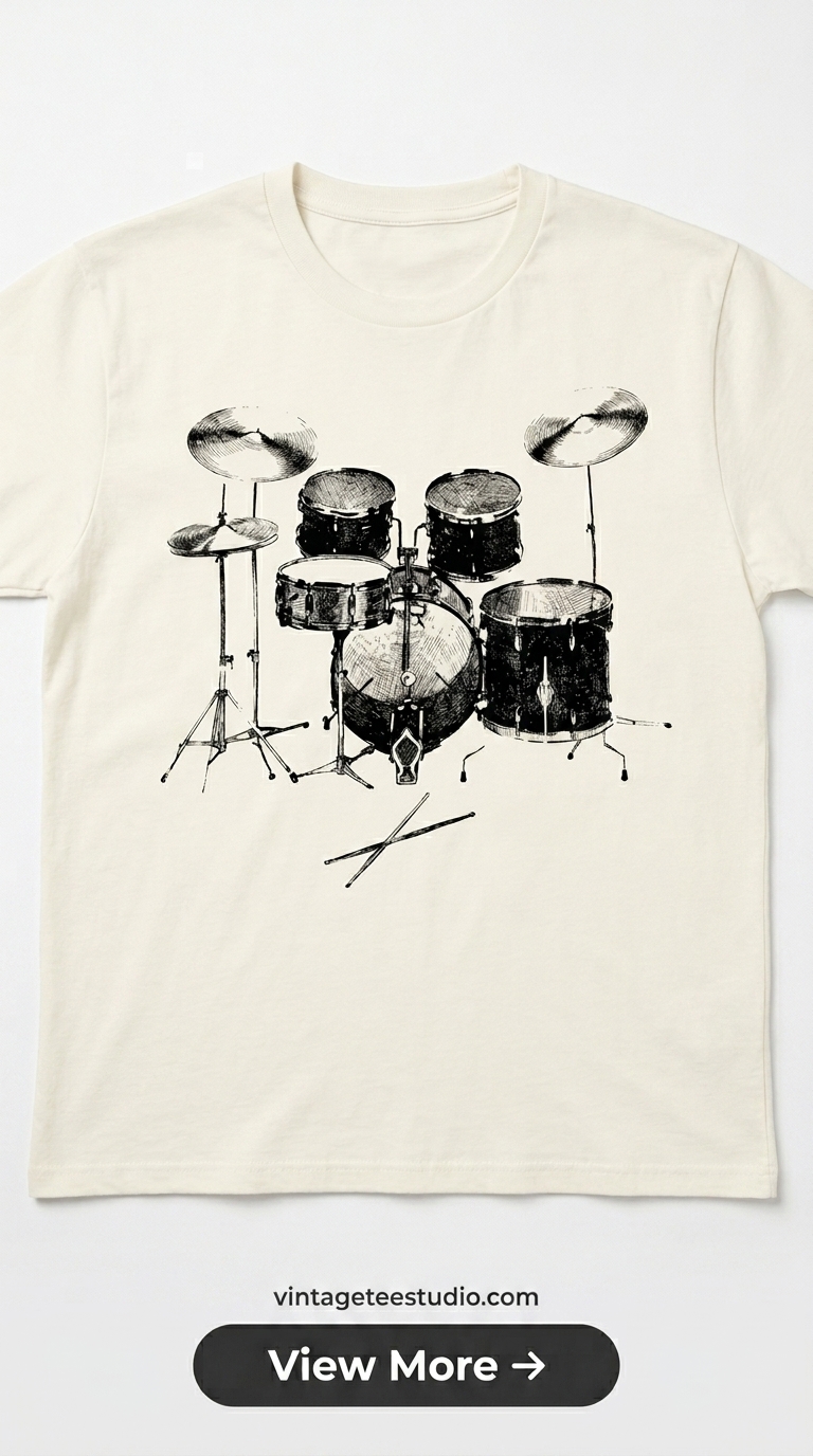
Vintage Badge Design Art PNG
Shield badge composition with period lettering — a design format that hasn’t gone out of style since the 1960s and still moves consistently.
More design art options at vintage t-shirt art, or browse retro shirt design PNG for the full collection.
Key Takeaways
- Era specificity sells: 70s, 80s, 90s each attract different buyers with different search terms.
- 70s = warm earth tones + rounded lettering; 80s = bold halftone + high contrast; 90s = grunge texture + worn darks.
- Americana and outdoor motifs are evergreen vintage art categories that don’t peak seasonally.
- Merch by Amazon favours simple bold graphics; Redbubble and Etsy support more detailed compositions.
- Distressed edges and worn texture are the fastest visual cues for authentic vintage design art.
FAQ
- What era of vintage design art sells best?
- 70s and 80s designs consistently outperform other eras on Merch by Amazon. 90s grunge sells well on Redbubble and Etsy, particularly to buyers in their 30s and 40s with nostalgia for that era.
- What’s the difference between vintage and retro design art?
- Vintage implies the design actually comes from or accurately represents a historical period. Retro is more of a visual style that references the past without strict authenticity. Both sell, but vintage-specific designs tend to attract more targeted buyers.
- How many colours should vintage design art use?
- 2-4 colours maximum. Real vintage printing was limited by the number of ink screens — designs with more than 4 colours don’t feel like authentic vintage printing.