Quick answer: The 70s palette prints far more reliably than the 80s one, because mustard, rust, avocado and warm cream all sit inside what ink can reach. What breaks it is the garment. Warm earth tones drift on cream, natural and heather grounds, and they drift by different amounts, so the palette that looked balanced on screen comes out with the relationships between colours bent. Build the design in three or four flat inks, decide the garment colour before the palette rather than after, and print one test on the actual blank.
A 70s design has one advantage over every other retro era: nothing in its palette is out of reach of a printer. The rusts and golds are ordinary, achievable colours. That is exactly why the failures are confusing when they happen. You did not chase a neon that ink cannot make, so when the shirt comes out muddy or washed the cause is somewhere else, and it usually is the blank underneath.
The one to start with
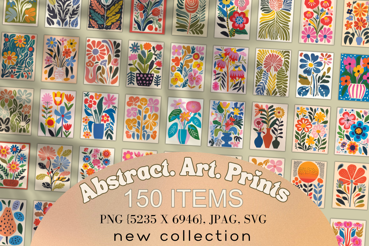
Abstract. Art. Prints
Flat abstract florals in the warm end of the decade, drawn as separate shapes rather than as one painted image — the same way the rest of the flat-colour 70s sets are built. That separation is the reason to start here: a design built from flat areas can be reduced to four or five inks without losing anything, and every one of those areas can be nudged before you print. Open it, pull the palette apart, and you have a starting set that already sits inside what ink can reach.
Why 70s colour behaves differently from 80s neon
Fluorescent colour fails because ink physically cannot get there. Earth colour fails a different way: it gets there, and then the fabric shifts it. Mustard and rust are already warm and already low in brightness, so they have very little headroom before they read as brown. Avocado sits close to the point where a green stops looking deliberate and starts looking dirty. Nudge either one a few percent and it lands somewhere else entirely.
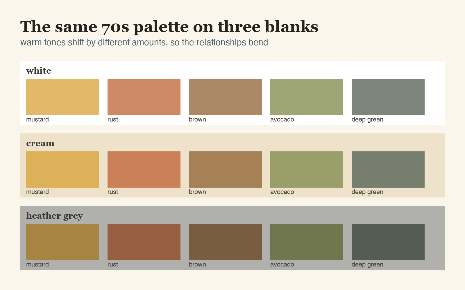
Look at what happens across the three grounds. On white the palette holds. On cream everything warms, which flatters the mustard and pushes the avocado toward olive. On heather grey the whole set drops in brightness and, more importantly, the gap between the rust and the brown closes until they stop reading as two colours. That is the failure people describe as it printed muddy, and it is a garment decision, not a file defect.
See type drawn for a warm 70s palette
The twelve colours the decade actually ran on
Every reference for this era hands you hex codes and stops there. Codes are the easy half — the sets worth opening are the ones that hand you the colours as separate shapes. What matters on a garment is what each of those codes turns into once the file is converted for print, and that number is never printed next to the swatch.
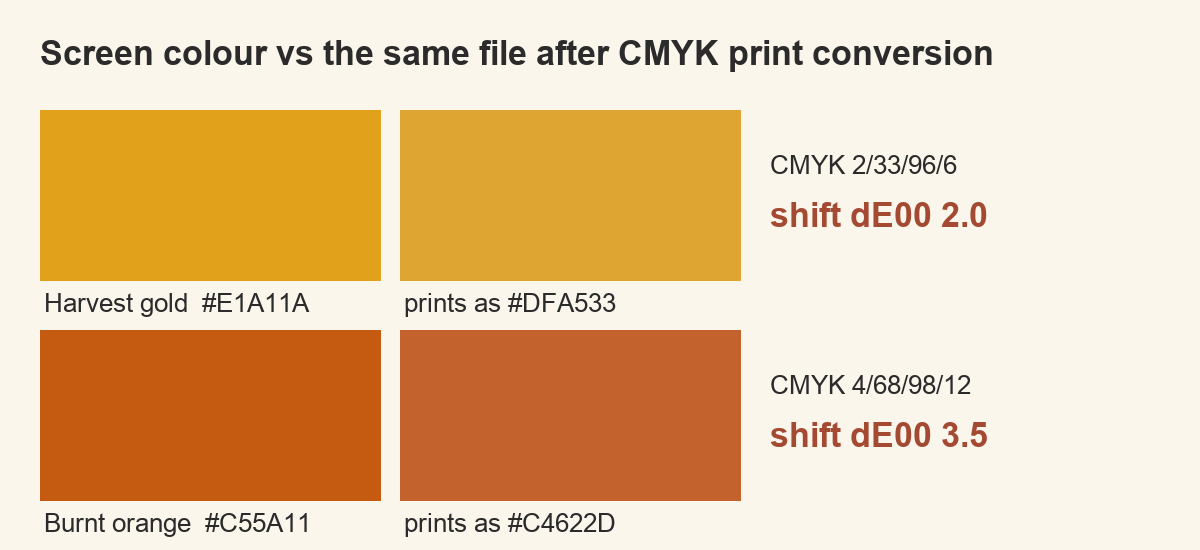
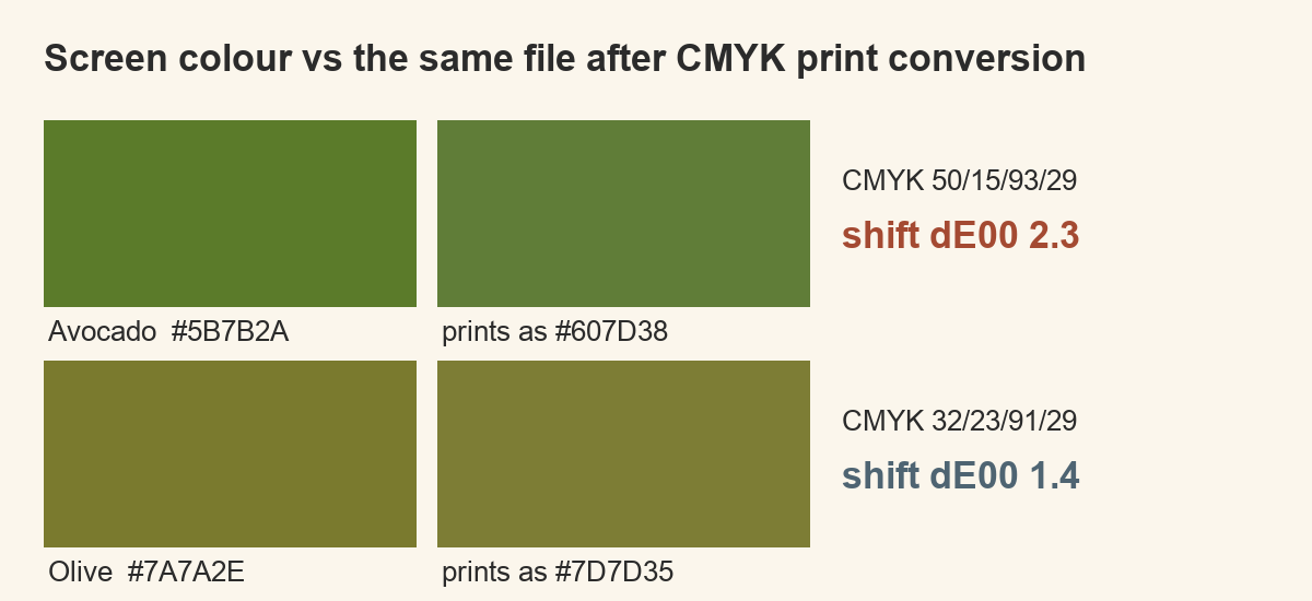
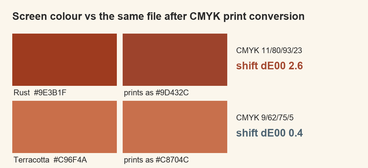
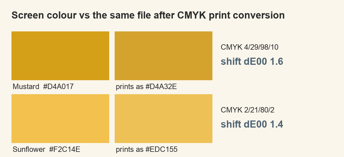
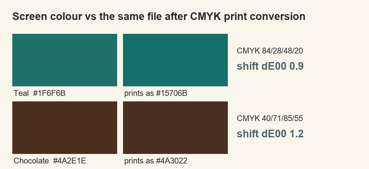
So I measured it. I took twelve colours that carry the decade — harvest gold, burnt orange, avocado, olive, rust, terracotta, mustard, sunflower, teal, chocolate, walnut and cream — converted each one from screen RGB into a printing CMYK space with a relative colorimetric intent, then converted it straight back and compared the two with the dE00 formula, which follows how the eye weighs a difference rather than how far apart two numbers sit.
The pairs below are the result. Left is the colour on your screen, right is the same colour after the round trip, with the ink mix and the size of the shift beside it. Anything at dE00 2 or above is a difference a person notices with the two side by side; below that you would have to be told it moved.
 Pin it
 Pin it
 Pin it
 Pin it
 Pin it
 Pin it
Read the ink mixes as well as the colours. Harvest gold lands at 96 percent yellow with a third as much magenta and almost no cyan, which is why it survives: there is nothing exotic in the recipe. Chocolate arrives with 55 percent black underneath everything else, and that is a warning — a colour carrying that much black behind it looks flat rather than deep if the press is running heavy.
Which of those colours move when the file goes to press
Four of the twelve crossed the visible line, and they are not a random four. Burnt orange moved most at dE00 3.5, then rust at 2.6, avocado at 2.3 and harvest gold at 2.0. The remaining eight stayed between 0.4 and 1.6, which is invisible in practice. If you would rather start from files that already sit inside that safe range, the flat-colour retro bundles are the shortest way there.
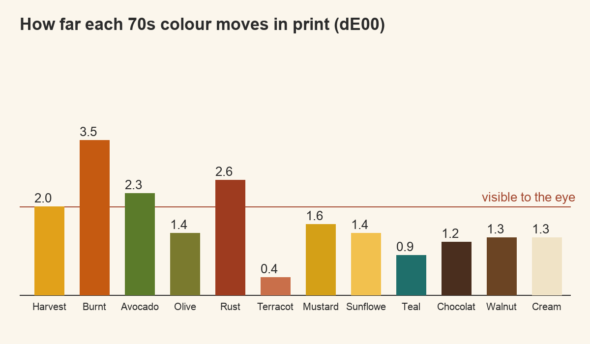
Look at which ones moved. The four that shift are the four the decade is built on: the saturated warm oranges and golds, and the green that sits with them. The colours that stay put are the supporting cast — the creams, the browns, the teal. The part of the palette that makes a design read as 70s at a glance is exactly the part that arrives slightly different from what you approved on screen, and the part nobody looks at twice is the faithful part.
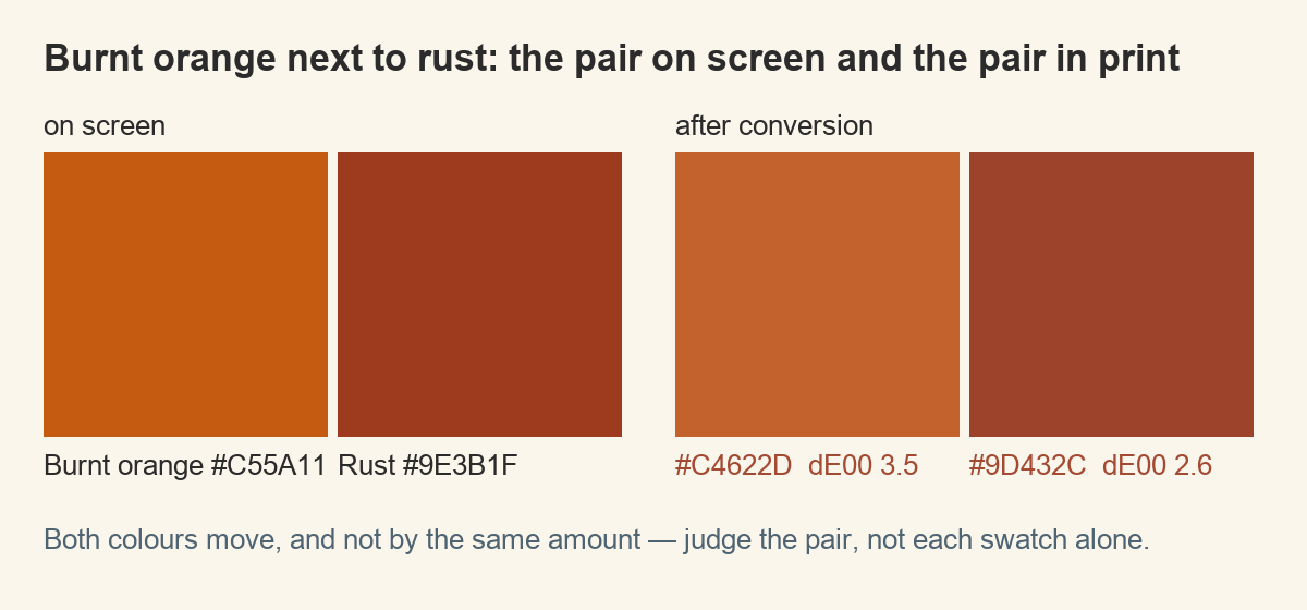
The consequence is small but specific. If a design depends on burnt orange and rust sitting next to each other, check that pair after conversion rather than before: both moved, and they did not move by the same amount. Their relationship, not their individual values, is what the eye reads.
What the same set does on a coloured blank
Conversion is only the first step. The second is the ground. The row of discs below is the printed version of all twelve, dropped onto four common blanks without changing a single value in the file.
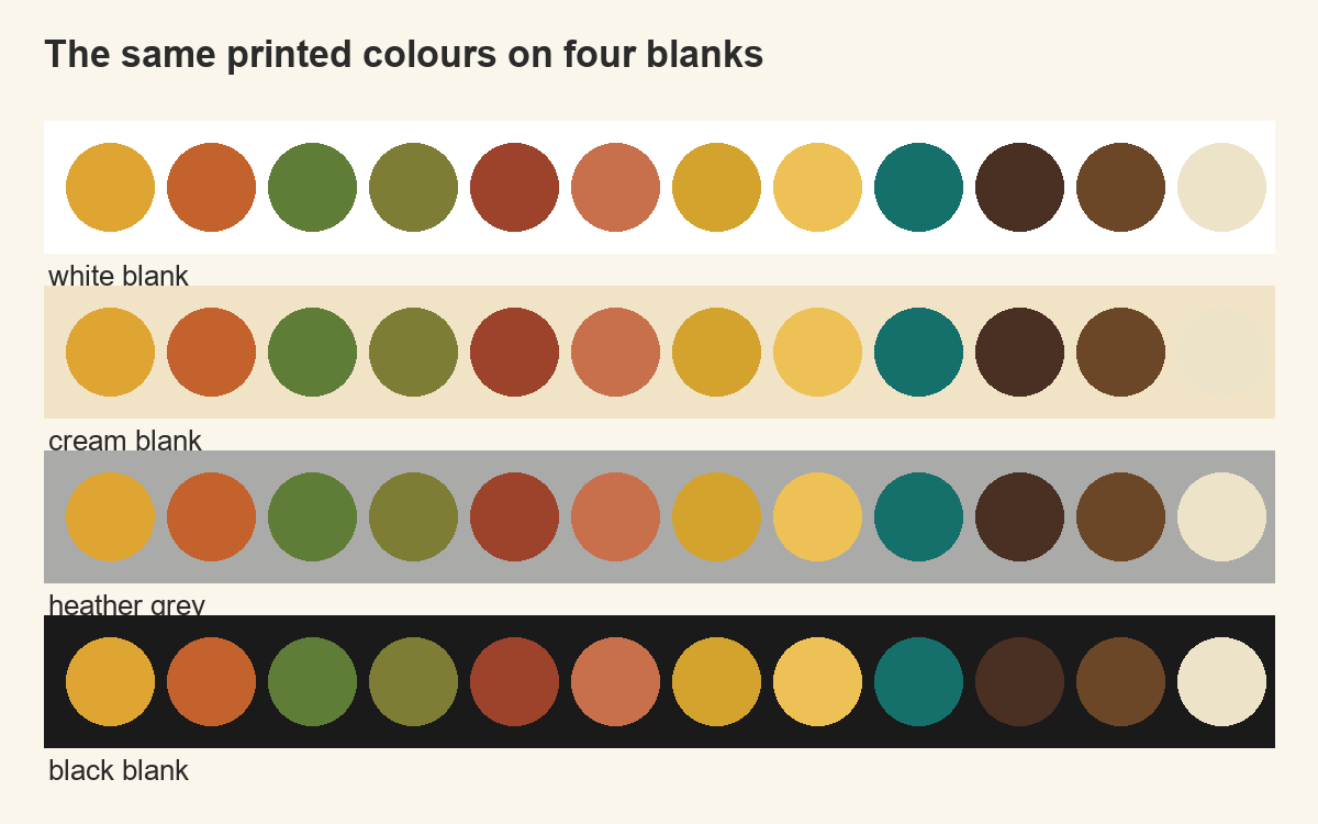
On white every colour keeps its identity. On cream the warm half of the set starts to merge with the ground: the sunflower and the cream disc almost vanish, and that is not a printing fault, it is the ground doing what grounds do. On heather grey the whole set loses brightness together, which sounds harmless but closes the gap between rust and walnut until they read as one colour. On black nothing merges and nothing glows either, unless a white underbase goes down first.
The rule that falls out of this: a palette is only balanced relative to a ground. Decide the blank, then judge the palette on it, and prefer files supplied on transparent backgrounds so the ground stays a choice rather than a repaint job.
Cutting twelve colours down to five inks
Twelve colours is a reference set, not a design. A screen print is built and priced per ink, and a transfer holds its edges better when fewer separations fight each other. The set below is what I keep when twelve have to become five.
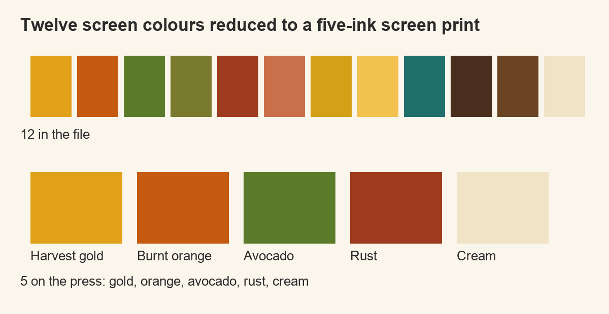
Gold, burnt orange, avocado, rust and cream. Two warms far enough apart to stay distinct after the shift, one green to break them, one dark to hold edges, one light to sit as paper. Olive, mustard and sunflower go because they sit between colours already in the set; terracotta goes because it is what orange becomes on cream anyway; chocolate and walnut collapse into one another at press.
If you need a sixth, make it black rather than another hue, and use it only for outlines. A sixth colour spends a separation on something the eye will not thank you for. Sets drawn with a vector layer make this cut painless: you merge two shapes instead of repainting a raster.
Decide the blank before the palette, not after
The usual order is backwards. Most people finish a design on a white artboard, like it, and then pick a shirt colour because it suits the brand or because that blank was in stock. By then the palette has already been tuned against white, and every colour moves when the ground changes.
Turn it around. Pick the blank first, put a rectangle of that exact colour behind the artwork while you work, and judge every colour choice against it. On a natural or sand blank the design usually needs one properly dark element, an outline or a solid block, or it floats. On heather grey it needs its two closest colours separated further than looks necessary on screen, because the ground is going to close that gap for you.
The thing worth internalising: a 70s palette is a relationship between four or five colours, not four or five individual colours. The garment does not shift them equally, so what breaks is the relationship, and that is why the print reads wrong even when every single colour looks acceptable on its own.
Find faces that hold on a cream blank
How many inks the look actually needs
Original 70s printing was a small number of flat inks, usually three or four, sometimes with a halftone to fake a fifth. That constraint is most of what makes the era recognisable: the flat shapes, the visible dot, the way one colour does the job of a shadow.
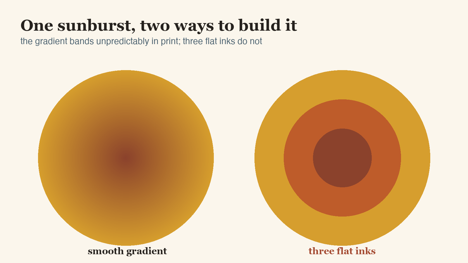
The comparison above is the same sunburst twice. On the left it is a smooth gradient, which is what a modern file usually contains. On the right it is three flat bands. The gradient version bands unpredictably in print, and the boundaries land wherever the transfer decides. The three-ink version prints identically every time, and it is also the one that looks like the decade.
If a file you like is built on gradients, you can still use it: posterise the gradient to three or four steps before you print, and you get the period look and the predictable result in the same move.
See flat-colour 70s type and lettering
What to check inside the file before you print
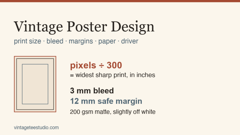
- Resolution at print size. Pixel width divided by 300 is the widest sharp print in inches. A 3600 pixel file gives a 12 inch chest print, about the practical maximum on an adult shirt.
- Transparent background. Open the PNG against a dark backdrop. A white box behind the artwork prints as a white box, and on a cream blank that box is visible from across the room.
- Colour count. Posterise or count the flats. More than five and the design has drifted away from the era it is imitating.
- Warm neutrals. Check that your darkest colour is dark enough. A warm brown that reads as dark on white will read as mid-tone on cream and the design loses its anchor.
- Type weight. Thin strokes lose a fraction of a millimetre on each side in transfer. Anything that has to survive that needs weight to begin with.
See what a print-ready 70s file looks like
Which type carries the decade
Strip a 70s design down and the shapes are simple: a sunburst, an arch, a rounded rectangle. The lettering is what dates it. Fat rounded strokes, tight spacing, an arch or a curve through the word, and counters small enough to feel packed without closing up. It is also the part that has to survive the transfer, so weight matters here as much as style.
Each face below is one I would set a headline in on a garment, with a note on what it is for. A face that carries a big chest print will disappear on a sleeve, and the reverse.
Weight first: a face whose thinnest stroke is under about a millimetre at print size will lose that stroke somewhere between the transfer and the third wash. Then spacing, because the era set letters tight and a modern default tracking reads as a modern shirt wearing old colours. Then the arch, which is the cheapest period signal there is and costs nothing in ink. A face that is heavy, tightly spaced and curved through the word carries the decade even in one colour, which is where you want to be when the ground is dark and the design is down to three inks.
What to avoid is easier to name than what to choose: hairline serifs, scripts with fine connectors, and anything with a built-in drop shadow you cannot separate, because that shadow becomes a fourth ink you did not budget for and it is the first thing to misregister.
See type drawn heavy enough for a transfer
Files that already carry the decade
What follows are sets I would open before starting a 70s design, chosen for how they behave under the two tests above: flat separable colour, and enough resolution that the edges survive a transfer. Each note says what the file is for rather than what it looks like.
Unlimited creative assets. Access to AI tools.
Commercial licence included.
Get downloadsReading Books and Chill Groovy Bundle
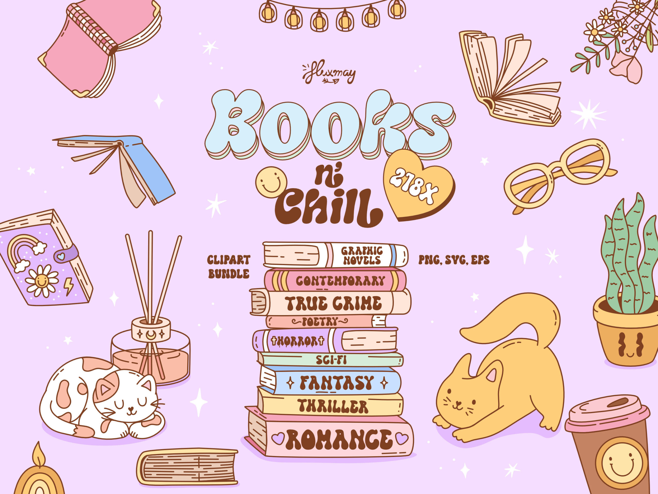
A large set of groovy scenes and objects drawn in flat shapes with visible outlines. The outline is what makes it useful on fabric: an element that carries its own edge does not depend on the colour underneath it to stay readable, which is the difference between a design that works on cream and one that only worked on white.
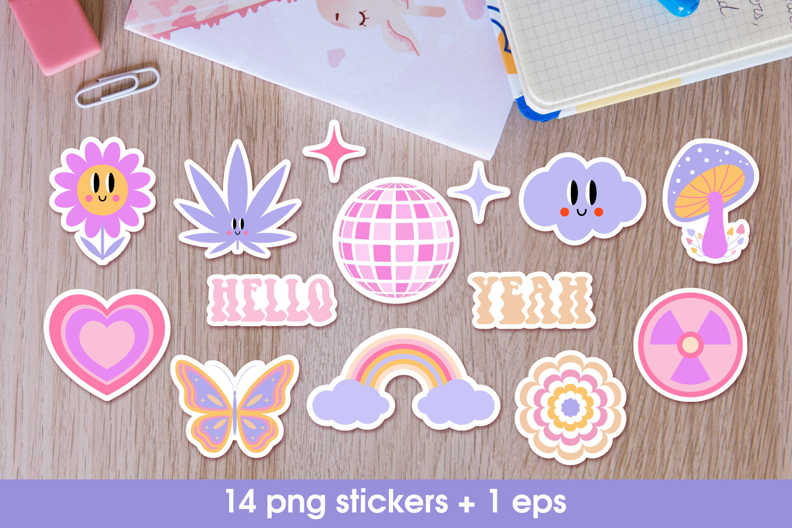
Retro Groovy Sticker Bundle in Y2k Style
Fourteen patch-style elements on transparent backgrounds at five thousand pixels on the long side, plus a vector file. Patches are the safest way into the decade because each one is a closed shape with its own border, so you can drop two or three onto a pocket print and the composition holds without any background at all.
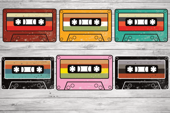
Vintage Retro Cassette Tape
One object, drawn properly, in PNG, EPS and SVG together. The vector matters more than it sounds: a cassette is mostly straight edges and small rectangles, and those are the first things to go soft when a raster file is scaled up to a chest print. With the vector you scale first and rasterise once, at the size you are actually printing.
Unlimited creative assets. Access to AI tools.
Commercial licence included.
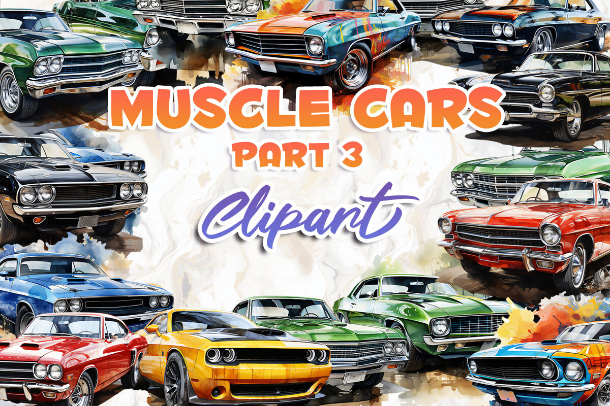
Get downloadsMuscle Cars Part 3
Cars date a design instantly, and this set keeps them as clean silhouettes rather than painted illustrations. Silhouettes reduce well: pull the colour count down to three and a car still reads, where a rendered one turns into a smudge. Good pairing for a heavy display face when the shirt needs a headline as well as an image.
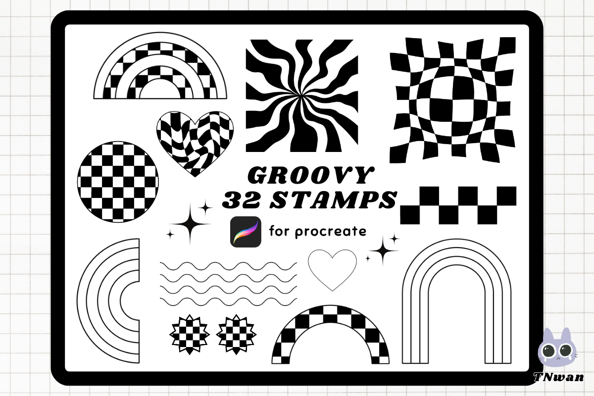
Y2k Groovy Retro Procreate Brush Stamp
Thirty-two stamps for Procreate rather than finished art. This is the set for when the design has to be yours: you build the arrangement, and every stamp lands as a shape you can recolour into the five-ink palette above. It also solves the sameness problem, because two people using the same stamps rarely compose them the same way.
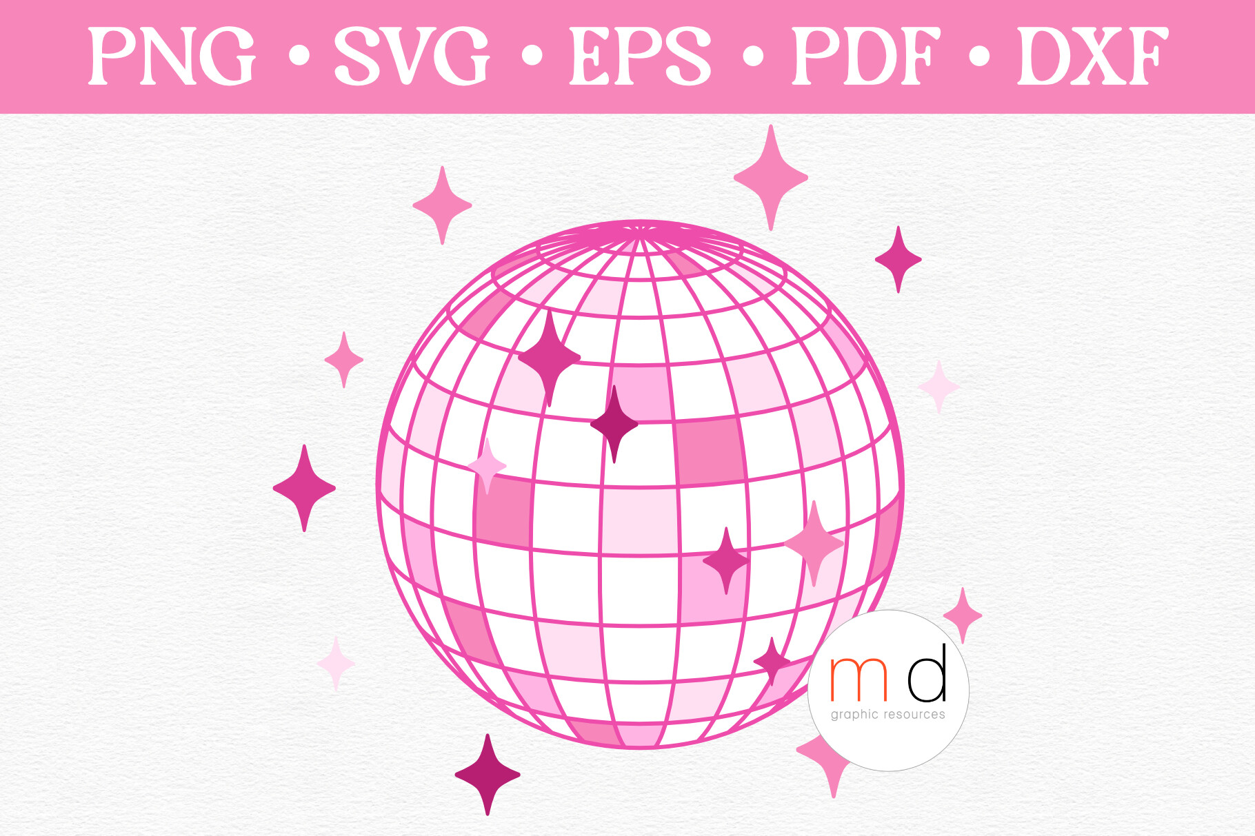
Cute Pink Disco Ball Svg Mirror Ball Png
A single well-made object at three hundred DPI across fourteen inches, supplied in PNG, EPS, SVG and DXF. The DXF is the reason it earns a place even though it is one design: if the same motif has to go to a cutter as well as a press, the file is already in a form the cutter accepts, and you are not redrawing it.
Unlimited creative assets. Access to AI tools.
Commercial licence included.
Get downloadsRetro Vintage Sunset Grunge Background
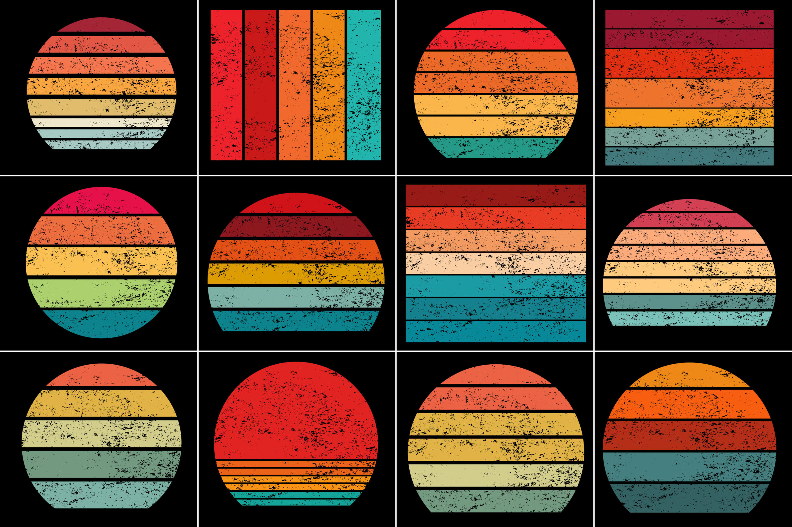
A background rather than a motif, and it is here as a warning as much as a recommendation. The sunset stripe is the decade’s most reused device and this one comes already distressed, which breaks up the banding a press would otherwise show in clean rows. Use it where the substrate takes a full print, or clip it inside lettering and use nothing else.
Browse more 70s sets built from flat colour
Where a 70s file earns beyond a shirt
The measurements above were made for garment printing, but they hold anywhere ink meets a surface. The same four colours drift on a sticker sheet, on a tote, on a poster; what changes is how much the ground interferes, and paper interferes least. That is why a design that came out muddy on heather grey can look right on a white sticker with no edit at all.
It also changes what is worth buying. A set supplied only as a flat image is fine for anything printed once at one size. A set that includes a vector, like the cassette and the disco ball above, keeps working when the same motif has to appear on a label, a sleeve print and a cut file, which is the point at which one purchase stops being one product. For anything you intend to sell rather than print for yourself, the licence terms settle that question before file quality does.
A press routine that catches drift early
Print one small test on the blank you are actually going to use. Not on paper, not on a spare of a different colour or blend. Press it with the settings you plan to use, let it cool completely, then look at it in daylight rather than under a warm bulb, because indoor light flatters exactly the warm palette you are trying to judge.
If the colours have closed up on each other, the fix is in the file. Separate your two closest tones further, or make the darkest element darker, and print a second test. Keep the two side by side. Once you have that pair for a given blank, you can predict what that blank does to any warm design you buy later, which is worth more than the sheet it cost.
Pick the type before you press a test
Key takeaways
- The 70s palette is printable in full. What bends it is the garment colour, and it bends each tone by a different amount.
- Choose the blank first and design against it, with a swatch of that colour behind the artwork the whole time.
- Three or four flat inks is both the historically correct choice and the predictable one. Posterise gradients before printing.
- Test on the actual blank, cool it, judge it in daylight, then widen the gap between your closest two colours if they closed up.
Frequently asked questions
Why did my mustard print brown?
Almost always the blank. Mustard has very little brightness to spare, so a cream, sand or heather ground pulls it straight into brown territory. Either move to a white or very pale blank, or lighten the mustard in the file until it survives the shift.
Can I print a 70s design on a dark shirt?
With sublimation, no. The ink is transparent, so on a dark ground most of the palette disappears and the white areas simply show the fabric. A dark garment needs a process that lays down opaque ink or a white underbase: screen printing, direct to film, or a vinyl transfer.
How do I get the halftone dot without it looking like a filter?
Use it on one element, not on everything, and keep the dot large enough to survive the press. A fine dot closes up in transfer and turns into a flat tint, which is the effect people mistake for a bad file when it is simply too fine a screen.
What resolution should a 70s shirt design be?
Divide the pixel width by 300 for the widest sharp print in inches. A 3600 pixel file covers a 12 inch chest print. Flat colour tolerates being stretched a little further than photographic detail, which is another quiet advantage of the three-ink approach.
Can I sell shirts made with these designs?
It depends on the licence attached to each file, and font licences are written separately from graphics licences. A personal use licence covers what you print for yourself. Selling finished garments, or handing the design to a client, needs a commercial or extended licence, so check that line before a production run rather than after.
The same colour arithmetic runs the other direction in 80s graphic design, where the palette is the problem rather than the blank. The file checks above are the ones a printer applies to screen printing designs, and the press settings behind all of this are in sublimation designs.
Get the type that holds on a warm blank