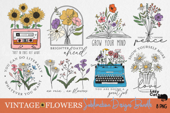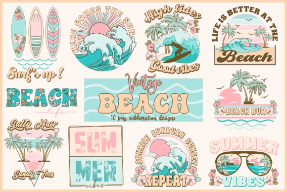
Cool vintage t-shirt designs aren’t a single aesthetic — they’re a cluster of distinct visual languages that each convert differently by platform. The designs that show up in buyer searches are the ones that read as “vintage” in under two seconds without explanation.
I’ve tracked which styles get clicks on Merch and saves on Etsy. The list is shorter than you’d think. Here are the seven that actually move.
What Makes a Vintage T-Shirt Design Look Cool (Not Generic)?
Cool vintage reads as a specific era or subcultural reference — not “aged texture” applied randomly. A distressed badge for a fictional 1968 racing team reads as cool. The same badge with no conceptual grounding reads as filler.
The cool vintage designs that convert are the ones with a specific visual language — not “vintage in general” but a distinct era, subculture, or graphic tradition.
Which Cool Vintage T-Shirt Designs Actually Sell?
1. Distressed Badge Emblem
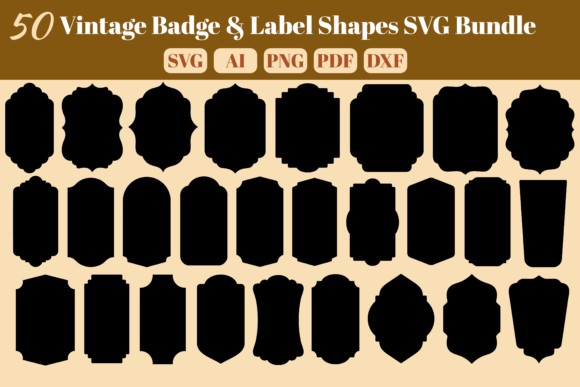
The consistent top-converter across all platforms. Circular or shield format with worn edges — reads as a real vintage patch or club emblem.
Unlimited creative assets. Access to AI tools.
Commercial licence included.
Browse all
Distressed Badge Emblem
Shield format with weathered outer ring and cracked interior lettering — white on black or dark navy. One of the top-selling vintage formats on Merch.
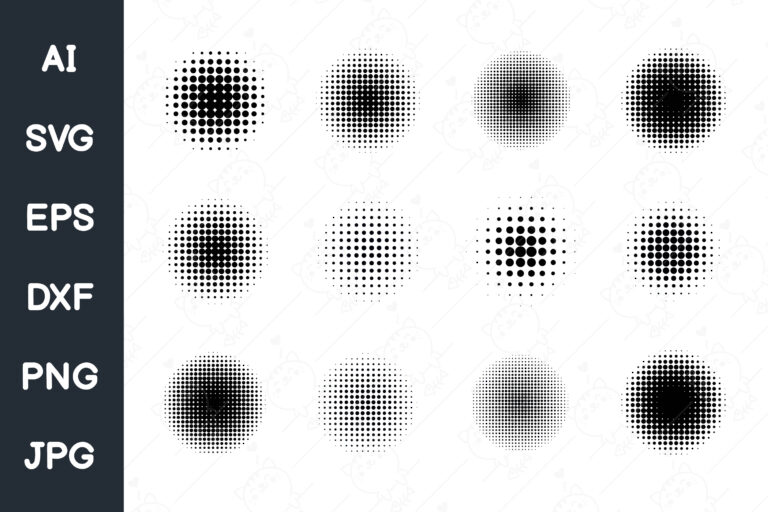
2. Halftone Vintage Graphic
Faded dot matrix print — looks like a screen print after years of washing. Converts across the 25–45 Merch demographic.
Unlimited creative assets. Access to AI tools.
Commercial licence included.
Browse all
Halftone Distressed Vintage
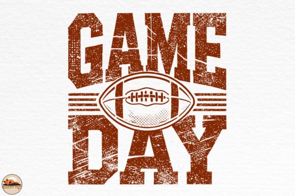
Dot-matrix fade at the edges with a denser centre — visible halftone pattern at close range, reads as solid-worn at distance.
3. Faded Script Lettering
Loose arched script with ink inconsistency — reads as hand-lettered rather than typeset. Strong save rates on Etsy in the vintage apparel category.
Unlimited creative assets. Access to AI tools.
Commercial licence included.
Browse all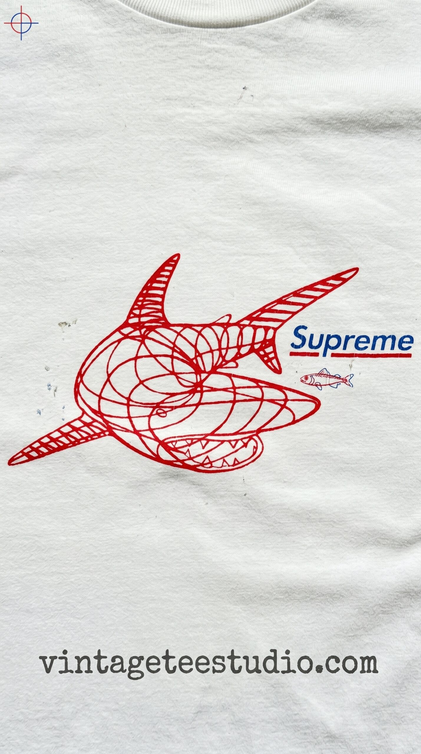
Faded Script Lettering
Wide brush letterforms with natural pressure variation — the fill is inconsistent and the baseline shifts slightly. Reads as painted, not font-generated.
Each file is a transparent-background PNG — open in Photoshop, layer over your mockup, export at 4500×5400px for Merch. Commercial licence from Creative Fabrica’s All Access plan covers Etsy and Merch listings.
Browse Cool Vintage T-Shirt Designs →
4. 70s Retro Logo Style
Bold serifed wordmark with geometric backing shape and a 70s colour palette. The 35–55 demographic buys this consistently on Merch — one of the more reliable keywords in the vintage niche.
Unlimited creative assets. Access to AI tools.
Commercial licence included.
Browse all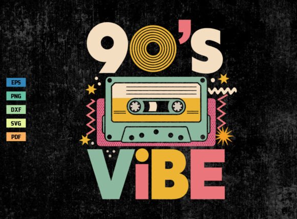
70s Retro Logo Graphic
Wide serifed letterforms with a geometric backing shape — warm orange and brown colour palette. Works as a chest print or centered full-design.
5. Vintage Poster Typography
Wide block lettering with a concert-poster wash behind it. High contrast on dark shirts. The faded background wash is what makes it read as vintage rather than just retro.
Unlimited creative assets. Access to AI tools.
Commercial licence included.
Browse all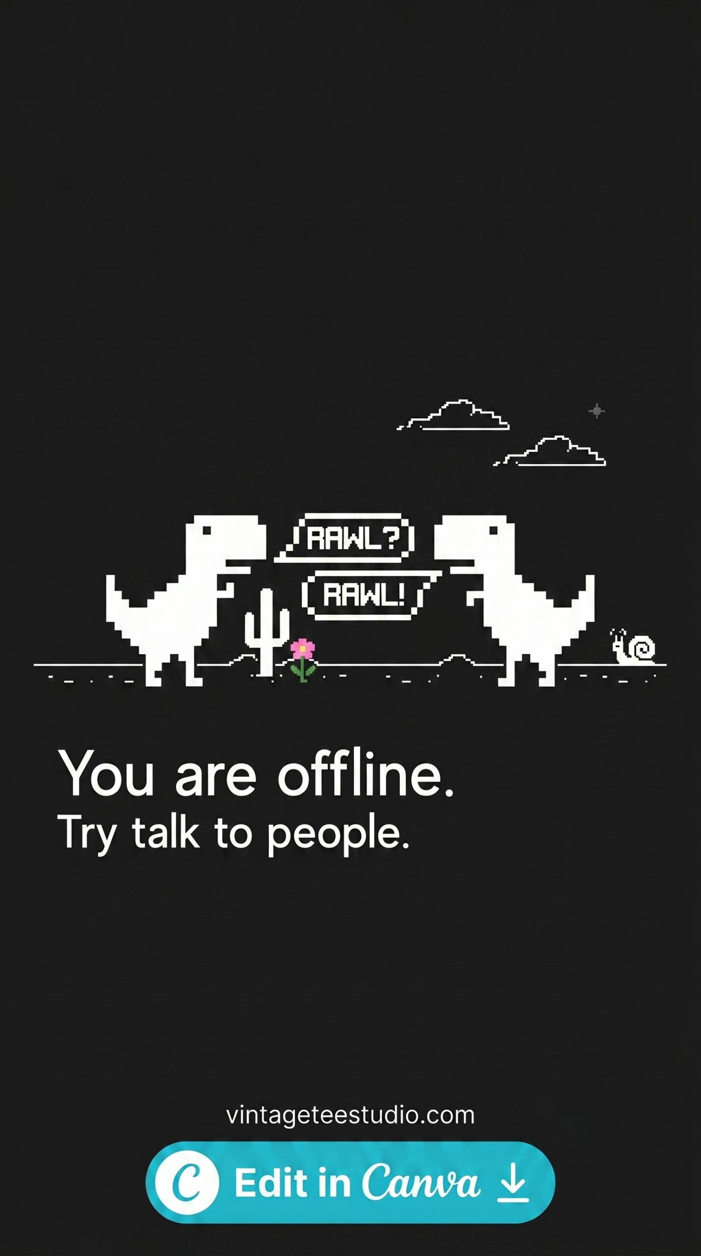
Vintage Poster Typography
High-contrast block lettering with a painterly wash underneath — the fill bleeds slightly outside the letter edges for a hand-inked quality.
6. 90s Grunge Typography
Heavy ink-splatter lettering with rough edges. The art deco geometric version was something I tried — sold 3 copies in 4 months. The grunge version was running 2x that within six weeks.
Unlimited creative assets. Access to AI tools.
Commercial licence included.
Browse all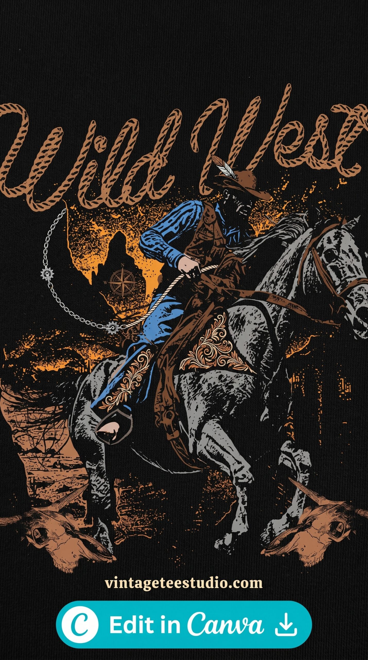
90s Grunge Typography
Rough irregular letterforms with ink-bleed edges — uneven stroke weight and visible spatter around the characters. High contrast on black.
7. Grain-Texture Vintage Emblem
A clean retro design with heavy grain overlay — the noise makes it look like a photograph of something genuinely old. Works on both light and dark shirts because the grain integrates with any base colour.
Unlimited creative assets. Access to AI tools.
Commercial licence included.
Browse all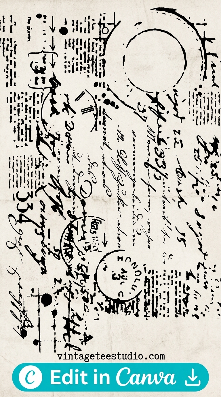
Grain-Texture Vintage Emblem
Fine noise overlay across the artwork — edges lose their digital sharpness and the whole design reads as printed and aged rather than screen-rendered.
Looking for more? Our vintage t-shirt design guide covers the full range of vintage design styles for POD, and our vintage shirt design retro roundup goes deeper on the retro aesthetic formats that work across different shirt colours.
Vintage, Retro or Neo Vintage: Know Which Look You Are Selling
Strictly speaking, every print-on-demand shirt is retro: it is new and it borrows an old look. Still, people who search for vintage want a design that could have been printed in 1975, while retro buyers accept a modern take. Neo vintage is a third look: old type and colour, but clean edges, as if the print survived perfectly.
Each decade has its own signature, and you can tell them apart in seconds:
- 60s: bold condensed serifs, psychedelic lettering, bright primaries and op-art shapes.
- 70s: rounded groovy type, mustard, rust, avocado and cream, suns and botanicals.
- 80s: chrome and bold italics, hot pink and electric blue, Memphis shapes and cassettes.
- 90s: boxy distressed type, black and grey with neon accents, flames and skate graphics.
Pick one decade per design. A 70s palette with 90s type reads as generic vintage, which is exactly what you want to avoid.
Built-In Print Texture Beats a Distress Filter
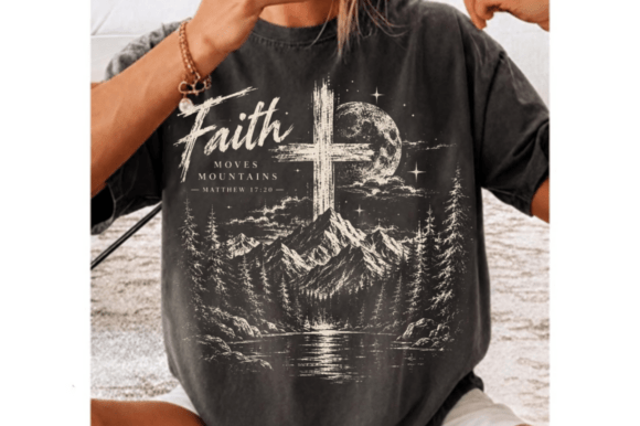
Old shirts look old because of how they were printed: few ink colours, halftone dots for shading and slightly loose registration. A design built inside those limits looks real. A clean design with a distress overlay on top does not, because the wear is spread evenly across every letter, which real ink never does.
When you zoom into a preview, look for wear that clusters on flat areas and edges, not a uniform speckle over the whole design.
Will the Design Print on a Black Shirt?
Many vintage designs vanish on black, because the worn texture and halftone dots are dark fills. Out of 192 vintage and retro shirt designs on sale at Creative Fabrica, 146 are sold for sublimation, which only prints on white or light polyester. Only 2 mention dark garments and 4 mention DTF.
- For a black or dark tee, print with DTF or DTG, not sublimation.
- Choose a design with light fills: cream, off-white, light grey or washed-out gold.
- Before you order a run, place the PNG on a black square in Canva and check that nothing important disappears.
Key Takeaways
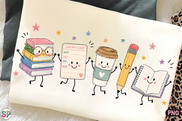
- Top cool vintage t-shirt designs: distressed badge, halftone graphic, faded script, 70s retro logo, poster typography, grunge text, and grain-texture emblem
- Cool vintage reads as a specific era — not generic aged texture applied randomly
- Badge and halftone styles convert best on Merch; script and grain-texture do better on Etsy
- All files are transparent-background commercial-licence PNGs
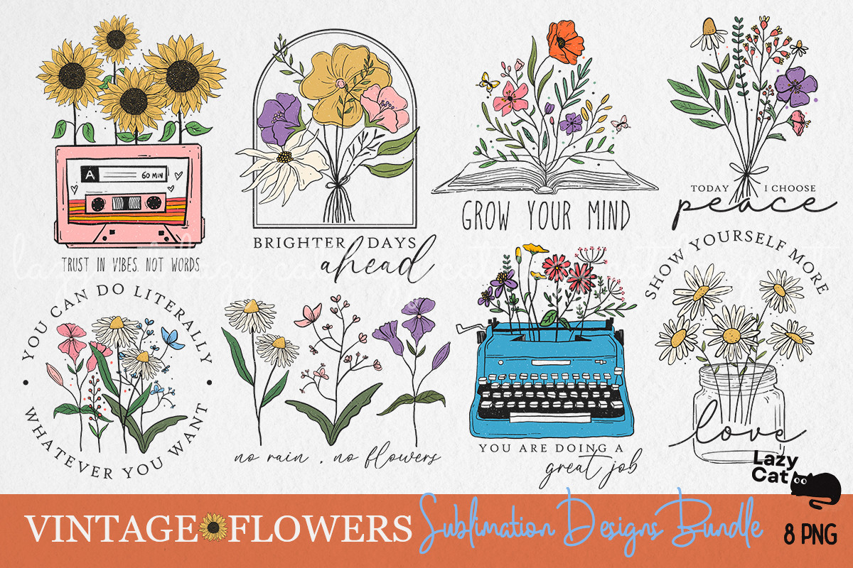
Frequently Asked Questions
What makes a vintage t-shirt design look cool?
A specific visual language tied to an era or subcultural reference — distressed badge formats, halftone dot-matrix prints, and hand-lettered script all read as cool vintage because they reference a real graphic tradition.
Which vintage t-shirt design styles sell best?
Distressed badge, halftone vintage, and 70s retro logo formats are the most consistent sellers on Merch by Amazon. Faded script and grain-texture styles perform better on Etsy.
What file format do I need for vintage t-shirt POD designs?
Transparent PNG at 4500×5400px for Merch by Amazon, or 300 DPI for printables you sell on Etsy. Creative Fabrica commercial files typically meet or exceed these specs.
Are cool vintage t-shirt designs commercially licensed?
Creative Fabrica’s All Access plan includes a commercial licence covering Etsy, Merch, and Redbubble. Always check the individual product licence tab before listing.