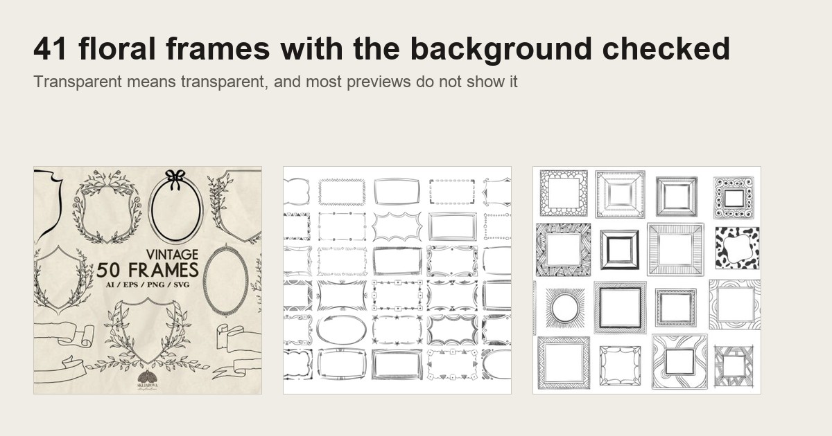
Quick answer: A vintage floral design only works on your page if the file arrives with a transparent background. “PNG” on a product page does not promise that. Look for the words transparent PNG, a grey and white checkerboard behind the preview, or an SVG or EPS in the download, because vector frames carry no background at all.
Then check the size: 300 dpi at the size you print. A frame that passes both checks will sit on cream paper, kraft card or a dark shirt without a white box around it.
You open the file, drop the rose frame onto your aged paper, and there it is: a white box around every petal. If that has happened to you once, you already know why this guide exists.
Vintage floral design is one of the most saved looks for printing. Roses, botanicals, Art Deco borders and folk wreaths all sit under the same two words. The trouble is that the same words also cover flat JPG scans, stock photos and mockups you cannot place on anything.
This guide sorts the look by era first, so you know which style you are after. Then it walks through the frame sets that hold up, one per section, with what each one gives you: background, size and what you can do with it. The last third covers printing, framing, journals, shirts, cutting machines and the licence.
The frame set to start with
Watercolor Ink Doodle Decor Page Borders
Watercolour and ink folk-art borders built to sit in the corner of a page. The seller states the backgrounds are transparent and that the frames go on top of any colour paper. Rated by 12 buyers, all five stars.

I start you here for one reason. The description answers the fear before you ask it: the background is transparent, and the frame is meant to be layered over coloured paper.
Corner borders are also the easiest floral frame to use well. You do not need to fit text inside a closed shape. You drop one corner on the top left of your card, one on the bottom right, and the page looks finished.
Because the line is ink with a watercolour wash, it reads as hand-made rather than printed. That is the quality most people mean when they say vintage floral.
Why PNG on a product page does not mean transparent
Here is the number that explains most white boxes. Across 1,022 floral and botanical frame files on Creative Fabrica, 483 come as PNG. Only 337 actually say the background is transparent.
So about one PNG in three gives you no promise at all. A PNG can hold a transparent background, but it can just as easily hold a solid white one. The format allows transparency; it does not guarantee it.
Another 224 of those frame files are JPG. A JPG cannot store transparency, ever. If the only file in the download is a JPG, the white is part of the image and you will be cutting it out by hand.
On the other side, 412 include an SVG and 237 an EPS. Those are vector files. A vector frame is lines and shapes with nothing behind them, so the background question disappears.
The safe shortcut is a set that ships both: the Hand Drawn Vintage Frames come as EPS and SVG, so there is no background to worry about.
Only 20 say “white background” outright. Most sellers do not mention it at all, and that silence is where your bad surprise comes from.
How to check for transparency before you buy
You can catch almost every white box from the product page. Run these four checks before you add a frame to your cart.
- Read the exact words. You want “transparent PNG” or “transparent background”. Plain “PNG” or “high resolution” is not enough.
- Look behind the preview. A grey and white checkerboard behind the flowers is the usual way a seller shows transparency. A flat white or cream square tells you nothing.
- Scan the file list. SVG, EPS or AI in the list means you have a vector copy, and vectors have no background.
- Find a dark preview. If one of the preview images shows the frame on black, navy or kraft, the background is almost certainly clear.
A good page to practise on is the Pink Floral Clipart set: its description names both the transparent PNG and the print resolution, which is what a passing page reads like.
If you already own a frame and you are not sure, open it in Canva or any editor and place it over a dark rectangle. If you see a white box, it is not transparent. Canva Pro’s background remover or a free remover will clear a simple frame, but it often eats fine leaves and tendrils.
What a white box looks like once it prints
On screen, a white background on white paper is invisible. That is why so many people only find the problem after printing.
Print the same rose frame on cream or aged paper and you get a bright rectangle around it. On kraft card it looks like a sticker someone forgot to trim. On a coloured shirt it becomes a white patch with flowers in the middle.
A second, quieter version catches people too. Some PNGs have a near-white halo along every edge, left over from a rough cut-out. You only see it on dark paper, as a pale fringe around each petal.
If your project is vintage, it almost always means tinted paper. So the transparent background is not a nice extra here. It is the whole point of buying a frame instead of a picture.
Victorian rose frames: dense, dark and boxed in
When most people picture a vintage floral design, they picture the Victorian version. Cabbage roses, heavy leaves, a closed oval or rectangle, and very little empty space.
The colours run deep: wine red, dusty pink, moss green, a brown that looks like old varnish. The frame usually fully closes around the centre, which makes it the right choice for a name, a date or a photo.
That closed shape is also the hardest to use with a white box problem. The background sits inside the frame as well as around it, so a non-transparent file fails in two places at once.
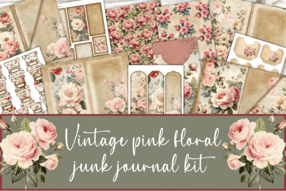
For the rose half of this look, the pink roses and eucalyptus clipart gives you loose blooms to build a closed oval of your own.
Choose Victorian roses for wedding stationery, memory pages and labels. Pair them with an ivory or tea-stained paper so the dark leaves have something to sit against.
One more tip for this style: leave more space inside the frame than feels natural. Victorian frames are busy at the edges, so a short name or a single date in the middle reads better than a full paragraph. If you need room for text, scale the frame up rather than the type down.
Art Nouveau florals and the whiplash line
Art Nouveau florals are about the line, not the flower. Stems curl into long S-curves, lilies and irises stretch upward, and the border flows instead of closing.
The palette is softer than Victorian: sage, mustard, muted teal, cream. Many Art Nouveau frames work best as a single colour, because the shape of the line carries the whole design.
That makes them friendly for printing. A one-colour Art Nouveau border prints cleanly on a home printer, cuts well on a machine and survives a screen print.
If you love this look, ask for an SVG. The curves are what you are paying for, and a vector keeps them smooth at any size.
Art Deco floral frames: geometry first, petals second
Art Deco keeps the flowers but disciplines them. Petals turn into fans and sunbursts, borders become stepped rectangles, and gold sits next to navy, black or deep green.
A Deco floral frame reads from across a room. That is why it suits posters, menu cards, invitation suites and book plates.
The danger is gold. A flat gold colour prints as mustard yellow on a home inkjet. If you want the gold to look like gold, you need foil, a metallic paper or a gold texture inside the file, which some sets include as a bonus layer.
When a Deco frame comes with both a flat version and a textured gold version, buy that one. You get a clean print copy and a showpiece copy in one download.
The Blush and Blue Leaves set carries exactly that bonus: gold and rose-gold geometric frames with foil textures.
Deco also loves a strong typeface. A tall, narrow sans serif or a thin geometric serif inside the frame finishes the look; a script font pulls it back toward cottage and confuses the era.
Antique botanical illustrations and plate-style frames
This is the look behind vintage botanical prints: a single plant drawn with its root, flower and seed head, labelled in Latin, sitting inside a thin ruled border like a page from an old book.
Antique botanical illustrations work because they are calm. One plant, plenty of empty space, a thin frame line. They look right in a gallery wall, a kitchen, a journal spread or a greeting card.
The frame here is usually a simple double rule or a small label at the bottom. That is good news for you: it is the easiest kind of frame to add yourself. Buy the botanical with a transparent background and draw the rule in your editor.
For a plate-style border with a hand-drawn feel, pair one plant with a rule from the vector flourish frames.
If you plan to sell framed prints, this is the style with the clearest audience. Buyers searching for vintage botanical prints framed already know the look they want; your job is a clean, large file.
Cottage watercolor wreaths
Cottage florals are loose watercolour: peonies, roses, sweet peas and eucalyptus painted wet, arranged into wreaths and swags with soft edges.
The soft edge is exactly where transparency matters most. A watercolour petal fades out gradually. If the file is transparent, that fade blends into your paper. If not, it stops at a hard white edge and looks pasted on.
Wreaths are the best cottage format for most people. A round wreath frames a monogram, a recipe title or a short quote without needing any layout skill.
Look for sets that sell the wreath both assembled and as loose flowers. You can use the ready wreath on day one and build your own when you want something different.
To try a ready one first, the free tulip and daffodil wreath is a cottage wreath you can print today.
When you build your own, work in odd numbers: three large blooms, five smaller ones, leaves filling the gaps. Leave one side of the ring lighter than the other. A perfectly even wreath looks printed; a slightly lopsided one looks painted by hand, which is the effect you paid for.
Folk florals and symmetric ornament
Folk florals come from painted furniture, embroidery and tiles. Flat colour, bold outlines, mirrored shapes: a tulip in the centre, two leaves either side, a border repeating the pattern.
Symmetry makes folk frames very forgiving. Because both sides match, small alignment errors disappear, and a single tile can be repeated into a border of any length.
They print beautifully, since flat colour has no gradients to band or blur. Red, mustard, cobalt and green on cream is the classic set.
The Folk Floral Tiles set is built on exactly this mirrored structure.
Use folk florals for recipe cards, kitchen labels, Christmas tags and fabric transfers. They also look right on kraft paper, as long as the background is clear.
Pressed and dried flower frames
Pressed flower frames copy a herbarium page: flat stems, a few faded petals, maybe a strip of washi tape painted across the top.
The colours are drained on purpose: faded lilac, straw yellow, dried rose, olive. The charm is that they look like something you found between the pages of an old book.
This style suits junk journals more than any other. A pressed-flower corner on a ledger page or a used envelope reads as an actual keepsake.
Because pressed flowers are thin and separate, a white box shows up around each stem. Check the transparency here twice.
The Wild Flowers border set is drawn in this thin, pressed style.
Pressed flower frames also look best slightly crooked. Rotate the corner piece a few degrees and add a strip of painted tape across one stem, and it reads as something glued in by hand rather than placed by software.
Black line-art flourish frames
Line-art frames are the vintage engraving look: black ink, cross-hatching, curling flourishes, a small flower at each corner.
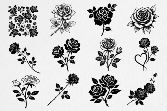
They are the most useful frames you can own. One colour means they print on anything, change colour in one click, cut on a Cricut and engrave on a laser.
They are also the easiest to check. A black line frame on a white preview shows you instantly whether the background is clear, because any white box makes the paper behind it look grey on a dark preview.
If you are building a library from scratch, buy a line-art flourish set first. It covers more projects per file than any coloured set.
Pastel corner ornaments
Pastel corners are small: a sprig of roses, a ribbon, a curl of leaves in blush, mint and powder blue. You place four of them and the page has a frame without a frame.
They suit planners, place cards, baby announcements and labels. Pastels also hide small printing faults better than strong colour, which helps on a home printer.
The catch with pastel is contrast. On white paper a pale pink corner almost vanishes. Put pastel corners on cream, grey or a soft kraft so the colour has something to stand against.
Blush and navy watercolor florals with gold frames
Blush and Blue Leaves Florals Watercolor
42 hand-painted watercolour elements in navy blue, blush pink and beige, plus gold and rose-gold geometric frames, gold dust and foil textures. 42 buyers have rated it, all five stars.

This is the set that sits between cottage and Art Deco. Soft watercolour flowers on one side, crisp gold geometric frames on the other.
Navy and blush is a vintage pairing that does not look sugary. It works on wedding paper, autumn invitations and journal covers.
The foil textures solve the gold problem from the Deco section. You get a gold that looks like metal on screen and in print, not flat mustard.
Wildflower borders for a pressed-flower page
Wild Flowers Floral Border Clipart Set
Soft watercolour meadow flowers built into borders, tagged pressed flowers and minimalist. Rated five stars by 31 buyers.

If the pressed flower look from earlier is what you want, start here. The stems are thin and spaced out, so the border stays light on the page.
Use one border along the bottom of a journal spread, or two facing borders on a card. Leave the middle empty for writing.
Because the style is minimal, it also works for small sellers who need a quiet frame on product labels or thank-you cards.
Autumn dahlia and rose corners
Autumn Flowers Watercolor Clipart PNG
Watercolour dahlias, roses and fall leaves in yellow, burnt orange, burgundy and copper, with corner borders and bouquets. 27 buyers rate it five stars.

Autumn florals are the warm side of vintage: burgundy, copper and burnt orange, the colours of an old seed catalogue.
The corner borders are the useful part. Two diagonal corners frame a recipe card, a Thanksgiving menu or a harvest journal page in seconds.
Warm colours print well on cream and kraft, so this set suits the tinted papers most vintage projects use.
Pink roses and eucalyptus at print resolution
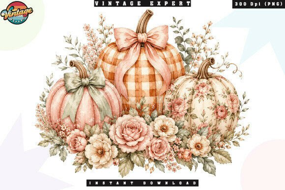
Pink Floral Clipart. Watercolor Flowers
Watercolour pink roses and eucalyptus leaves, saved at 300 dpi in RGB as transparent PNG files. Ten buyers have rated it, all five stars.

This set says the two things you need to hear: transparent PNG and 300 dpi. That covers both halves of the white box and blurry print problem.
Pink roses with eucalyptus is the softer, cottage version of the Victorian rose. Lighter leaves, more air, less shadow.
Build your own wreath or swag from the loose pieces. Because each element is separate, you can resize one rose without touching the rest.
Hand-drawn flourish frames in vector
Hand Drawn Vintage Frames
83 vector calligraphy elements: flourishes, corners, dividers and frames, delivered as EPS and SVG. Rated five stars by eight buyers.

This is the line-art set I told you to buy first. EPS and SVG mean no background at any size, and the shapes recolour in one click.
The dividers are an underrated part of it. A flourish divider between a title and a body of text makes any printable look older.
Use the frames for labels, cut them on a Cricut, or engrave them. One file does all three.
A free spring wreath to test your workflow
FREE Tulip and Daffodil Flowers Wreath
Watercolour pink tulips and daffodils around a golden frame, sold as a printable PNG. Six buyers have rated it, all five stars.
Use this one to test before you spend. Download it, place it on your paper, print one copy and see what your printer does with watercolour and gold.
If the edges come out clean, your setup is fine and you can buy bigger sets with confidence. If you see a box or a halo, you have learned that before it cost you anything.
A spring wreath also fits Easter cards, baby showers and garden labels, so it earns its place after the test.
Folk floral tiles for symmetric borders
Folk Floral Tiles Clipart Set
Colourful folk floral tiles in boho and Scandinavian styles, each built around a symmetric floral motif. Rated five stars by four buyers.
Tiles are the folk style in its most practical form. Line them up and you have a border; put four in a square and you have a frame.
Symmetric motifs make the joins easy. You do not need any layout skill to make a row look deliberate.
Folk tiles suit recipe binders, kitchen labels and pantry jars, and they print well on kraft.
Celestial botanical frames for a darker vintage
Hand Drawn Mystic & Celestial Bundle
163 hand-drawn elements: plants, crystals, moons, moon phases, constellations and a moth, with SVG cutting files. 35 buyers rate it five stars.

Not every vintage floral is sweet. The darker side mixes botanicals with moons, stars and moths, the look of an old almanac.
The plant and branch pieces here make frames on their own. Add a crescent moon at the top and you have a frame for tarot cards, Halloween pages or a moody journal.
The SVG cutting files mean you can also cut the shapes as stencils or vinyl.
A Canva letter frame you fill with florals
Quirky Doodle Alphabet Canva Frame
A Canva template where each letter is a frame: drag a pattern or a photo into it and the letter fills. Eleven buyers have rated it.

This is a different kind of frame: the flowers go inside, not around. Drop a vintage floral pattern into each letter and you have a monogram or a name banner.
It suits people who already work in Canva and do not want to touch a vector program.
Pair it with any of the floral PNGs above as the fill.
PNG, SVG, EPS or JPG: which file for which job
The file type decides what you can do with a floral frame, so match it to your project.
- Transparent PNG is for watercolour and painted frames you place in Canva, Word, Photoshop or a print shop file. It keeps soft edges and texture.
- SVG is for cutting machines and for recolouring. It scales to any size without blur.
- EPS is the same idea for Illustrator and many print shops.
- JPG is only for a frame printed on white paper, or as a full background you will put other things on top of.
Painted, textured frames almost never come as SVG, because a watercolour wash cannot be turned into clean shapes. So for the cottage look, transparent PNG is your format, and the size check below matters more.
Sizing vintage botanical prints for framing
Print quality comes from pixels per inch at the printed size. 300 dpi is the standard for a sharp print you will look at up close.
Work it backwards from the frame you own:
- A 5 x 7 inch print needs 1,500 x 2,100 pixels.
- An 8 x 10 inch print needs 2,400 x 3,000 pixels.
- An 11 x 14 inch print needs 3,300 x 4,200 pixels.
A product page that says only “high resolution” tells you nothing. Look for the pixel size or the dpi together with a print size.
Vector frames skip the problem: an SVG or EPS prints sharp at 5 x 7 and at poster size. That is one more reason to have one in every set. The 83-piece vector frame set is the simplest example.
How to frame vintage botanical prints at home
Once the file is right, the framing is simple and makes the print look far more expensive.
- Print on a matte, slightly warm paper. Bright white paper makes antique botanicals look new.
- Leave a wide margin, or use a mat. Old plates always had plenty of space around the plant.
- Pick a thin frame in black, brass or natural wood. A heavy ornate frame fights the drawing.
- Hang them in pairs or sets of four from the same series, so the eye reads a collection.
If you like this look, the guide to vintage frame TV art shows the same botanical style on a screen.
Floral frames in a junk journal
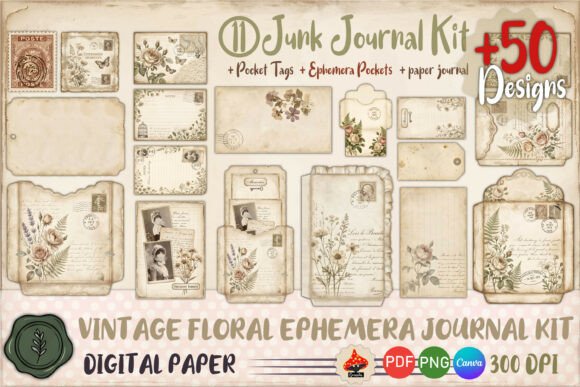
Junk journals are where transparency pays off the most. You print a frame onto ledger paper, an envelope, a tea-dyed page, and it must look as if it was always there.
Use corners and partial borders more than closed frames. A closed frame on every page looks like a template; a pressed flower corner here and a wreath there looks collected.
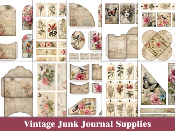
Print a sheet of loose florals at different sizes and cut them out as ephemera. One good transparent set fills a whole journal.
For journal corners specifically, the Watercolor Ink Doodle borders were made to sit on coloured paper. More layout ideas: a brown paper bag junk journal, junk journal DIY and junk journal vs scrapbook.
Try printing the same frame twice: once at full strength and once faded to about half in your editor. The faded copy looks like an old stamp or a bleed-through from the page before, and it gives your spreads depth without buying anything new.
For page backgrounds that go under these frames, see vintage floral scrapbook paper, and for more pieces to layer on top, junk journal images.
Floral frames on a shirt or tote
Fabric is where a white box hurts most. On a coloured shirt, a non-transparent PNG prints as a white rectangle, and you cannot hide it.
For DTF, DTG and sublimation, use only transparent PNG at 300 dpi at the print size, often 12 inches wide for a chest print, which means 3,600 pixels.
Watercolour fades need care on dark shirts. The soft edge can print as a thin, washed halo. Line-art and folk florals in flat colour print cleaner.
The full file checklist for shirts is in shirt PNG for print on demand.
Laser and cutting machines need one clean outline
A Cricut, a Silhouette or a laser needs a closed vector path. A painted PNG gives the machine nothing to follow.
Only 85 of those 1,022 floral frame files mention laser cutting. To cut or engrave, filter for SVG, DXF or a laser-ready label, and check the preview shows a single outline.
Fine botanical detail also fails here. Tiny leaves burn through wood or tear in cardstock. Choose bold line-art and folk frames for cutting.
What a commercial licence covers for a floral frame
If you sell anything you make with a frame, read the licence before you design.
A commercial licence normally lets you use the frame inside a finished product: a printed card, a framed print, a shirt, a planner page. It normally does not let you resell the frame file itself, or sell it as clipart, even if you recolour it.
Creative Fabrica’s standard licence covers commercial use in end products. If you plan to sell printables or digital kits, check the product page for any extra limit on digital resale.
Keep the licence and the product page link with your files. If a marketplace ever asks, you can show where the frame came from.
The Mystic and Celestial bundle includes SVG cutting files, a typical case where the file goes into products you sell, not resold as clipart.
A simple habit helps: one folder per set, with the files, a copy of the licence and a text note of where you used it. When you come back months later to reorder a best-selling card, you will know exactly which frame it was and what you are allowed to do with it.
Building a matching set from three files
You do not need ten bundles. Three files cover nearly every vintage floral project:
- One line-art vector set for labels, dividers and cutting.
- One watercolour transparent PNG set for cards, journal pages and wreaths.
- One era set, Deco gold, folk tiles or celestial, for the projects that need a strong character.
Seasonal projects use the same sets: see vintage Christmas tags and vintage paper art, and for overlays on photos, vintage frame overlays.
Keep the palette consistent across the three and your work will look like a collection rather than a pile of downloads. For border ideas that tie these together, see vintage border design.
Matching the era palette to the paper
The paper decides half of the look. Match it to the era you chose.
- Victorian roses: ivory or tea-stained paper.
- Art Nouveau: warm cream or pale sage.
- Art Deco: black, navy or deep green card, with gold.
- Botanical plates: warm white matte.
- Cottage watercolour: cream or very pale pink.
- Folk: kraft or natural cream.
- Pressed flowers: ledger, envelope or grid paper.
Every one of these papers is tinted. That is the final reason the transparent background matters: vintage floral design almost never goes on pure white.
Browse more vintage floral frames
Key Takeaways
- PNG does not mean transparent: look for the words transparent PNG, a checkerboard preview or an SVG or EPS in the download.
- JPG frames always carry a background; use them only on white paper.
- Check the pixel size against your print size: 2,400 x 3,000 pixels for an 8 x 10 inch print.
- Pick the era first: Victorian, Art Nouveau, Art Deco, botanical, cottage, folk, pressed, line art or pastel.
- Line-art vector frames cover the most projects per file and are the only kind that cut cleanly.
- A commercial licence covers finished products, not resale of the frame file.
Frequently Asked Questions
What is vintage floral design?
It is floral artwork drawn in the style of an earlier era: Victorian roses, Art Nouveau lines, Art Deco geometry, antique botanical plates or folk patterns. For printing, it usually means a frame, border or clipart file you place on tinted paper.
Why does my floral PNG print with a white box?
Because the PNG has a solid white background instead of a transparent one. The format allows transparency but does not guarantee it. Check the description for “transparent” and the preview for a checkerboard before you buy.
Can I make a white background transparent myself?
Yes, with a background remover in Canva Pro or a free tool, but fine leaves and soft watercolour edges often get damaged. A file sold as transparent is cleaner.
What size should vintage botanical prints be?
Aim for 300 dpi at the print size: 1,500 x 2,100 pixels for 5 x 7 inches, 2,400 x 3,000 for 8 x 10 and 3,300 x 4,200 for 11 x 14.
Which floral frames work on a Cricut or laser?
Only vector files with a clean outline: SVG, DXF or a file marked laser-ready. Painted PNG frames cannot be cut.
Can I sell cards or prints made with these frames?
A commercial licence normally covers finished products like cards, prints and shirts. It does not cover reselling the frame file itself.
Which set should I buy first?
One vector line-art set for cutting and labels, such as the Hand Drawn Vintage Frames, and one transparent watercolour set, such as the Autumn Flowers clipart.