You bought a plain scrapbook, some photos, and a glue stick — and the page still looks like a school project instead of something pulled from your grandmother’s attic. The gap isn’t effort. It’s technique.
A vintage-looking scrapbook page comes down to five repeatable moves: aged paper tone, layered depth, imperfect edges, muted color palette, and handwritten or typewriter-style text. Skip any one of these and the page reads as photos on paper instead of “vintage.”
Quick answer: tea-stain or pre-toned paper, torn (not cut) edges, at least three layers per page, a warm sepia-and-cream color palette, and script or typewriter lettering are what separate a vintage scrapbook page from a regular one.
Why Does Paper Tone Matter More Than Any Other Choice?
White cardstock reads as modern no matter what you put on it — your eye clocks the brightness before it registers anything else on the page. Warm off-white, tea-toned, or cream paper resets that first impression instantly, before a single photo or embellishment goes down.
You don’t need to dye every sheet yourself. Pre-toned vintage-print paper packs save the mess of tea-staining dozens of sheets, and the tone is consistent across the pack — hand-staining almost always comes out blotchy on the first few tries.
How Do You Get Layered Depth Without It Looking Cluttered?
Three layers is the working number: a base paper, a mid-layer element (a torn strip, a doily, a map fragment), and the photo or focal item on top. More than four and the eye doesn’t know where to land. Fewer than three and the page looks flat regardless of how good the paper tone is.
Vary the layer shapes, not just their content — a rectangular photo over a rectangular mat over a rectangular base paper reads as stacked squares. Swap one layer for something torn, round, or angled and the stack suddenly looks composed instead of accidental.
Unlimited creative assets. Access to AI tools.
Commercial licence included.
Get downloads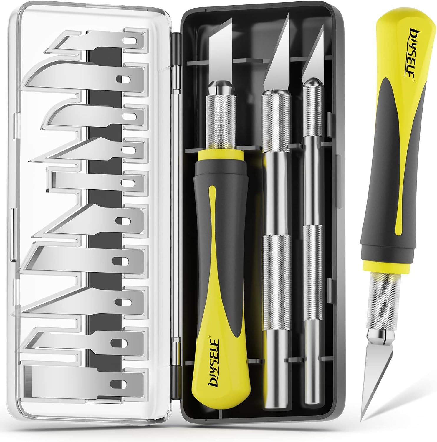
Best for: controlled torn edges and layer cutting
A proper craft knife set gives you cleaner control over torn-edge effects than scissors do — you can score a line first, then tear along it for an edge that looks worn but not ragged. Also useful for cutting doily and map-fragment layers to size.
Best for: controlled torn edges and layer cutting
A proper craft knife set gives you cleaner control over torn-edge effects than scissors do — you can score a line first, then tear along it for an edge that looks worn but not ragged. Also useful for cutting doily and map-fragment layers to size.
Best for: controlled torn edges and layer cutting
A proper craft knife set gives you cleaner control over torn-edge effects than scissors do — you can score a line first, then tear along it for an edge that looks worn but not ragged. Also useful for cutting doily and map-fragment layers to size.
What Colors Actually Read as “Vintage” on a Page?
Sepia, faded rose, dusty teal, and mustard yellow show up in almost every genuinely old photograph or ephemera piece — they’re the colors that paper and ink actually fade to over decades, not colors someone chose to look old. Stick to that palette and skip anything saturated; a bright red or true black embellishment will stand out as clearly modern against everything around it.
One trick that reads instantly as vintage: limit yourself to three colors per page, including the paper tone. Pages that stay disciplined on palette look intentional even when the layout is simple.
Does Handwriting Actually Matter, or Is That Overkill?
It matters more than people expect. Printed captions in a modern sans-serif font undercut every other vintage choice on the page instantly. Handwritten captions, a script font sticker, or a typewriter-style stamp all signal this was made by hand, possibly a while ago — which is the entire point of the aesthetic.
If your handwriting isn’t the style you want, a typewriter font sticker sheet or rubber stamp set solves this without requiring calligraphy practice.
What Do Most Beginners Get Wrong First?
They buy modern die-cut embellishments — hearts, stars, clean geometric shapes — and expect the paper tone alone to carry the vintage look. It doesn’t. Every element on the page needs to match the aesthetic, not just the background. A crisp die-cut star on tea-toned paper looks like a sticker slapped on old paper, because that’s literally what it is.
The fix: choose ephemera-style elements first (ticket stubs, postage stamp images, botanical illustrations, ledger lines) and build the rest of the page around them, rather than starting with a modern die-cut and trying to age it after the fact.
Frequently Asked Questions
Do I need to actually tea-stain my own paper for a vintage scrapbook?
No — pre-toned vintage-print paper achieves the same visual result without the drying time or uneven staining that comes with doing it by hand, especially on your first few pages.
What’s the fastest way to make a scrapbook page look aged?
Torn edges plus a sepia-toned base paper. Those two changes alone move a page most of the way toward “vintage” before you add a single embellishment.
Can I mix modern photos into a vintage-style scrapbook?
Yes, and it’s common — desaturating or sepia-filtering the photo before printing, then framing it with vintage-style mats and ephemera, keeps a current photo consistent with an aged page.
How many embellishments is too many on one page?
Past four or five distinct elements, most pages start looking busy rather than rich. Fewer, well-chosen pieces read as more curated than a page packed with stickers.
Is there a difference between vintage scrapbooking and junk journaling?
Yes — a vintage scrapbook is still a structured photo album that happens to use aged materials, while a junk journal is a looser, hand-bound object built entirely from found ephemera. See our junk journal vs scrapbook comparison for the full breakdown.
If you’re still deciding on a base format before committing to the vintage aesthetic, our DIY junk journal guide for beginners covers binding and paper choices from scratch.
Key Takeaways
- Paper tone is the single biggest factor in whether a page reads as vintage — start there, not with embellishments.
- Three layers per page is the sweet spot for depth without clutter.
- Stick to a sepia/rose/teal/mustard palette; bright or saturated colors break the look instantly.
- A craft knife set gives cleaner control over torn edges than scissors alone.
About the Author: Alina has spent years designing and selling print-on-demand vintage graphics on Etsy and Amazon Merch, and now hunts down the physical vintage-decor finds that actually hold up — the ones with real material quality, not just a “vintage” label slapped on a modern print.